Elizaveta Gordeeva
Graphic Designer / Art Director
ABOUT
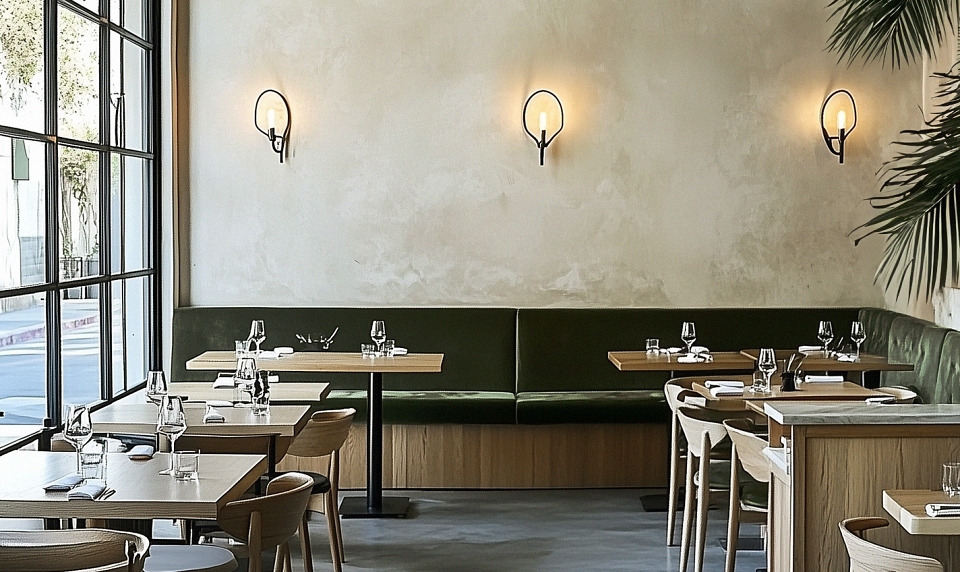
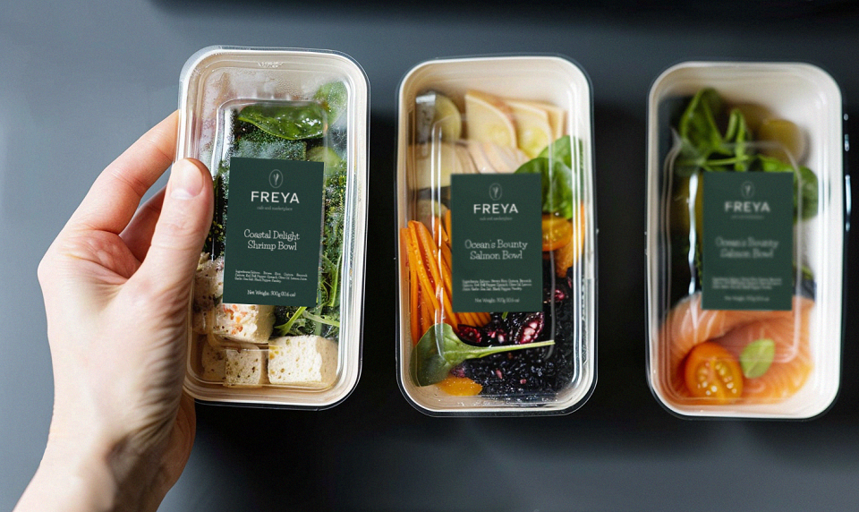
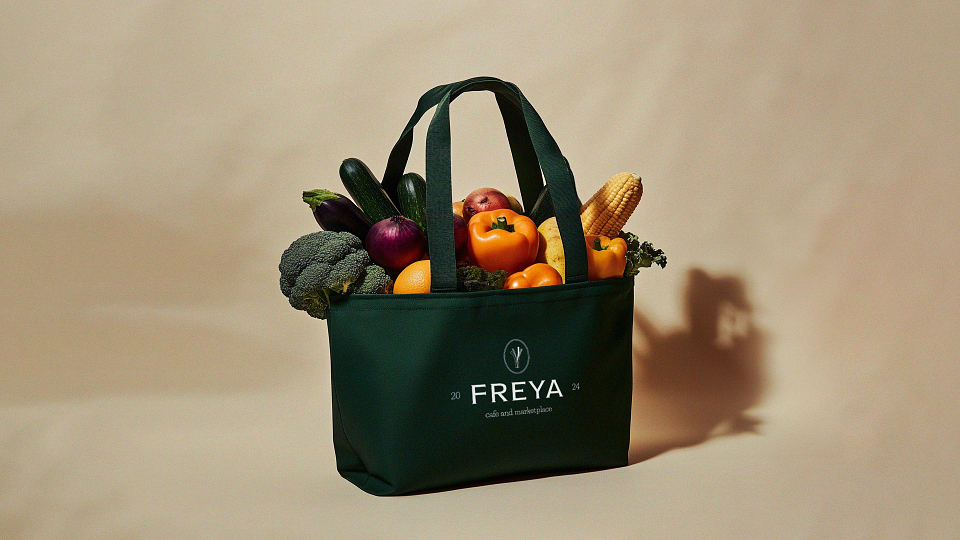
The branding was developed for a chain of cafes with a conscious approach, an emphasis on balanced and healthy nutrition, care for the environment and attention to proper waste disposal, reuse of resources.
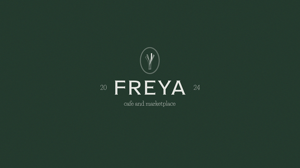
The green color of the brand emphasizes the benefits of the products, organic nature, freshness, and one of the main values - care for the environment. The color palette in neutral natural shades creates an association with freshness, ecology, greenery and benefit.
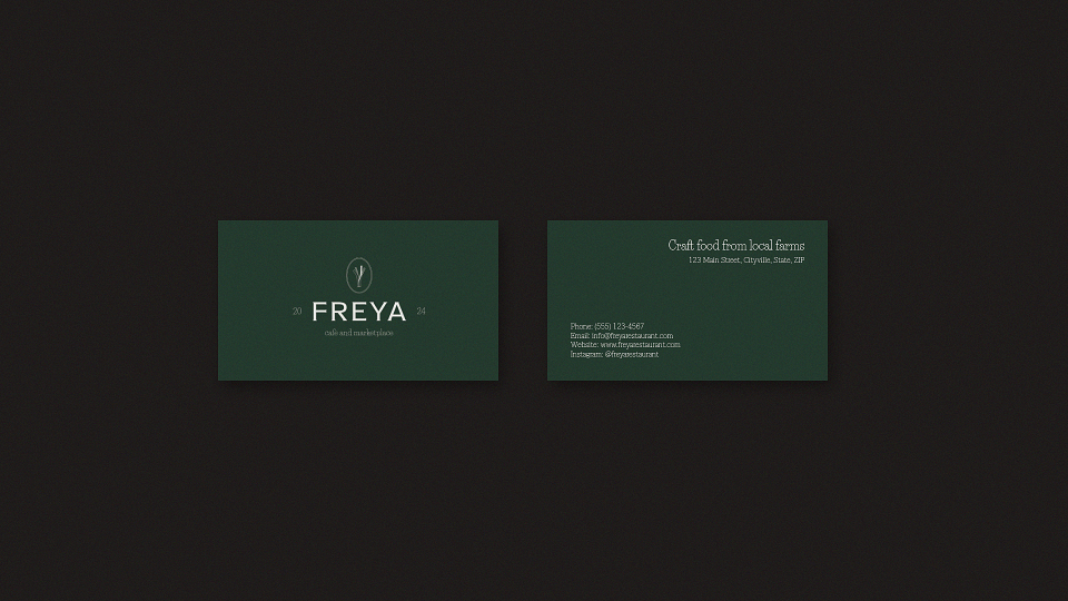
The typography and composition of the logo refer us to vintage signs above farm shops, creating the atmosphere of a local place that pays great attention to the quality of the products. The logo uses an image of a leek, which is also a corporate sign, evokes additional associations with greenery, vegetables, healthy food.
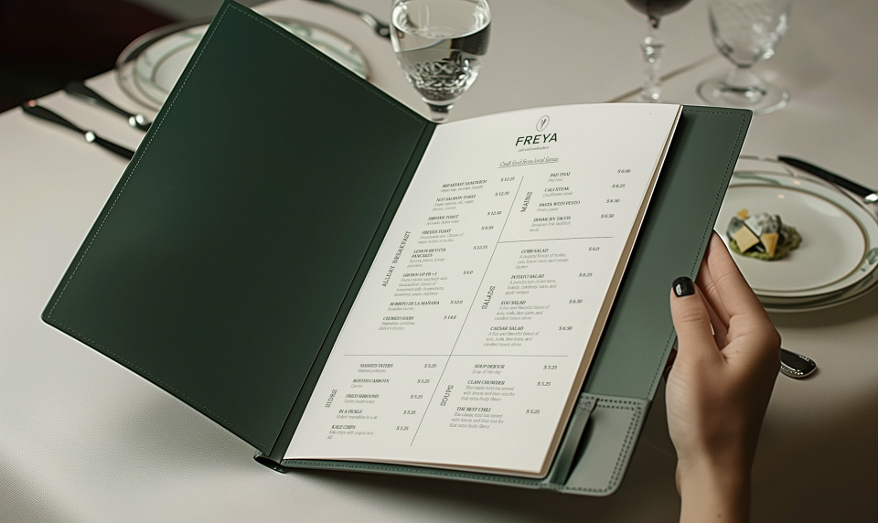
For the project, a logo, corporate color palette, font pair, packaging and printing design were developed, a style for photographs was thought out, a corporate style guide was compiled.
MADEIT CREDITS
-

Elizaveta GordeevaGraphic Designer / Art Director