Elizabeth Rhodes
Graphic Designer
ABOUT
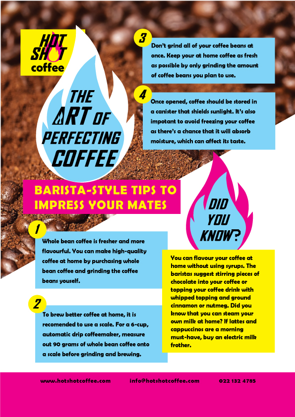
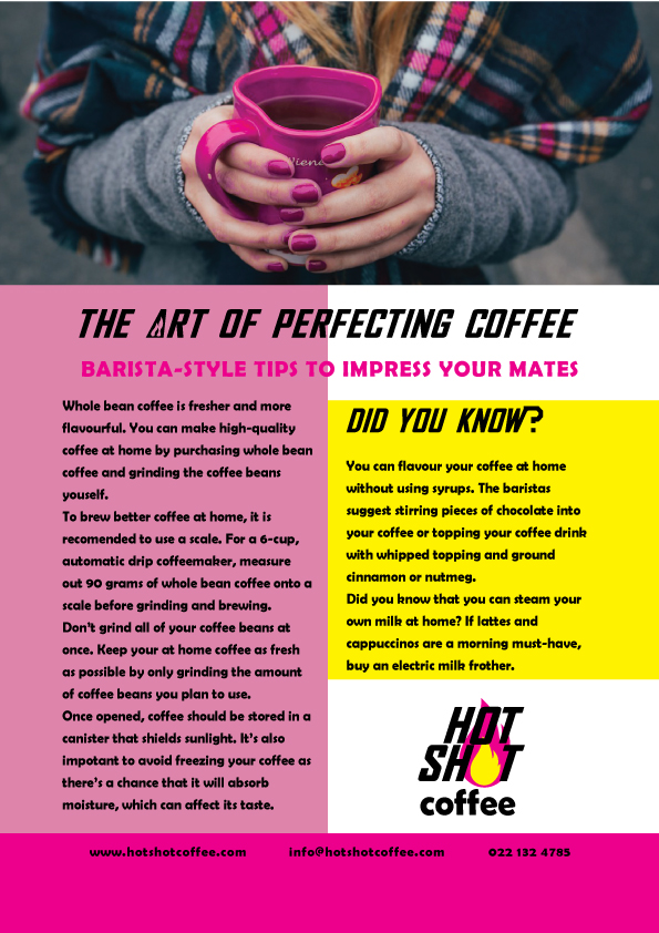
As part of my Graphic Design Diploma with Shaw Academy I had to design a logo and promotional leaflet entitled 'The Art of Perfecting Coffee'.
I came up with my own imaginary coffee shop called Hot Shot Coffee, a vibrant and youthful coffee shop with a neon 80s vibe. I didn't want it to fall into any brown, earthy coffee shop cliche.
I designed two logos, a lettermark and a wordmark.
For the lettermark I included an espresso cup with a bright flame to reflect the company name. I chose bright pink and yellow as they are not what you would normally see in a coffee shop but are fun and vivid and also complement brown (for coffee beans) very well.
I chose an italic font as it has the sense of speed, to reflect the youthful branding and high that coffee gives. It also has a retro 80s feel and I was inspired by posters for 80s racing games.
For the wordmark logo I used the flame in place of the letter O in Shot.
As part of the task I designed a promotional leaflet by clearly following the hierarchy of visual, headline and body copy in quite a straightforward way (second view). I then decided to re-design it in a more energetic way by adding in a diagonal, adjusting the font size in the header, utilising the flames from the logo design and including numbers to break down the text into chunks (first view). I also added white and pale blue to reflect the hot flames and offset the darker pink, yellow and brown.
MADEIT CREDITS
-

Elizabeth RhodesGraphic Designer