Elizabeth Rhodes
Graphic Designer
ABOUT
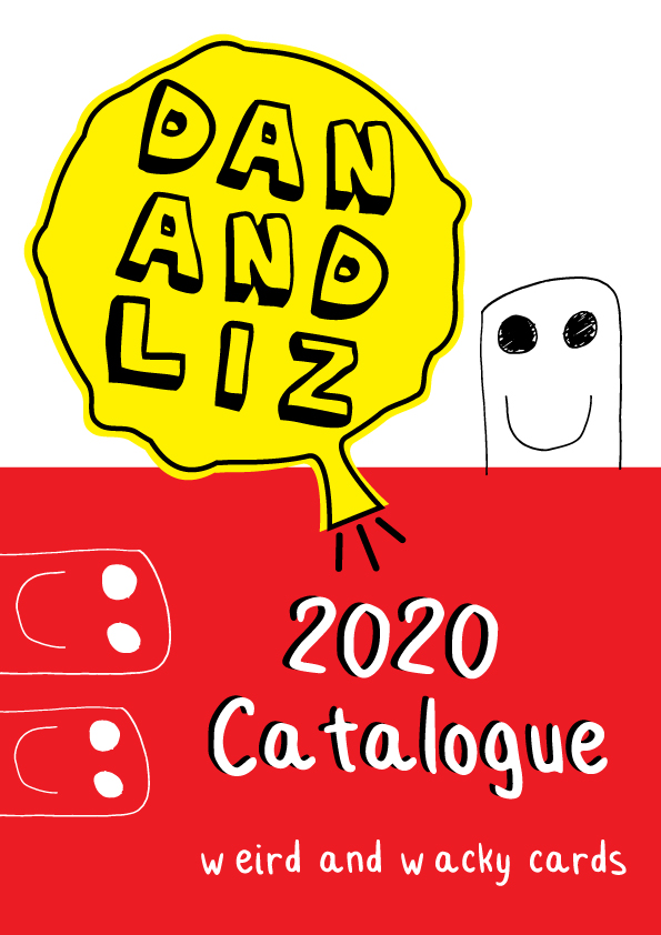
My partner Dan and I design weird and wacky cards and prints to sell on Etsy. I wanted to design a logo which reflected the fun and daft nature of our brand.
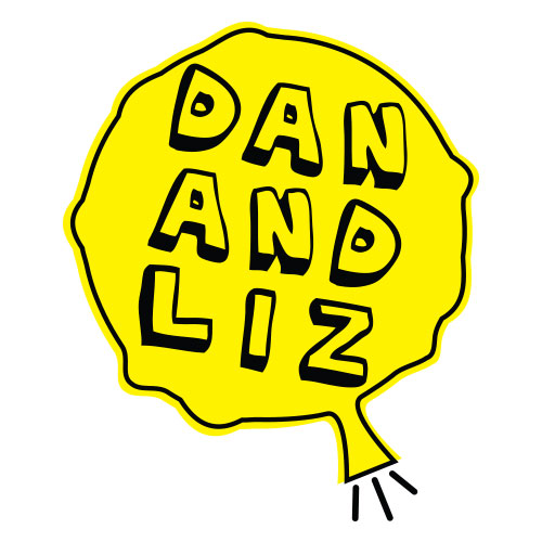
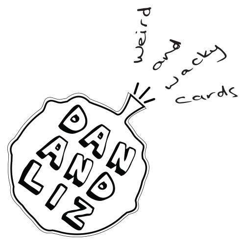
I liked the idea of a round shape for it's versatility and came up with a whoopie cushion! I thought it would work well when combined with taglines as the words could be positioned like they were being blown out of the cushion in a dynamic way. I liked that a whoopie cushion doesn't really have a top or bottom so could be rotated an still be easily recognisable.
I made sure the design still stood out clearly in black and white but I included a bright yellow to emphasise the fun and unserious brand.
I chose an irregular bubble font to reflect the unpredictable and comic style of our designs. I laid out the text to almost look like a mini wordsearch as the jokes and funny writing are a big part of our designs. See how many words you can make! The writing is laid out on a slight angle to reflect the dynamic movement of the whoopie cushion and the off-kilter style of our brand's humour.
MADEIT CREDITS
-

Elizabeth RhodesGraphic Designer