Ekaterina Kuzneczova
Branding Designer
ABOUT
COORIE premium household brand
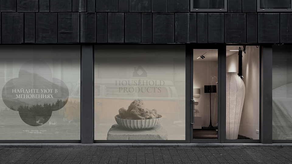
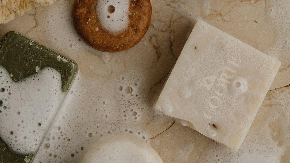
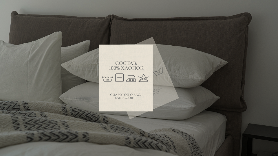
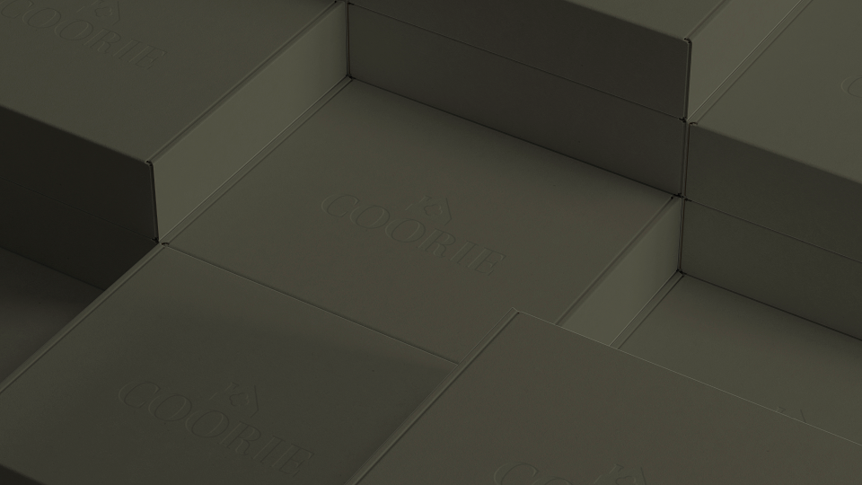
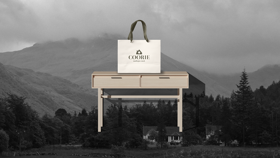
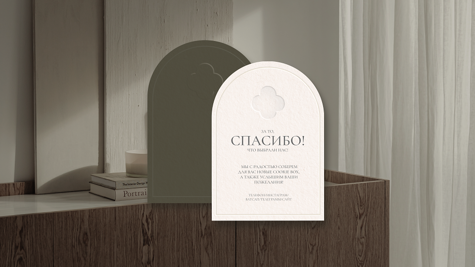
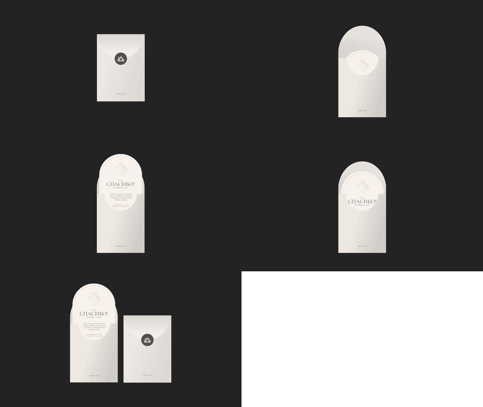
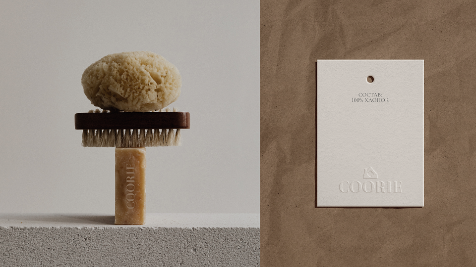
Coorie is not just bed linen, it is a real way of life. “Feeling part of something bigger” is what this philosophy, inspired by cozy Scotland, is all about.The concept of "coorie" focuses not so much on home comfort, but on interaction with the environment. This is an attempt to reduce the crazy pace of life, balancing them with small joys.The goal of the brand is the competent positioning of a quality product with a certain philosophy and the creation of a reflective corporate identity, the carriers of which include the entire product packaging. The main task was to make the process of contact with the product as reverent as possible, so that the first thing the buyer gets is an emotion, and then he sees underwear that will change his whole life.
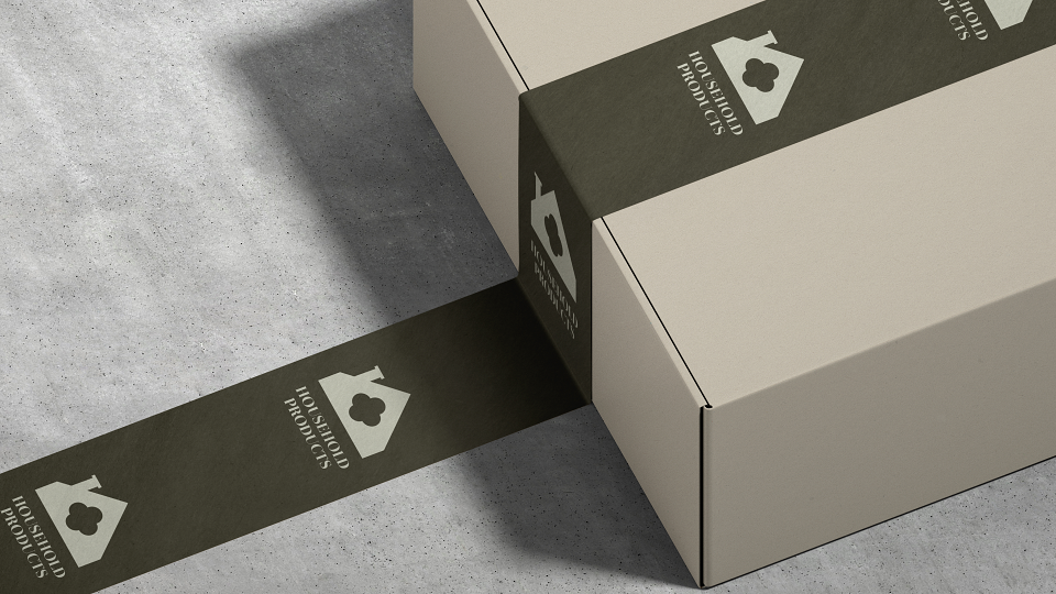
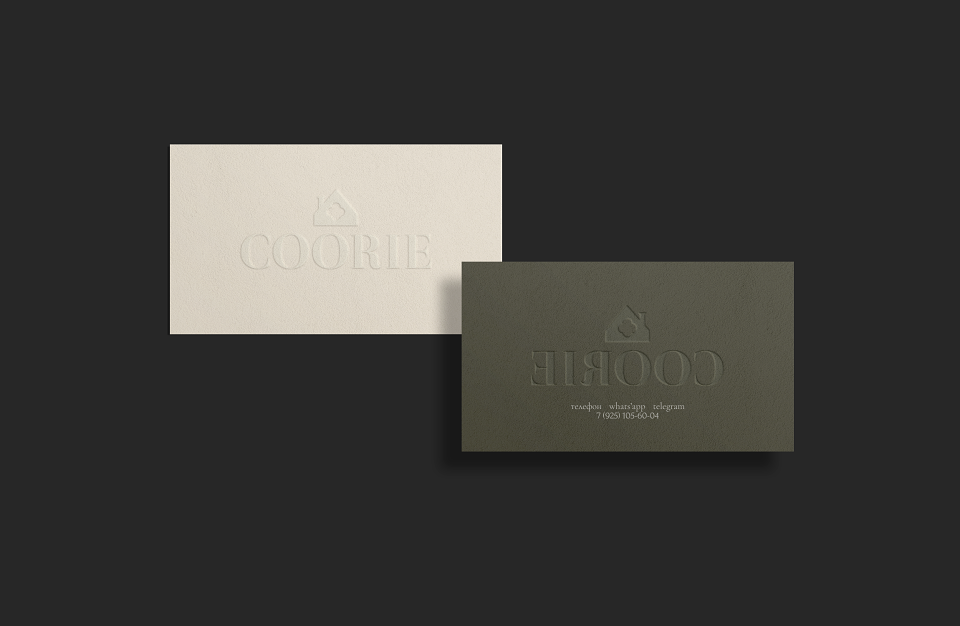
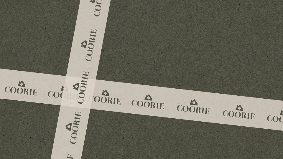
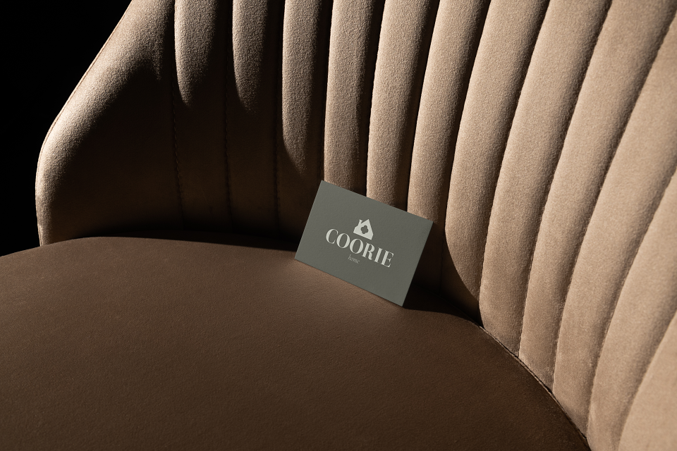
The logo is a stable composition offont logo and brand name.The font and its volume convey to us a sense of confidence and reliability, and serifs give it a touch of elegance and privilege. The sign is the main symbol containing the image of a cozy home and the outline of cotton in its middle. Cotton - as the main, dominant symbol, telling us about the naturalness and tranquility of the brand.Every detail in the design was thought up and implemented taking into account the main style and brand identity. All elements of "Coorie" convey to us the values, philosophy and thoughts of the founders, who want to create a feeling of exceptional comfort and tranquility for their customers.
In the project, it was important to reflect the premium and quality of the product, as well as the environmental friendliness of production, minimalism in use, limited edition of products and, of course, the comfort, calmness and unity inherent in the philosophy from Scotland.
MADEIT CREDITS
-

Ekaterina KuzneczovaBranding Designer