Edite Satkovska
Graphic Designer | UI/UX Designer
ABOUT
Concept
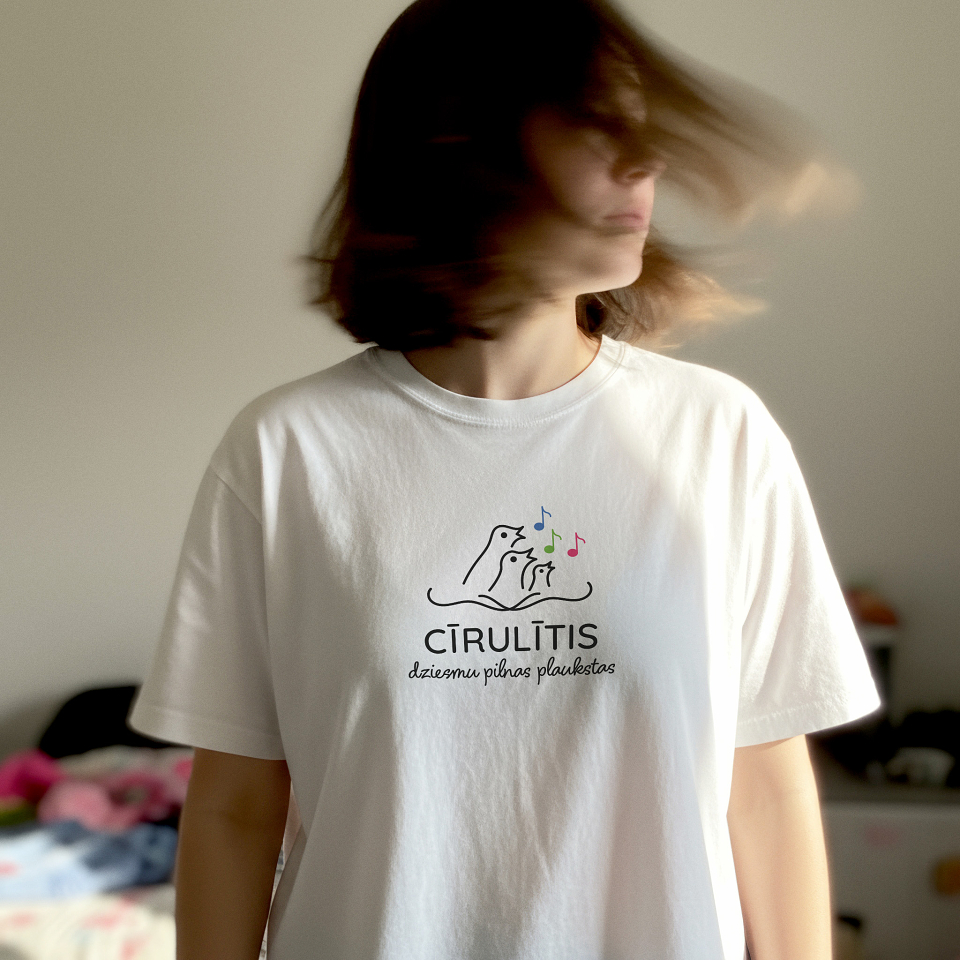
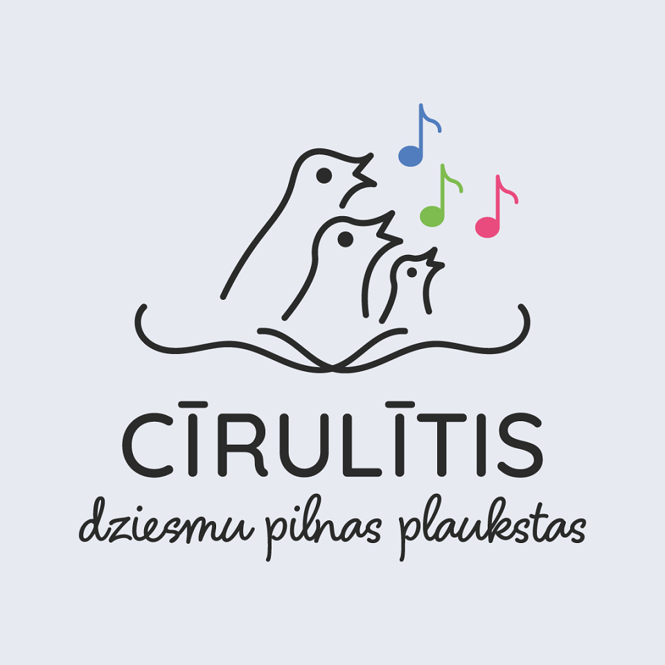
The goal of the project was to create a friendly and expressive logo for the children’s vocal ensemble “Cīrulītis”. The visual identity needed to reflect the joy of singing, the presence of multiple generations of children within the ensemble, musical harmony, and strong family values - while maintaining clarity, adaptability, and suitability for long-term use in educational and cultural environments.
The main sources of inspiration were the children themselves, singing across different generations, and the idea of family unity. Symbolism was drawn from birds as a family, the nest - which also subtly references a music book - and playful musical notes. These elements were translated into a visual language that feels warm, playful, and approachable
Execution
A custom logo concept was developed to balance playfulness and clarity, ensuring it resonates with children, parents, and educators alike.
An expressive mark was created, inspired by musical rhythm and natural movement, while deliberately avoiding overly literal or decorative elements.
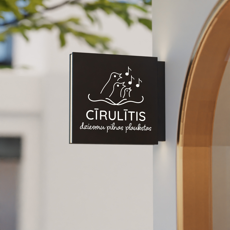
The logo was designed to be universally adaptable, performing equally well across print, digital formats, stage materials, and educational applications - on both light and dark backgrounds.
Special attention was given to proportions, legibility, and scalability, ensuring strong performance at both small and large sizes.
Results
The final logo gives “Cīrulītis” a distinctive and joyful visual identity that supports the ensemble’s artistic mission. It communicates warmth, creativity, and musical spirit while remaining professional and adaptable. The result is a logo that can grow alongside the ensemble and consistently represent it across performances, events, and communication channels.
MADEIT CREDITS
-

Edite SatkovskaGraphic Designer