Edgar Zarate
Graphic designer
ABOUT
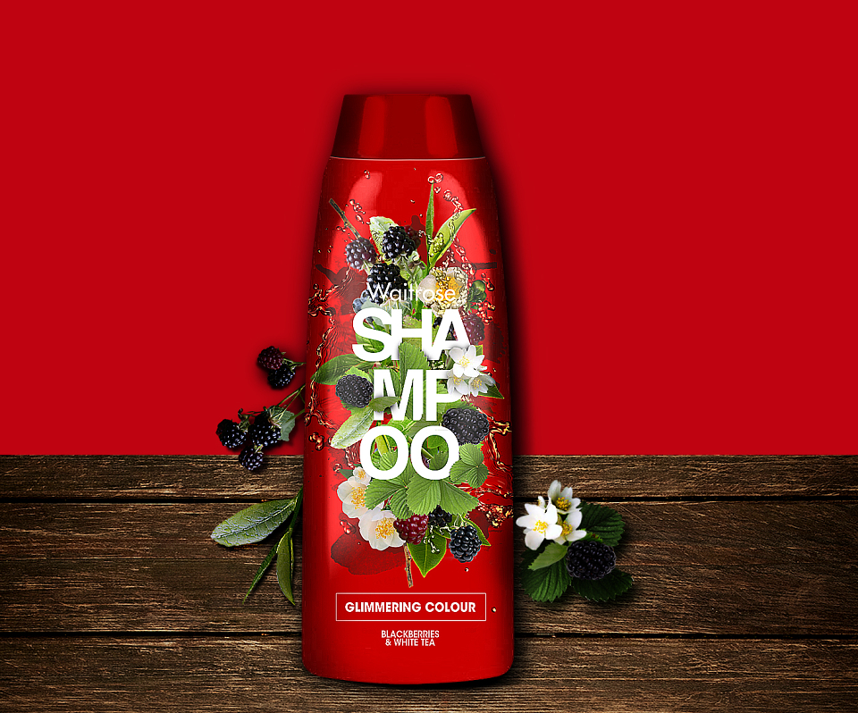
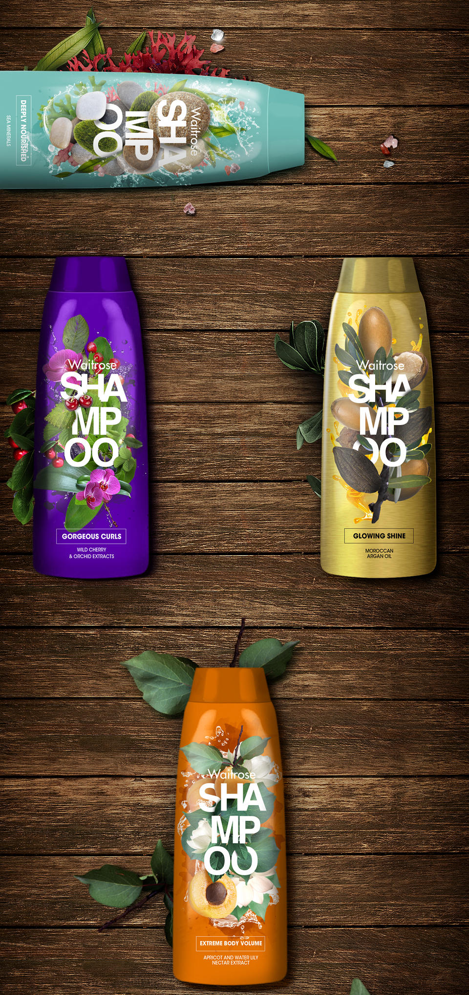
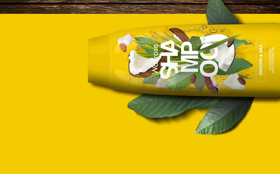
This project was part of a big pitch work for SPB. They wanted to present to Waitrose a line of hair care products. They asked two different lines, one more focused on professional target and the second one of a more sensory tone. This is the latter who positions itself as being more accessible to the consumer, fresher, trender and what you see is what you get. I designed the label by mixing the name of the product type with the key ingredients.