


Article by Bella Jordan (Digital Design and Marketing at ecce)
It’s been just over a year since I handed in my final year dissertation: a semiotic study on the aesthetics of fashion blogger imagery on Instagram. Even my tutor (who freely admitted he initially had absolutely no idea what I was going on about and why I would even want to write thousands of words about these sorts of images) learnt a lot and was positive about my findings despite knowing very little about the ‘gram.
I wanted to find out why particular Instagram imagery is so successful and what is it about these images that makes them so popular.
Instagram has developed its own set of visual connotations and overarching style, with content on the platform being seen as 2.8 times more distinctive than its counterparts on other sites.
There are tons of articles claiming to know how to make your feed “#goals” but no one ever actually tells you why it works or backs it up with any kind of evidence. So I thought I would try to condense and repurpose my mass of analysis into a few clear tips for social marketers and content creators to use, rather than continue to let it just collect digital dust on my cloud drive.
(If it is useful, please let me know so I don’t feel like the only one that drools over beautiful flat-lays and dog accounts with a prettier grid than my own)
Let’s get to it.
1. Use plenty of light
Seems pretty obvious right? It’s been determined that images with a higher lighting level receive 24% more likes than their darker counterparts (1). It makes the colours pop, looks cleaner and generally more appealing.
Key takeaway: You don’t need to invest in hundreds of pounds of studio lighting, try to shoot in natural light in the early morning or late afternoon.
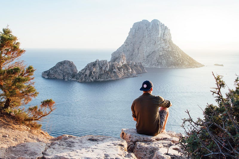
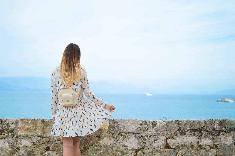
2. Your background is just as important as the focus of your image
A study by Curalate (1) found that images with a larger amount of background space generated 29% more likes than those with little space. The background as a predominant element of an image enforces the situation and location of the person or object in the shot.
When a person is present it emphasises their participation in the wider environment adding an element of relatability. Background is important to provide contrast to draw attention to the feature of the images but also to formulate the situation being displayed (see number 6 for more about this)
3. Use blue hues

Blue hues are found to be more popular in comparison to a reddish tone. This choice of hue is perhaps due to the connotations of the colour such as serenity, coolness, calm and reflection (2). Cooling an image allows the whites to appear brighter and removes any unpleasant yellow tones. Lovely.
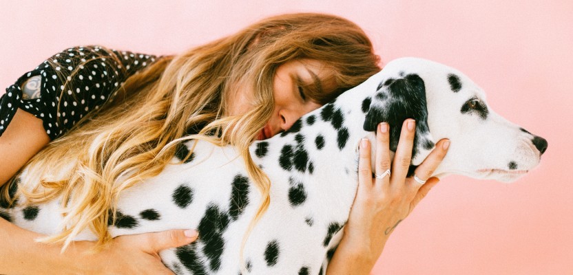
4. Embody the “Anti-selfie”

What the heck is that? Stay with me, it’s not as complicated as you may think.
In the Anti-selfie, the body is the element of the pictured world as opposed to the face (3).
The hands, fingers, feet or complete figures are shown, as complete or disjointed entities, placed within a situation. This may include drinking a cup of coffee, pointing to a landscape or displaying a product on the body. These images work with the overall feed to record the author’s experience over time. While images where the creators face is shown are still seen to be the most successful, product images with a human presence are still more likely to do well than those missing this tangible presence.
Top tip: don’t just stick your hand in the photo and hope for the best, your presence needs to be worthwhile and serve a purpose!
5. Don’t over edit

Bump up the saturation, whiten your whites and lighten your shadows but don’t go crazy with the filters. If you absolutely must use an Instagram preset filter then Clarendon is your best bet. Over editing your images creates issues with the authenticity of your shot (4)
Simplicity is key: it allows the viewer to concentrate on the intended focus on the piece, this may be the clothing, location, object or experience of the post.
6. Embody the “slow lifestyle”
I could probably write another dissertation about slow lifestyle but if you have made it this far through the article, I think you probably have enough tips to be thinking about for the time being, also thanks for sticking with me!
Sitting in a coffee shop, enjoying the view or perching on a set of stairs: these are all shots that embody the concept of ‘being’ as opposed to ‘doing’ with objects or people surrounded by plenty of space with very little action taking place within the imagery.
“Slow lifestyle” on Instagram is a conscious attempt to change the current order to one which offers more time to attend to and enjoy everyday life. The focus on ritualising the everyday formalities that would otherwise be seen as a routine experience advocates a relatable and authentic persona that is accessible for a wide audience (5).
Basically: enjoy the little things and take time to do so.
7. Create a story through your feed

“It doesn’t go with my theme” or “I’ve posted one like that recently”, lots of people get hung up on the flow of their feed. While this is important it’s just as worthwhile spending time creating a story through your imagery. While a stand-alone image may have the capacity to sell an idea, product or lifestyle etc, it is the way the imagery works together that creates greater meaning. This story-like approach is representative of Barthes’ (6) analysis into the nature of photography, where more interest is generated by a story as opposed to an isolated picture.
So you don’t have a top of the range camera or the money to invest in editing software like Lightroom, instead create a bigger picture through your grid. If you’re invested in a particular style or colour then that’s cool stick to it #youdoyou, but ensure that your images can work together to create a deeper narrative whether its through the editing, composition or subject of your imagery.
Remember: Your grid doesn’t have to be perfect, followers want to know you and the story you have to tell.
8. Use brands subtly
We all enjoy it when a brand we love reposts our photo featuring their product. However featuring brands in an explicit manner could be affecting your likes (7). It is the art of subtly that will win you marks here. If the branding is done right you don’t need to plaster a logo everywhere for people to know who it’s by. This is important for both personal and business brands. Get creative. Think about how you can create visual signifiers using composition, editing and theming to “brand” your images with a signature style.
If you are a blogger, feature products in a wider environment (see number 2) where they are being used within a situation rather than simply showing off their existence. Feel free to still tag the company in your image, but ensure the image alone is appealing enough in itself for someone to want to check the tags to see who the product is by.
Oh and one last thing!
These tips are based on recent academic research looking at real Instagram accounts, but may not all work for your feed. Ensure your profile is a business account so you can keep a track on all your analytics to see what images are most popular with your followers!