David
Lead Designer
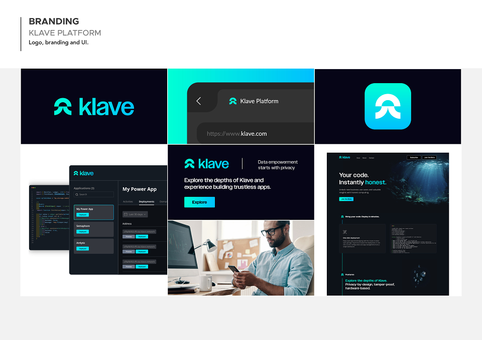
ABOUT
To develop a brand identity that focussed around a developers platform that provided honest and transparency by design via secure hardware and cryptography. The identity had to be playful, minimalist and iconic.
The logo represents the secure principles of Klave and the developer community it was built for.
The logo was designed with three main elements in mind: meaning, iconicity and playfulness. The meaning stems from the secure principles of Klave, cryptography and the mathematical elliptic curve. The iconicity aspect is the icon itself, the dissected elliptic curve creates a geometric 'K' keeping it simple, memorable yet distinct. The playfulness comes from once the shape is rotated it becomes the jellyfish, representing the transparency and trustlessness we provide which allows for adaptation in its environment. The ocean theme itself is also symbolic.
Comparing the internet to an ocean is a metaphorical way that helps us visualise the immensity and complexity of the online world, while also reminding us of the need to navigate it responsibly and be mindful of the impact we have on it. Klave allows developers to explore the vast ocean of possibilities within digital creativity whilst having a secure and positive impact on the internet.