Dragan Loncar
Senior Brand Consultant
ABOUT
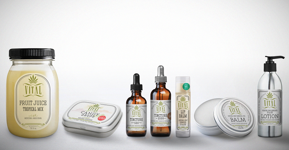
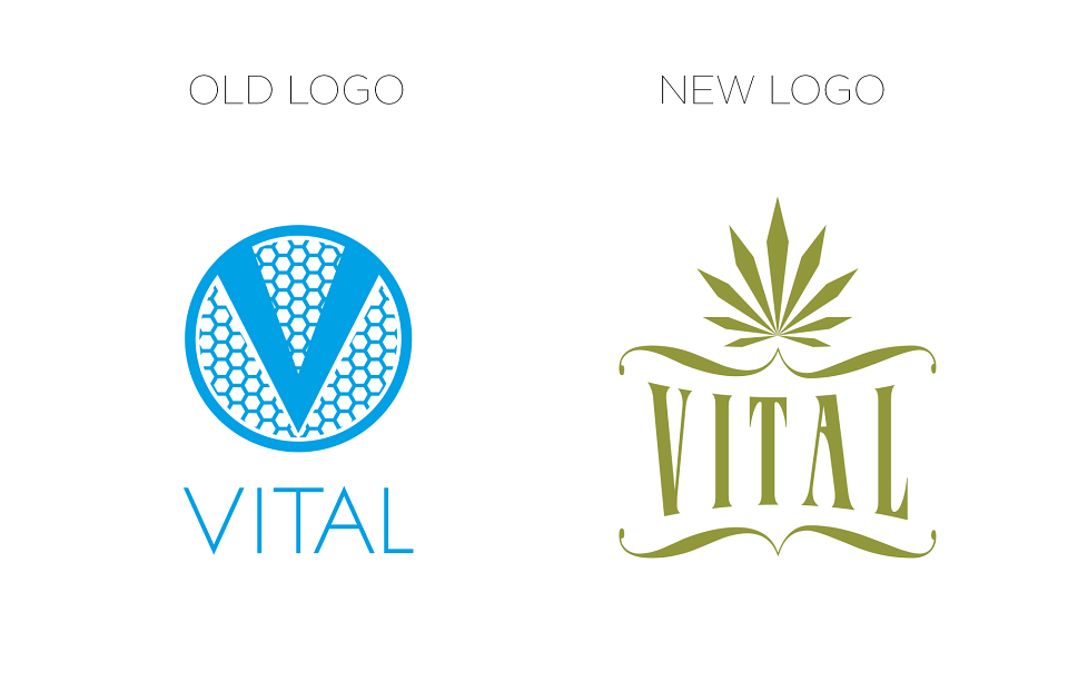
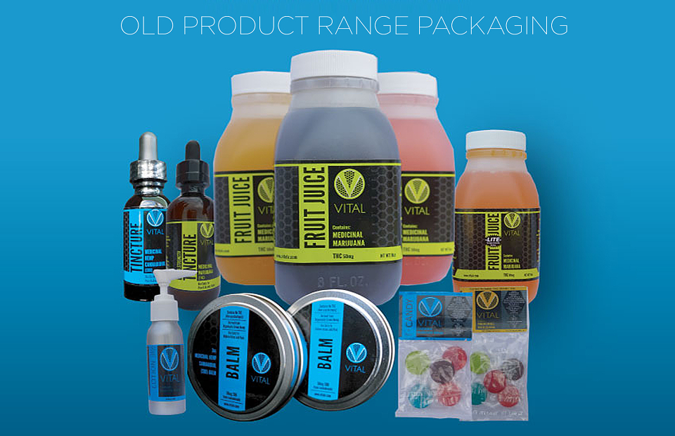
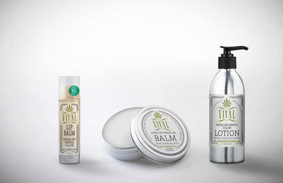
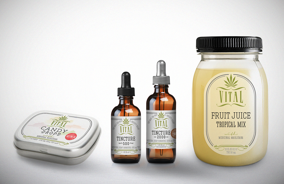
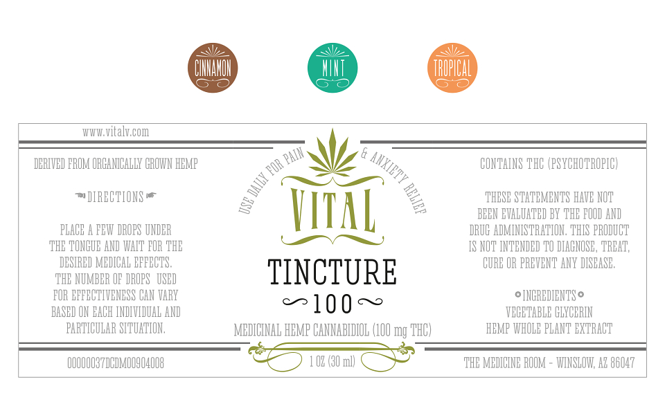
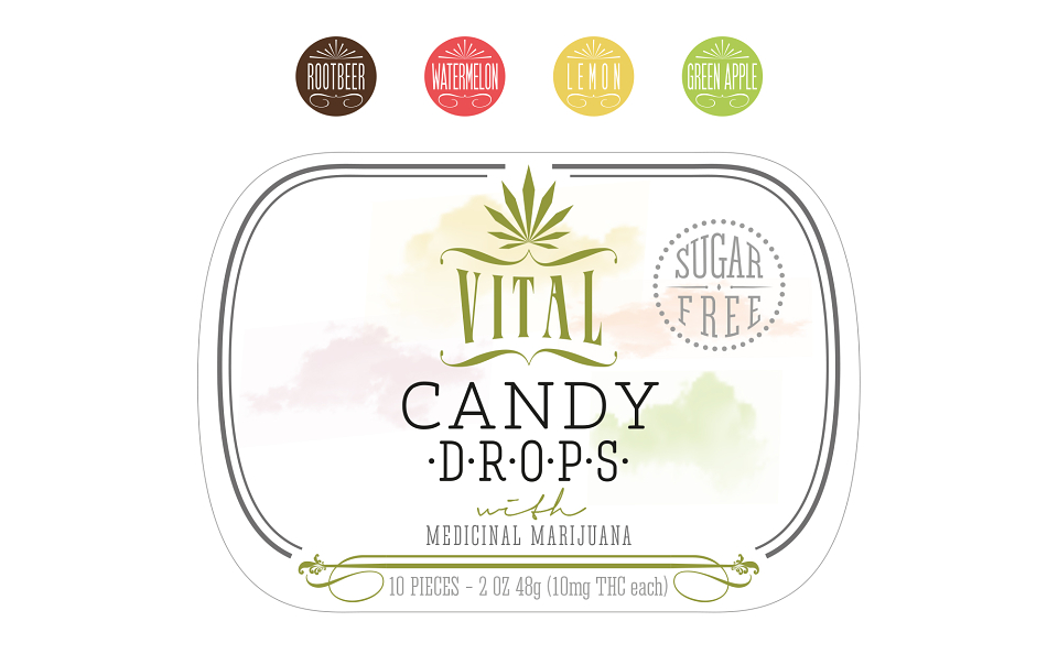
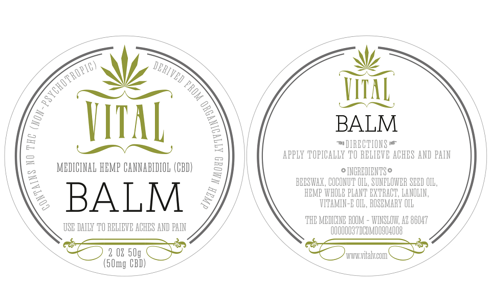
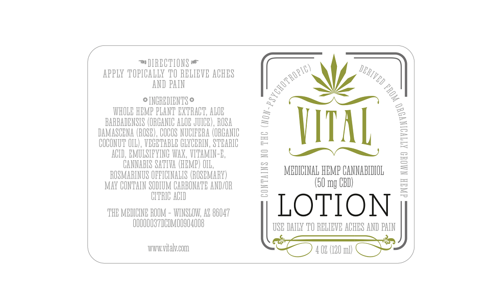
The client was unhappy about branding they've started with since they have a really good quality product, and branding didn't communicate that well with techno look and neon colours. They needed complete revamp and new visual positioning, as well as choice of containers and labels produced. The client is VITAL, based in Arizona, and they produce THC and CBD organic cannabis products, both for consumption and topical use. Since products have alternative medicinal properties, the idea was to go in the direction of vintage apothecary products. The challenge was how to incorporate cannabis leaf in their new logo, without having a classic pot smoking reference. Also, to blend European apothecary references with something American, so there is this slight "Western" feel, together with soft curvy shapes of containers similar to vintage Ball Mason jars.