Dragon Rouge
London
ABOUT
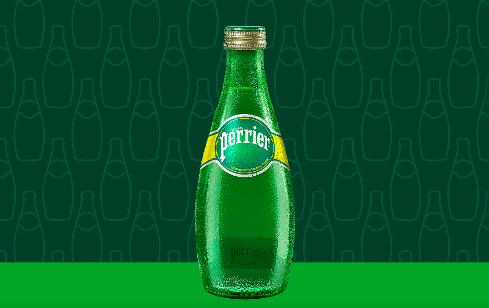
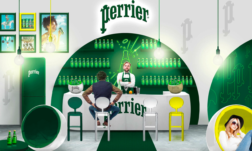
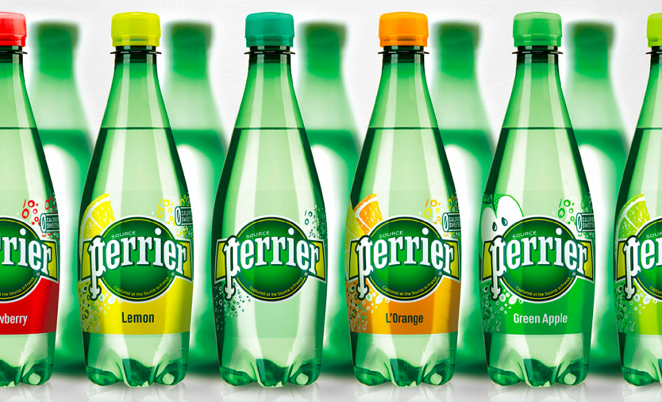
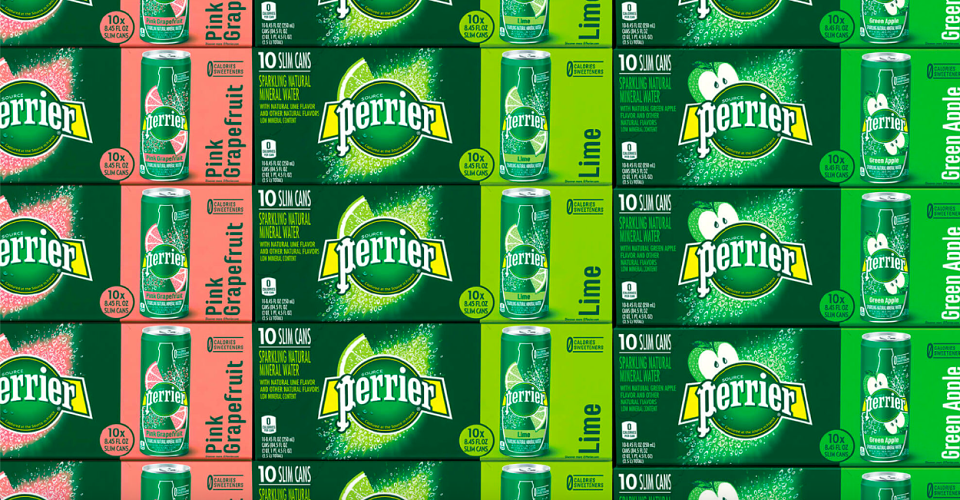
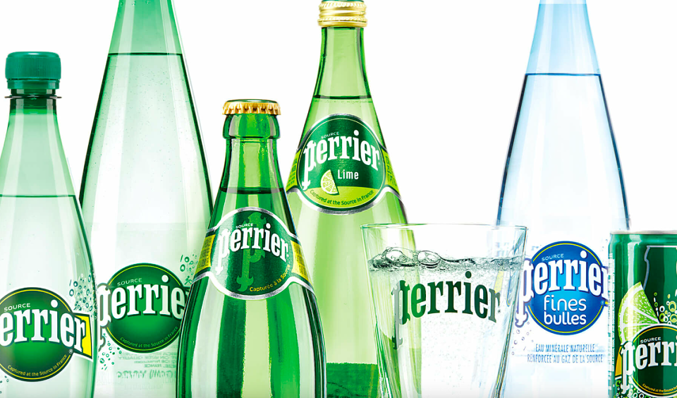
Perrier, the world’s top sparkling mineral water brand, recognises that design plays a key role in connecting the brand to the next generation of fans. From packaging to brand world, from activation to events, from supermarkets to café terraces, design is essential. Since Perrier’s creation in 1863, this is the first time that a single design has expressed the brand from Europe to America and Asia.
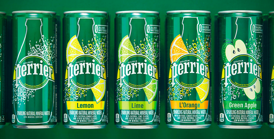
A symbol of the aesthetic and eccentric French way-of-living recognized across the world, the Art Nouveau style of the typography has been re-designed for more elegance and purity.
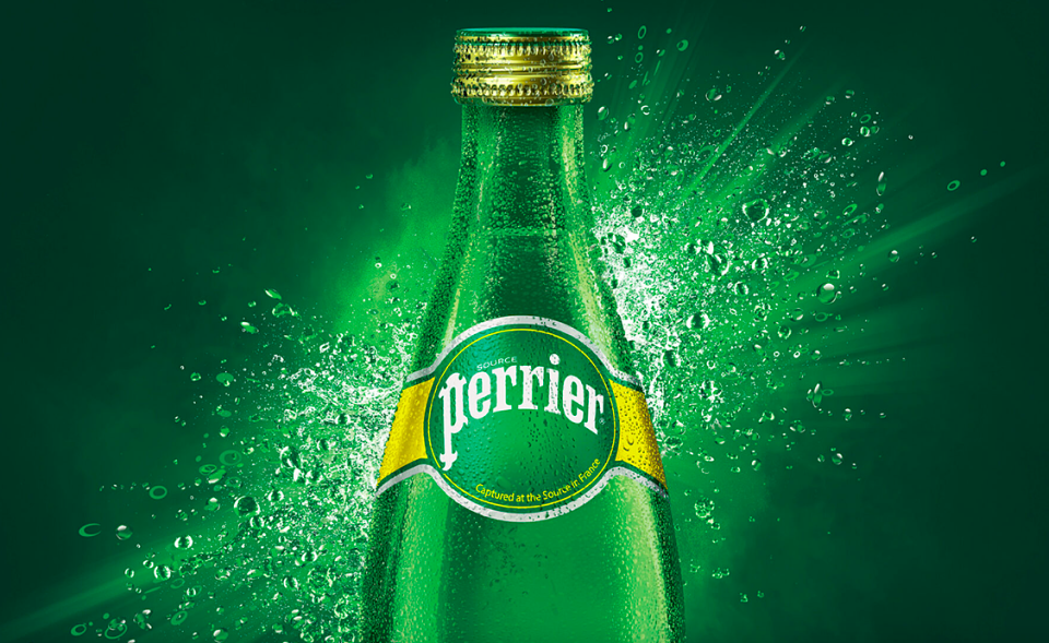
The fusion of air and water represents Perrier’s unmatched energising force, while the surging bubbles brings excitement and life. A dynamism always under pressure sets the pattern for all the packaging whatever the size.
An activation campaign rolls out the new 24/7 strategy: declaring Perrier’s stable superiority — enjoy it plain or in a cocktail, with family, on-the-go, socialising with friends at home or out on the town.
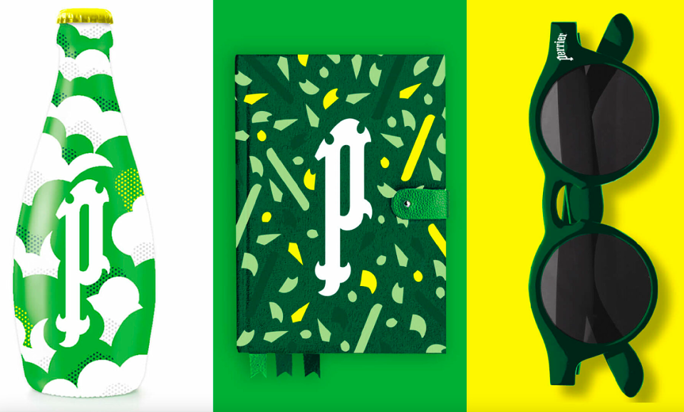
A new visual asset, the Perrier essence, has been created: The ‘P’ captures all the artistic, trendy and aspirational spirit of Perrier. Cafes, hotels, and restaurants promote and nurture Perrier’s iconic status. Contemporary and creative, it adorns stylish objects, chic goodies and Perrier furniture.