


There is an entrenched, yet dangerous habit within the digital product design industry. When a product faces stagnating conversion rates or declining user engagement, stakeholders often commission a "design audit." Typically, a designer opens Figma, takes hundreds of interface screenshots, and meticulously catalogs surface-level flaws: inconsistent spacing, off-brand button colors, or cluttered forms.
However, by focusing exclusively on screens, we are merely treating the symptoms while completely ignoring the underlying pathology.
A true design audit is not a cosmetic hygiene check. It is a strategic diagnostic tool designed to uncover the misalignment between a product’s user experience and the company’s commercial engine. A product with a flawless design system can still fail if its user flows are fundamentally disconnected from its business model.
1. The Trap of "Aesthetic Chauvinism"
Focusing on screens at the beginning of an audit stems from what I call aesthetic chauvinism—the bias that all digital product failures can be solved by visual order and pixel perfection. It is highly tempting to claim that a drop in sales is due to a "sub-optimal CTA color."
But look at the global data. Some of the world’s most profitable digital platforms—such as Amazon, Craigslist, or booking.com—frequently run counter to modern aesthetic trends. Yet, they generate billions in revenue. Why? Because their user experience is strictly optimized for core business objectives: trust, speed, discovery, and high transactional efficiency. If an auditor started analyzing Amazon purely through the lens of modern UI aesthetics, they would suggest a total redesign that would break millions of users' mental models and decimate conversion metrics.
"If you start your design audit by looking at screens, you inevitably get stuck optimizing local maxima. You make a bad product strategy slightly more beautiful, instead of restructuring it for growth."
2. The Strategic Methodology: The Inverted Audit Pyramid
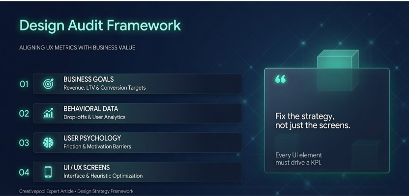
To deliver quantifiable Return on Investment (ROI), a design audit must follow a top-down approach—cascading from macro business objectives down to micro UI elements.
Audit PhaseFocus Area (Business Context)Product Outcome
1. Business Goals AlignmentUnit economics, LTV, CAC, funnel bottlenecks, and retention targets.Defining focus areas (e.g., auditing onboarding to reduce churn).
2. Behavioral Data ValidationQuantitative metrics (Mixpanel, Google Analytics), event tracking, drop-off heatmaps.Grounding business assumptions in actual user behavioral patterns.
3. User Psychology & FrictionQualitative research, Jobs-to-be-Done (JTBD), barriers to value perception.Understanding the why behind the numbers (Motivation vs. Cognitive Friction).
4. Interface & Information ArchitectureHeuristic evaluation, accessibility (WCAG), layout, typography, and UI consistency.Executing high-impact micro-adjustments and building the engineering backlog.
3. Bridging the Gap Between UX Metrics and Business Revenue
The core responsibility of a design strategist during an audit is translation. You must act as the bridge between business KPIs and user behavior. Consider this real-world B2B SaaS case study:
-
The Business Problem: Low conversion from free-trial to premium subscription. The commercial goal was a 15% lift in conversion within Q3.
-
The Flawed UI Approach: An auditor focusing on screens would review the pricing page. They would tweak the pricing cards, change the typography, or shorten the checkout fields.
-
The Strategic UX Approach: The strategist looks at the Time-to-Value (TTV). The audit reveals that users drop off long before they ever see the pricing page. The product's onboarding flow is so convoluted that users fail to complete their first automated task during the 14-day trial. The audit recommends reducing onboarding steps from 12 to 4.
The interface changes not to look "cleaner," but to accelerate the user's realization of product value, directly driving trial-to-paid conversion.
The Value Attribution Formula
Every design defect identified in an expert audit must follow a rigid chain of logic:
Step 1 - Visual/Heuristic Defect
Step 2 - Cognitive Load Impact
Step 3 - Behavioral Churn Risk
Step 4 - Financial Revenue Leak
Conclusion
Screens are merely the final layer of a digital ecosystem. They represent the physical manifestation of business constraints, technical capabilities, and user psychology. Auditing a product by looking only at its screens is like judging the integrity of a skyscraper's architecture solely by the color of the paint on its walls.
As design experts, our first question must never be "How can we make this look better?" It must be "What business problem is this interface trying to solve, and where is the system failing the user?" Only then can we deliver design work that doesn't just look great on a portfolio site, but actively moves the economic needle for businesses globally.
About author
Volodymyr Ozirnyi is a founder and award-wining UX/UI Designer with a passion for creating digital experiences that feel intuitive, emotional, and visually refined. With over 13 years in the design industry, he focuses on crafting user-centered interfaces that combine functionality with strong visual storytelling.
As the founder of Dizz Agency, Volodymyr has worked on more than 700 projects for startups, tech companies, and global brands including Porsche, Nestlé, Volvo, and Fiat. His approach to design is driven by simplicity, clarity, and attention to user behavior — transforming complex ideas into seamless and engaging digital products.
His expertise spans UX strategy, interface design, branding, and motion design, with a strong focus on creating experiences that not only look beautiful but also deliver meaningful results for users and businesses alike.