Chris Hogben
Graphic Designer
ABOUT
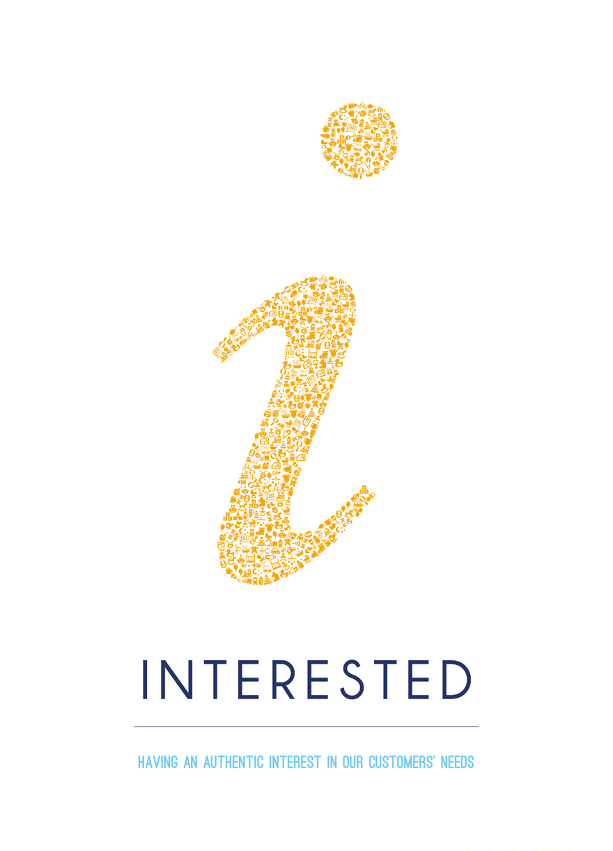
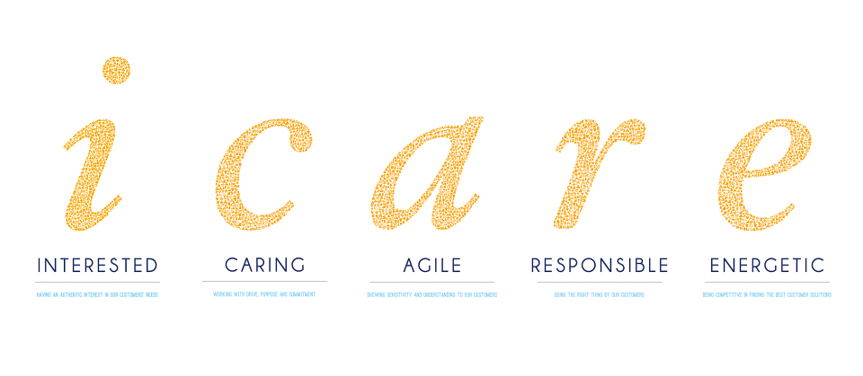
At my current job I was asked to create a series of posters for Mothercare, based on their internal company values. These were to fill 5 frames circling their head office's boardroom table. I wanted it to be interesting and to have detail, so I devised this simple design based around typography, but each letter is made up of hundreds of little baby themed icons, carefully positioned using the lines and edge of the icons that when viewed all as one, form the letter. A visual metaphor for the core values of the company