Die in Color
Paris
ABOUT
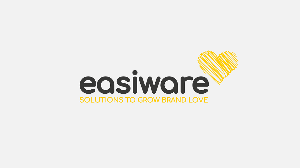
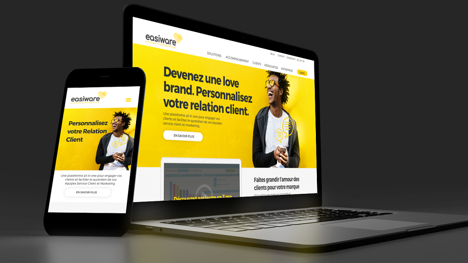
A new logo
A serious, technologically-minded typeface spells out the company's name, while a pencilled-in heart hovering near it, in place of a traditional trademark symbol, adds a living, human touch that reflects its universe of "love brands."
The color palette was also completely re-done, in favor of a bright, vibrant yellow that contrasts with a high-impact, readable anthracite gray.
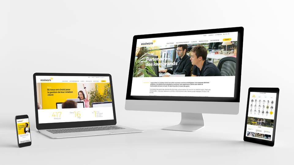
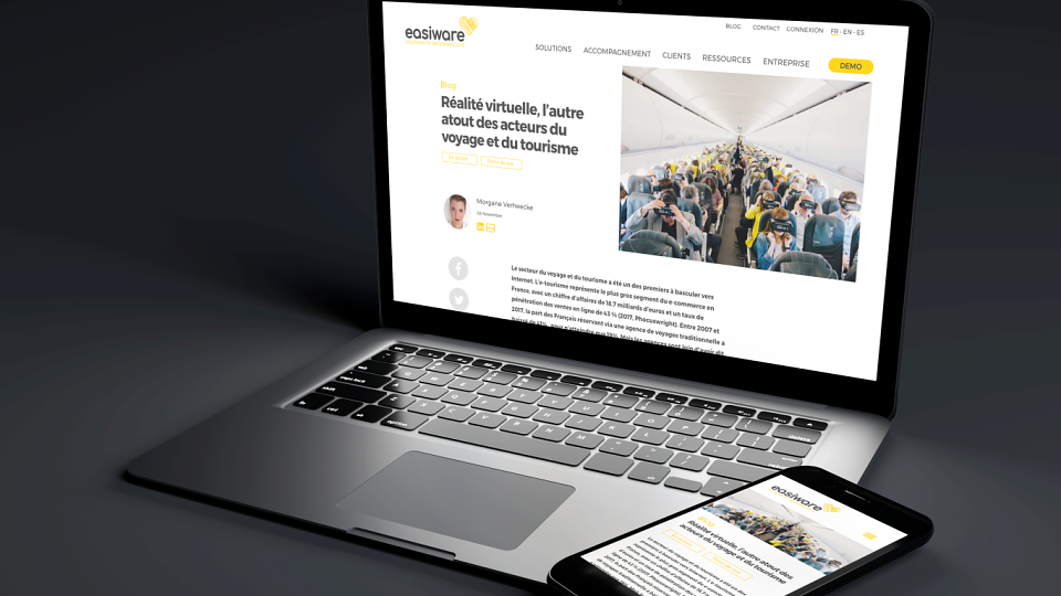
A new website
Easiware then tasked Die in Color and Look Further with re-designing its website's graphics and content, while the teams at Markentive took care of the development using HubSpot.
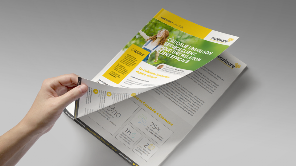
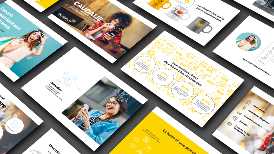
Rich content
Die in Color and Look Further created a brand video to explain easiware's work and platform, using a dynamic sequence of scenes that show the client experience combined with motion design. The project wouldn't be complete without including the design and execution of client projects, as well as testimonials and video interviews, all of which are key resources for the site.
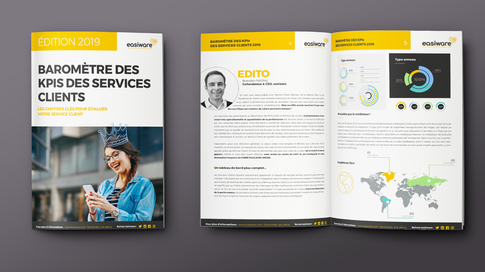
Tools
To finish it all off, easiware asked us to work on its "sales deck," the foundation of its business development, as well as a digital campaign to launch its new website and unveil its updated identity.