Dhanya Gokul
Graphic Designer
ABOUT
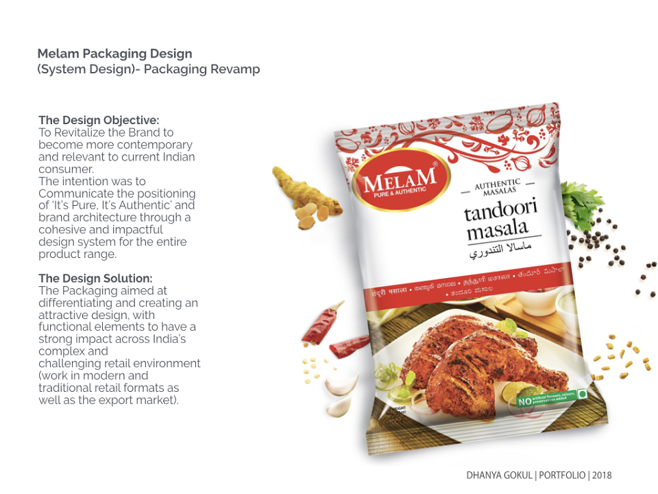
The core objective was to transform Brand Melam to a strong South Indian Player as well as strong export player. To also portray Melam’s positioning of ‘It’s Pure It’s Authentic’ and a strong system design in the Packaging focusing on the Product Categories and the brand architecture that needed to be communicated.
The new re-brand identity for Melam better represents where the company is today and projects itself as a trusted market player.
The bold serif brand mark created a cleaner & contemporary presence, to revitalize the brand to become powerful and relevant to current Indian Consumer. The positioning of ‘Pure & Authentic’ was enclosed within a seal. The
gold was added to the seal to bring in the heritage and lineage of the brand.
The Solution: (Sub Branding)
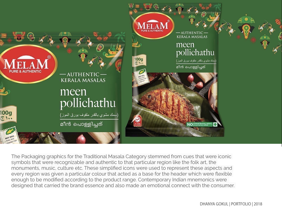
Develop strong descriptive sub-brand names and distinctive visual identities that are easily understood by the consumer, clearly communicating their distinctive values & roles of i) pure spices ii) authentic masalas iii) traditional pickles iv) breakfast mix v) traditional snacks while being in synergy with the already strong Melam brand.