Vila DeVila
Moscow
ABOUT
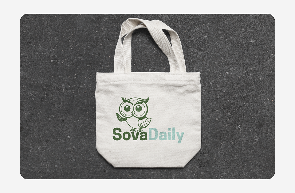
Logo and website for ecoproducts (dietary supplements) SovaDaily
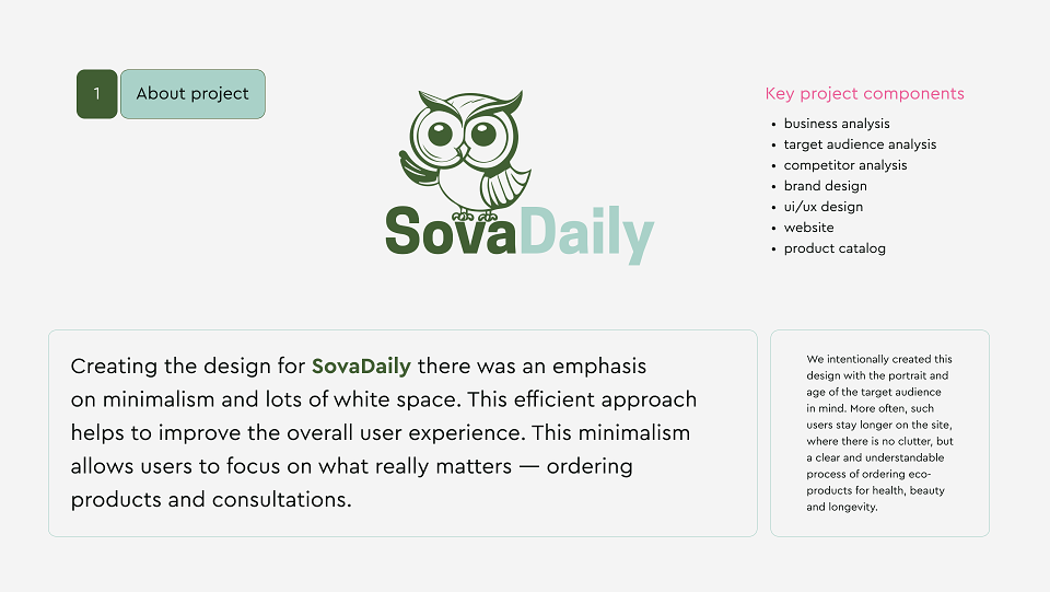
About the Project
For SovaDaily, we focused on minimalism and generous white space in the design. This clean, efficient approach enhances the user experience, allowing customers to focus on what truly matters—ordering products and booking consultations.
Key Project Components:
- Business analysis
- Target audience research
- Competitor analysis
- Brand design
- UI/UX design
- Website development
- Product catalog
We intentionally crafted this design with the target audience’s age and preferences in mind. Users in this demographic tend to stay longer on sites that feel uncluttered, with a clear, intuitive process for ordering eco-friendly health, beauty, and longevity products.
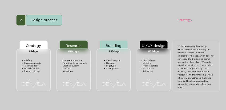
Design Process
Strategy (7 days)
- Briefing
- Business analysis
- Technical requirements
- Goal setting
- Project timeline
Research (10 days)
- Competitor analysis
- Target audience research
- User persona development
- Interviews
Branding (15 days)
- Visual research
- Naming
- Logo design
- Color palette
UI/UX Design (15 days)
- UI/UX development
- Website design
- Product catalog
- Adaptive design
- Motion design
Naming Insight
During the naming process, we noticed something interesting: Russian names often sounded like children’s toy brands, which didn’t align with our client’s desired brand perception. So, we took a tactical approach—generating 30 English names that could be smoothly translated into Russian without losing meaning. This strengthened the brand’s identity, and the client ultimately chose two names that perfectly represented their vision.
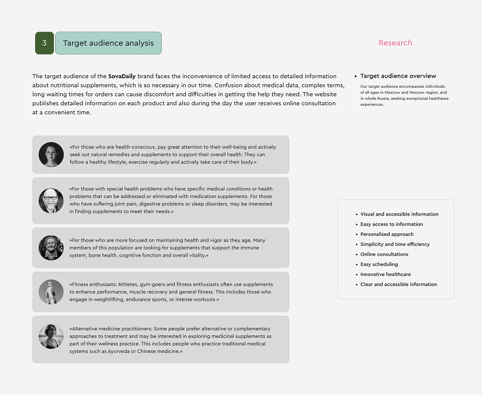
Target Audience Analysis
SovaDaily’s audience struggles with limited access to detailed supplement information—something crucial in today’s world. Confusing medical terms, unclear data, and long order wait times create unnecessary frustration.
Our solution? A website with detailed product breakdowns and **same-day online consultations**—available whenever the user needs them.
Research
Who We’re Designing For
Our audience includes health-conscious individuals of all ages, primarily in Moscow, the Moscow region, and across Russia, who prioritize exceptional wellness experiences.
Branding
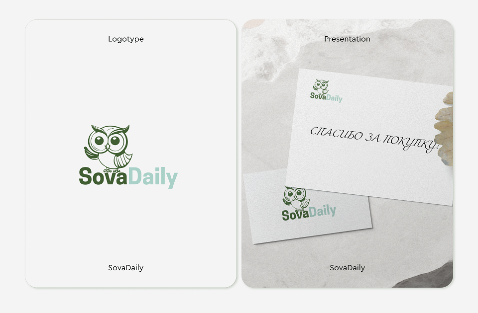
We designed a logo that’s cute, kind, and positive**—because first impressions matter. A warm, inviting brand image fosters **trust and memorability. For SovaDaily, it was essential to reflect care, kindness, and positivity, making the brand instantly relatable.
Print & Digital Materials
From business cards to online banners, every piece of design aligns with SovaDaily’s mission: self-love, care, and a commitment to health, beauty, and longevity.
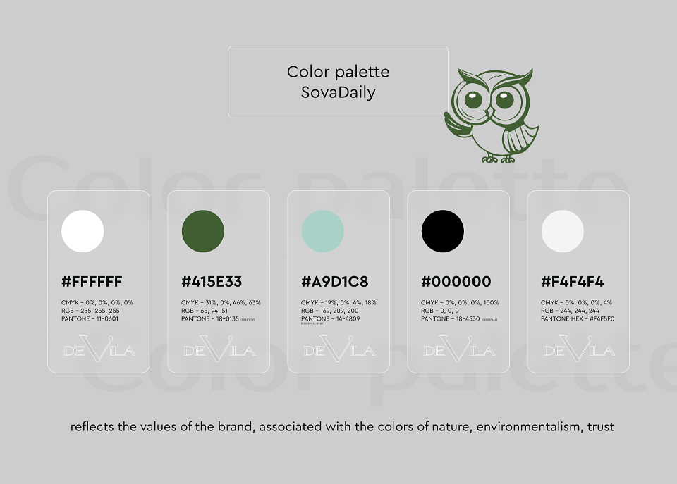
Color Palette
SovaDaily’s colors reflect **nature, sustainability, and trust**—reinforcing the brand’s core values.
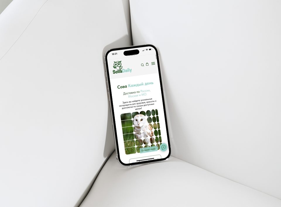
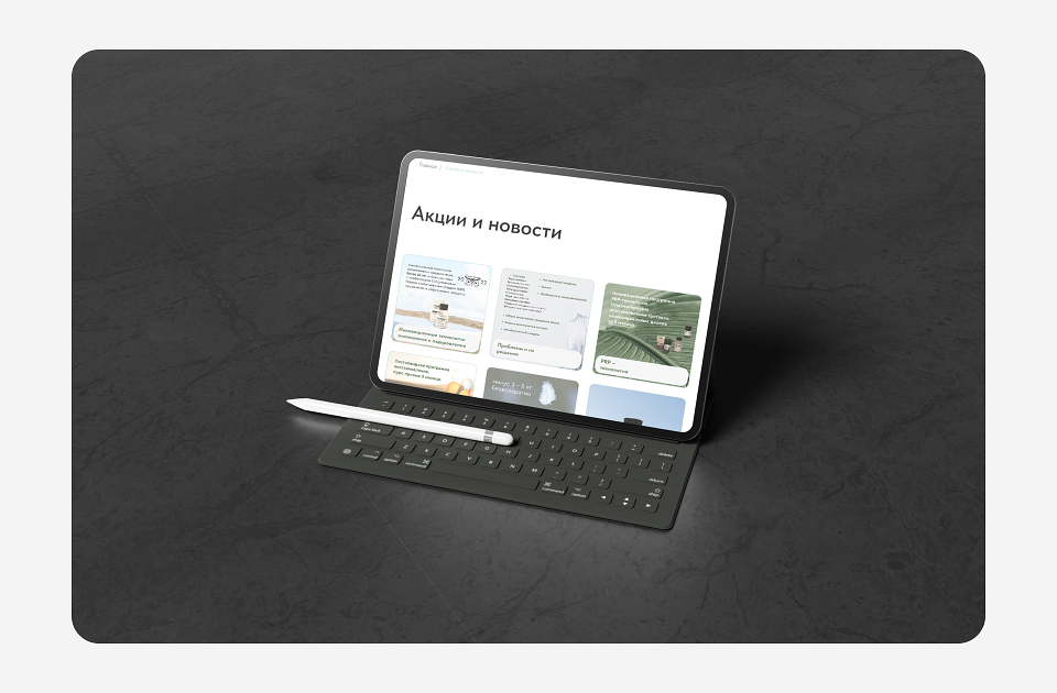
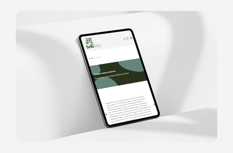
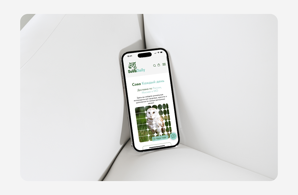
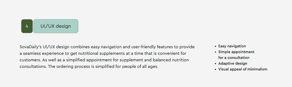
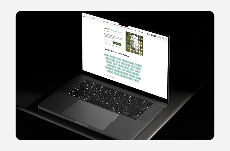
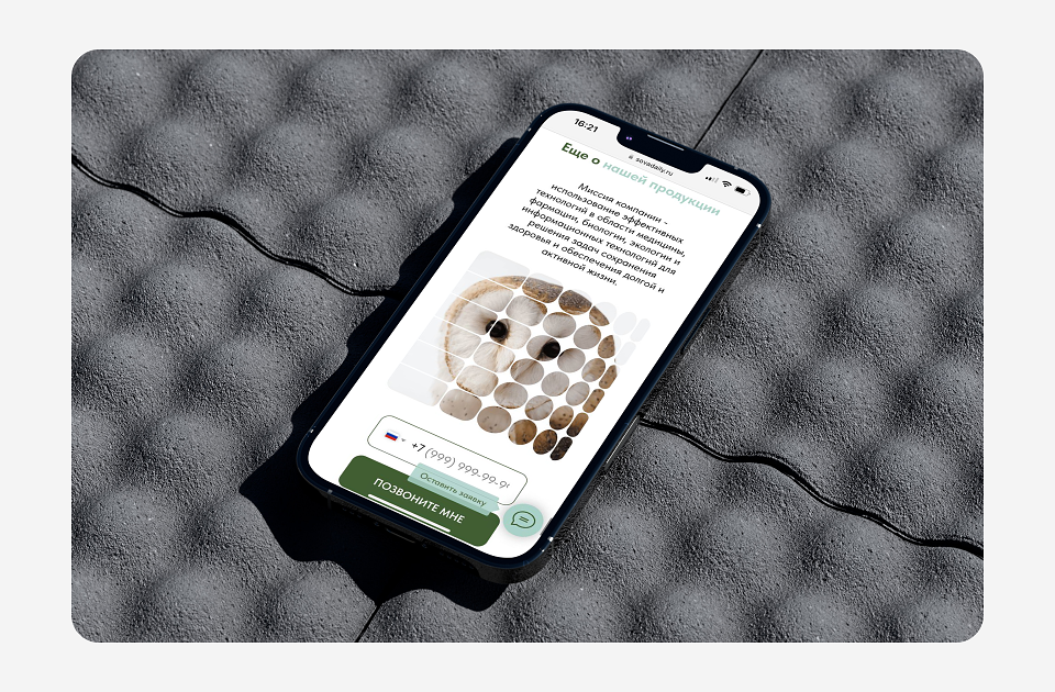
UI/UX Design
SovaDaily’s interface combines easy navigation and user-friendly features, ensuring a seamless experience for ordering supplements and booking nutrition consultations. The process is simplified for all ages.
Key Features:
✔ Intuitive navigation
✔ Easy consultation booking
✔ Responsive design
✔ Clean, minimalist aesthetic
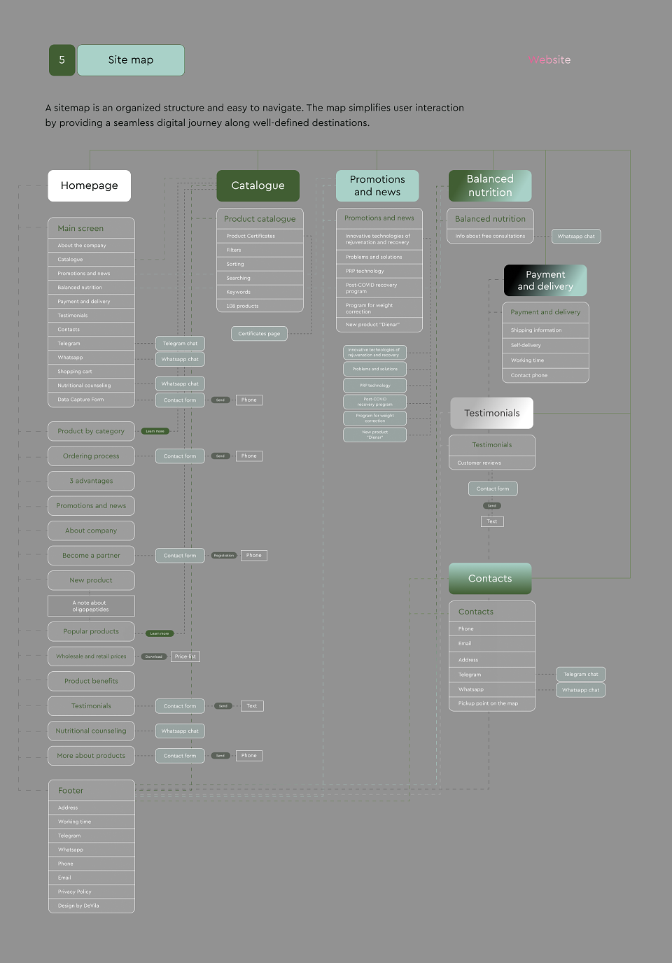
Sitemap
A well-structured sitemap ensures smooth navigation, guiding users effortlessly through their digital journey.