Vila DeVila
Moscow
ABOUT
House of senses is a new skincare brand that creates luxurious face and body care products using only natural ingredients. Our mission is to elevate everyday beauty routines into moments of indulgence and self-care, offering a sensory experience that nurtures both skin and spirit.
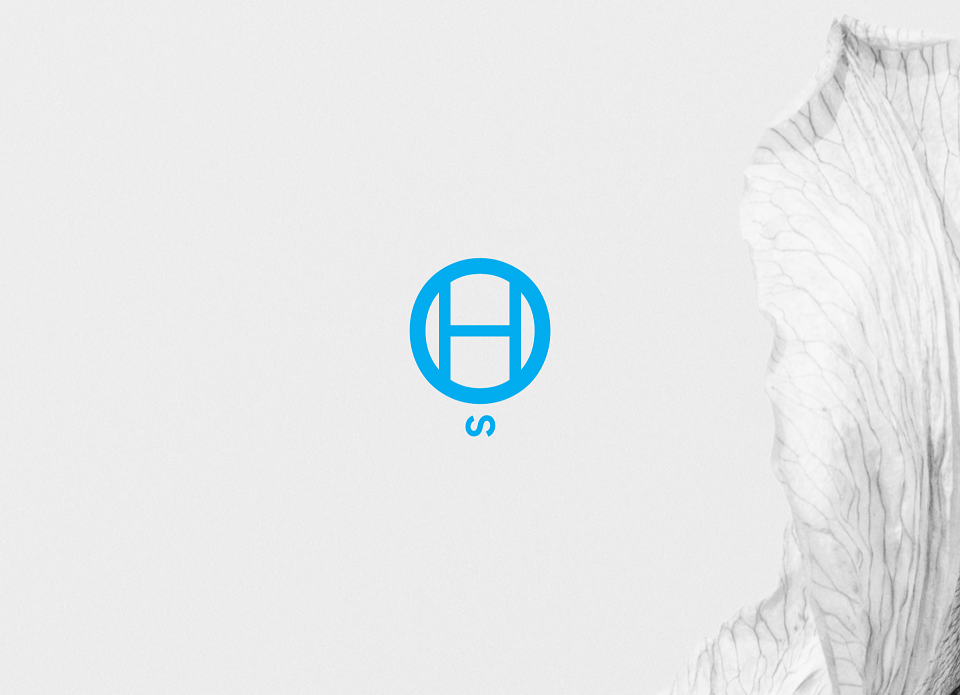
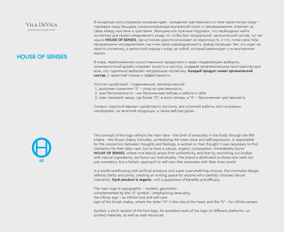
The concept of the logo reflects the main idea - the birth of sensuality in the body through the fifth chakra - the throat chakra Vishudha, symbolizing the inner voice and self-expression, is responsible for the connection between thoughts and feelings. A woman or man thought it was necessary to find cosmetics for their daily care, but to have a natural, organic composition, immediately found
House of senses, where true beauty arises from authenticity, and that by nourishing our bodies with natural ingredients, we honor our individuality. The brand is dedicated to those who seek not just cosmetics, but a holistic approach to self-care that resonates with their inner world.
In a world overflowing with artificial products and super overwhelming choices, the minimalist design reflects clarity and purity, creating an inviting space for anyone who carefully chooses natural cosmetics. Each product is organic, with a guarantee of benefits and efficacy.
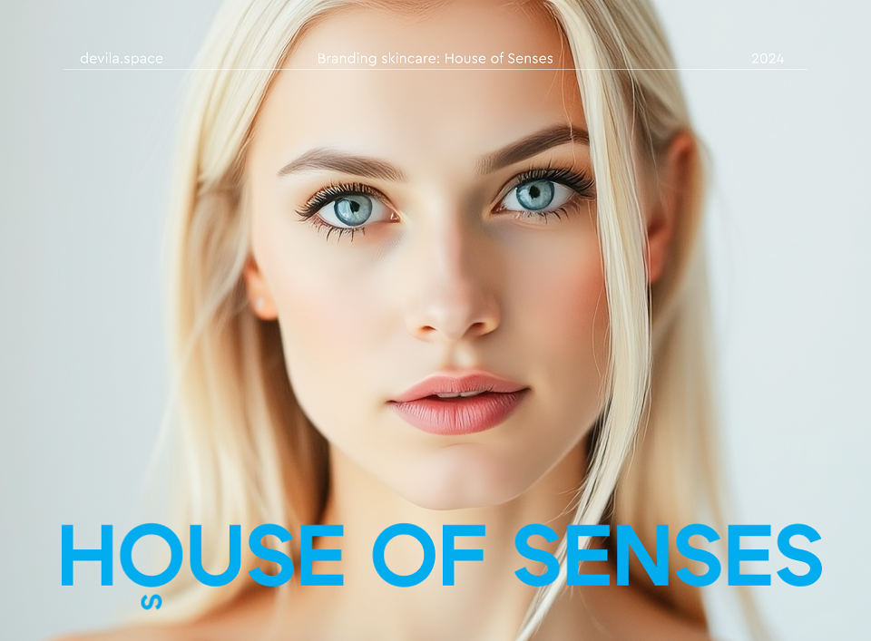
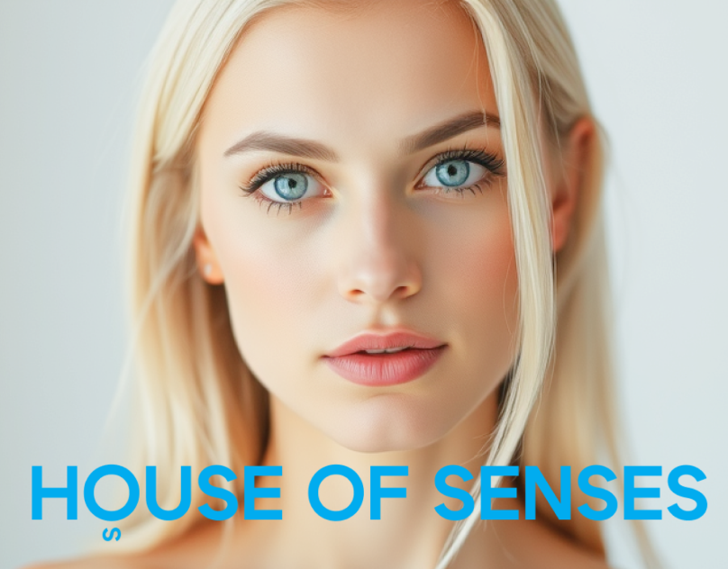
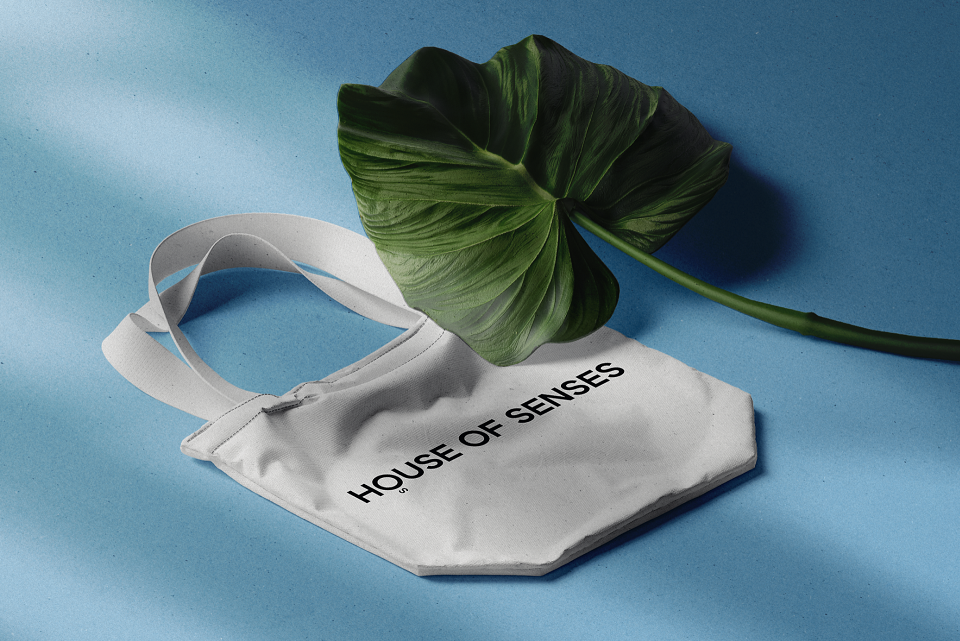
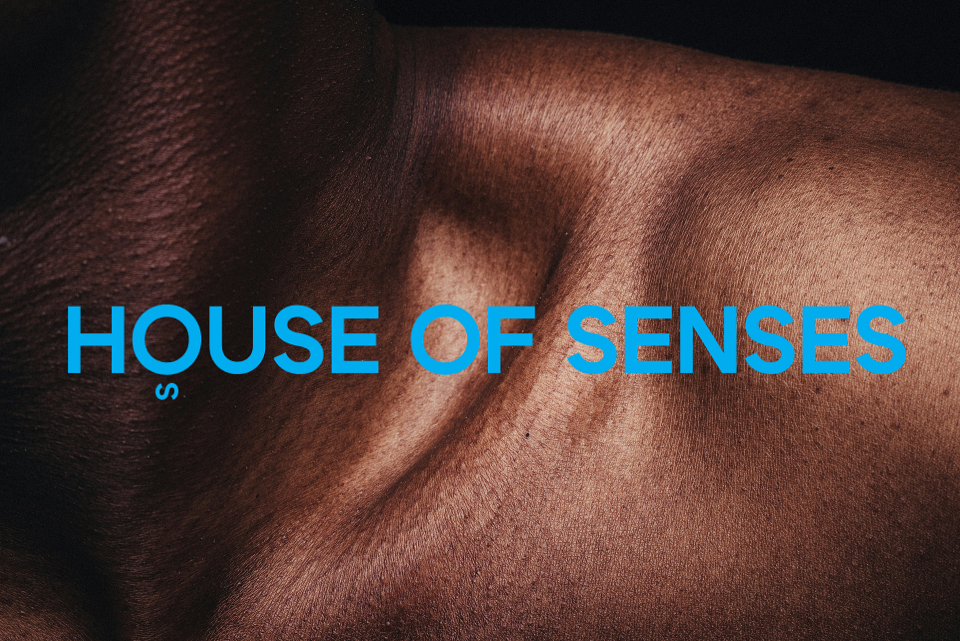
The main logo is typographic - modern, geometric:
complemented by the “S” symbol - emphasizing sensuality,
the infinity sign - as infinite love and self-care.
sign of the throat chakra, where the letter “O” in the role of the head, and the “S” - for infinite senses.
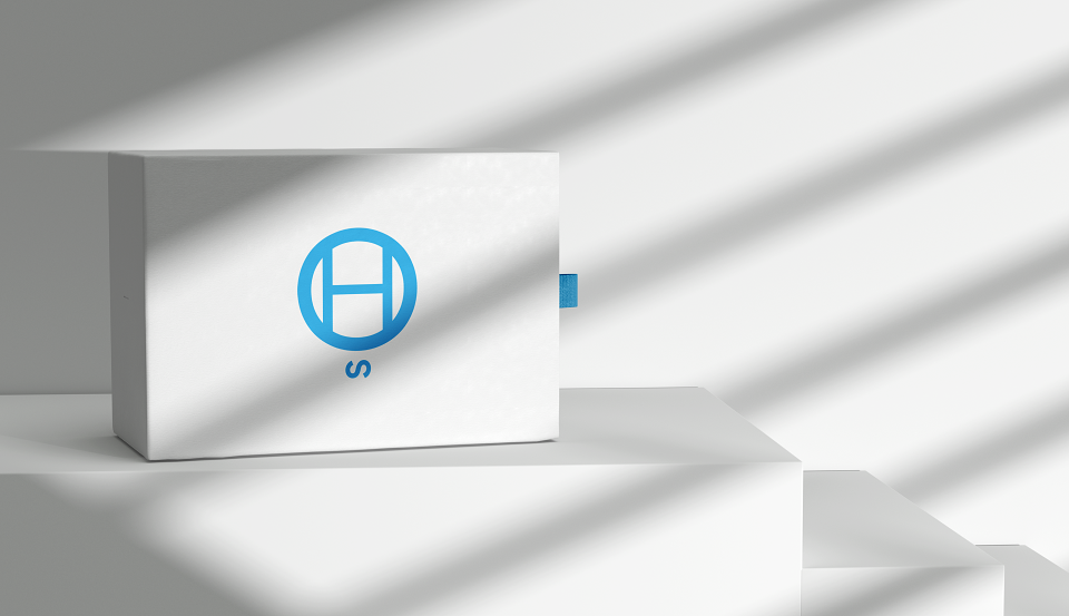
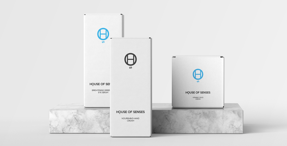
Symbol: a short version of the font logo, for excellent work of the logo on different platforms: on printed materials, as well as web resources.
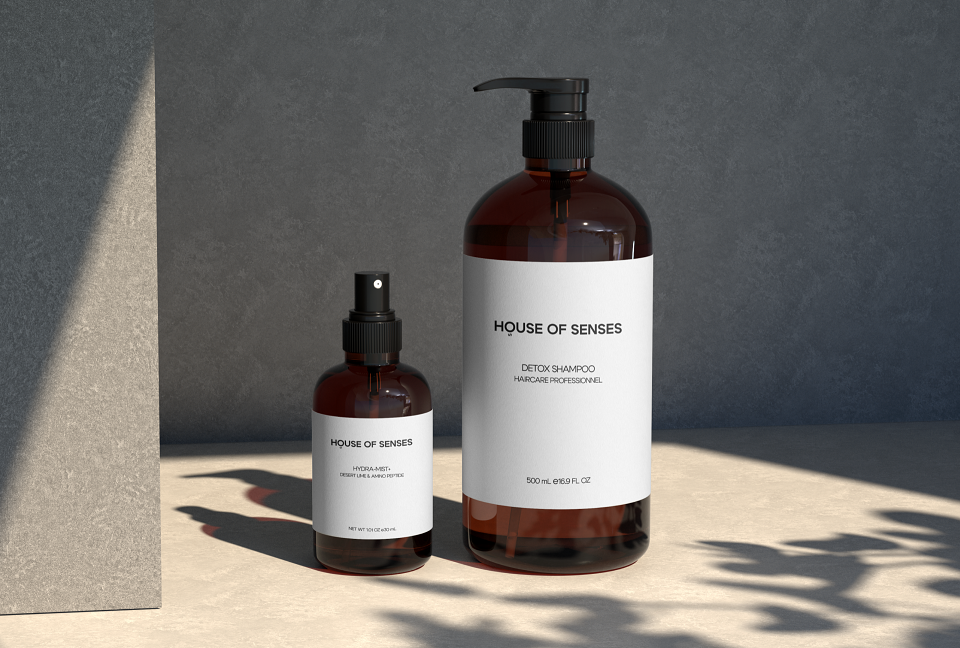
House of Senses' minimalistic packaging design, particularly the use of sleek amber bottles, plays a crucial role in communicating the brand’s value. This design choice not only reinforces the timeless, unisex aesthetic, but also appeals to a broad consumer base, effectively resonating with both men and women.
Research shows that packaging significantly influences consumer perception, with elements such as color, shape and design playing a crucial role in attracting attention and setting expectations for product quality. The minimalist approach is in line with current trends in branding, where simplicity is often associated with sophistication and elegance, reinforcing brand identity in a competitive market.
We thoughtfully integrated minimalist design into House of Senses products, not only emphasizing the aesthetic appeal of the bottles, but also strategically reinforcing the overall brand value, making it more recognizable and desirable to a diverse audience.
MADEIT CREDITS
-

Vila DeVilaGraphic Designer