Vila DeVila
Moscow
ABOUT
Design Project for the Apple Premier Service Center: Where Quality Meets Trust
Imagine a space where every detail exudes professionalism, reliability, and style.
The Apple Premier Service Center isn’t just a repair shop—it’s a place where technology meets aesthetics, and customer trust is the top priority.
The core idea behind this project is simple yet powerful: *idea + concept = quality and trust*. This formula became the foundation of the design we crafted for Apple Premier.
A Logo That Speaks for Itself
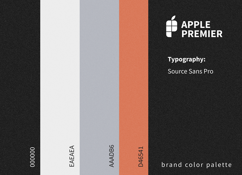
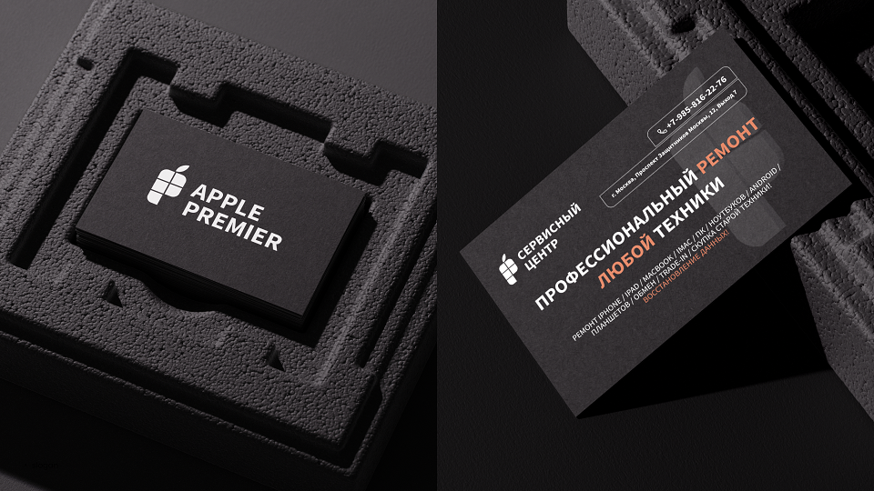
The Apple Premier logo is more than just a symbol—it’s a statement. Minimalistic yet expressive, it blends elegance with functionality. At its heart lies the iconic apple leaf, a nod to quality and innovation. This element not only connects to the Apple brand but also underscores the center’s expertise in Apple technology. The logo also incorporates the silhouette of a smartphone, reflecting the center’s primary service: iPhone repairs. The detailed assembly of the smartphone in the design adds a layer of precision and care.
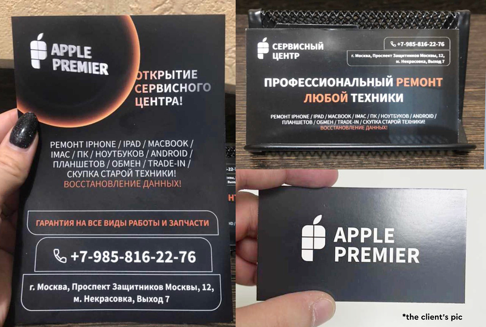
The logo is sleek, modern, and memorable, designed to scale seamlessly across all mediums—from business cards and signage to commercials and social media. It perfectly captures the essence of a service center where every detail is meticulously thought out.
As a strategist, I approached the color palette with intention, considering the brand’s niche and the relevance of its services. I chose a classic palette with an accent of dusty orange—a color often used by legacy brands that aim to leave a lasting impact, not just sell products or services.
A Concept That Inspires
Apple Premier isn’t just a service center—it’s a place where technology gets a second life. Our design highlights the center’s versatility: while they repair and sell devices from various brands, Apple remains their priority. The apple leaf in the logo isn’t just a tribute to a powerful brand; it’s a symbol of the quality customers associate with Apple Premier.
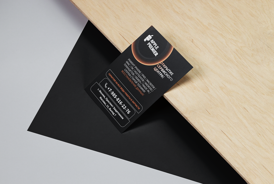
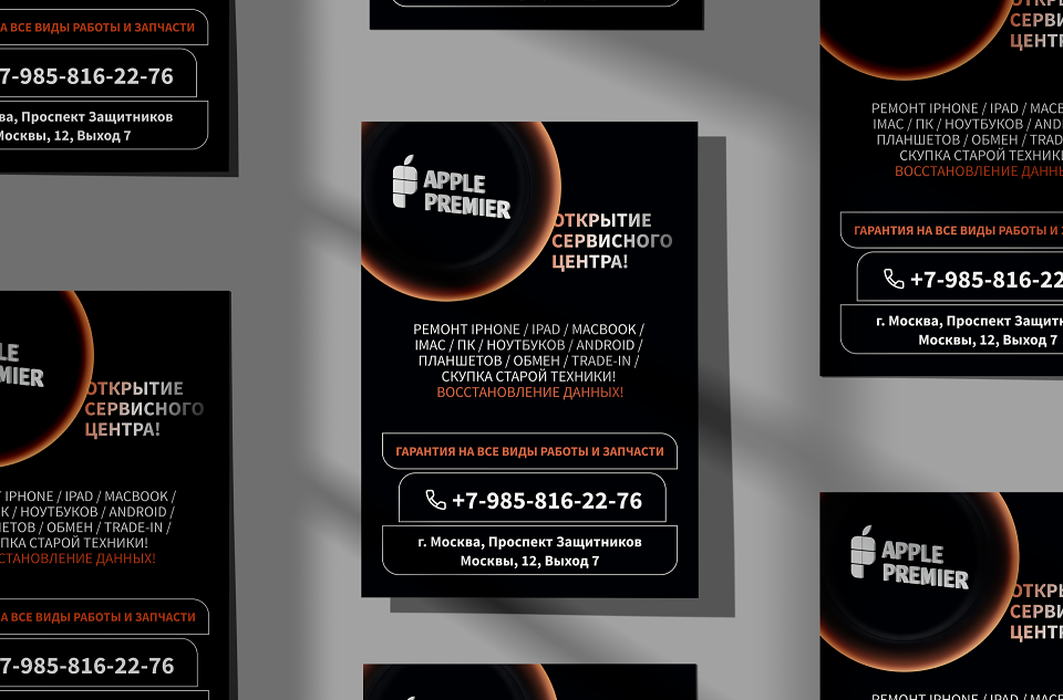
The design concept is rooted in minimalism and functionality. Clean lines, a restrained color palette, and attention to detail create an atmosphere of professionalism and reliability. Every element—from the interior design to the marketing materials—works together to reassure customers that their devices will be handled with care, speed, and expertise.
The Challenge We Took On
When the Apple Premier team approached me, they didn’t have a clear vision—they didn’t even have a name! But they had a tight deadline: just six days to create a complete brand identity. Their grand opening was scheduled in a week, and they were ready to provide all the resources needed to bring the project to life.
Their words were both motivating and affirming: *“Vila, we believe in you and your professionalism. Yes, we came as a recommendation, but we’ve seen your work, and we trust you completely.”* This wasn’t just another project—it was a challenge that demanded focus, creativity, and efficiency.
And we delivered. On time. The client was blown away by the quality and thrilled to see their dream realized so quickly.
Why Did It Work?
This project was about strategy, not just aesthetics. The logo and concept create a strong visual identity that’s easy to remember and builds trust. Customers see Apple Premier not just as a service center but as a partner that understands their needs and delivers top-tier solutions.
This project is a testament to what can be achieved with a clear vision, trust, and professionalism—even under tight deadlines. Apple Premier isn’t just a service center; it’s a benchmark for quality, trust, and style. And we’re proud to have translated that into a design in just six days.
Thank you for reading! It was a pleasure to share how every detail of this project contributes to the brand’s success.