Vila DeVila
Moscow
ABOUT
The story of one of our most inspiring projects—the branding for *The Oyster Inn*, an oyster bar nestled on the charming shores of Nice. This is a place where coastal elegance meets culinary artistry, and every breath of air is filled with the Mediterranean breeze.
The owners of *The Oyster Inn* wanted to create more than just a bar—they envisioned a space that would embody luxury, tranquility, and indulgence. They dreamed of a brand that would capture the spirit of the French Riviera—its sophistication, refinement, and love for the sea. And we took on this challenge with immense enthusiasm.
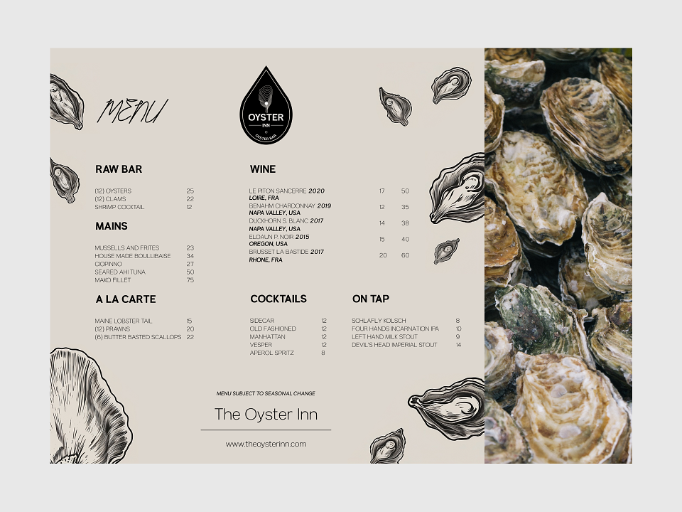
Color Palette: Premium Shades for a Life of Indulgence
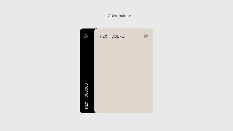
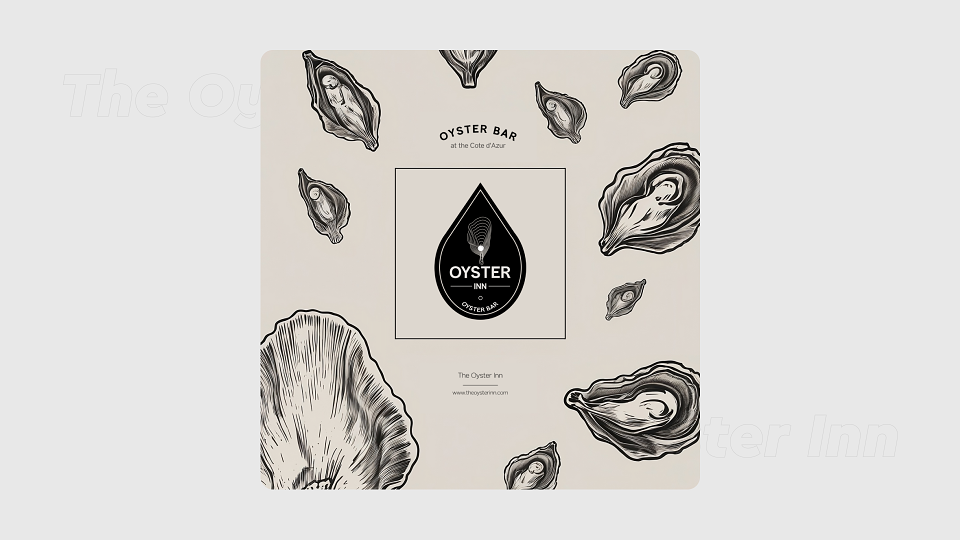
We chose a minimalist yet strikingly effective two-tone palette: a warm, almost creamy hue and a deep black.
- The creamy color evokes the seaside sand at dawn, just as the sun begins to touch the horizon. It brings a sense of calm, comfort, and lightness. It’s a color that reminds you of serenity, of sitting on a terrace with a drink in hand, listening to the sound of the waves.
- Black represents depth, mystery, and elegance. It adds gravitas to the brand, emphasizing its premium quality and timeless style.
This palette is not only easily recognizable but also creates a strong visual identity. It works across all platforms—from menus and signage to the website and social media—crafting a cohesive brand image.
Why Just Two Colors?
We live in an era of visual noise. The human brain is wired to conserve energy, and overly bright, cluttered palettes often get ignored—a phenomenon known as "banner blindness." A two-tone palette, on the other hand, attracts attention through its restraint and refinement. It allows the brand to stand out without overwhelming the senses.
Logo: A Symbol of Maritime Elegance
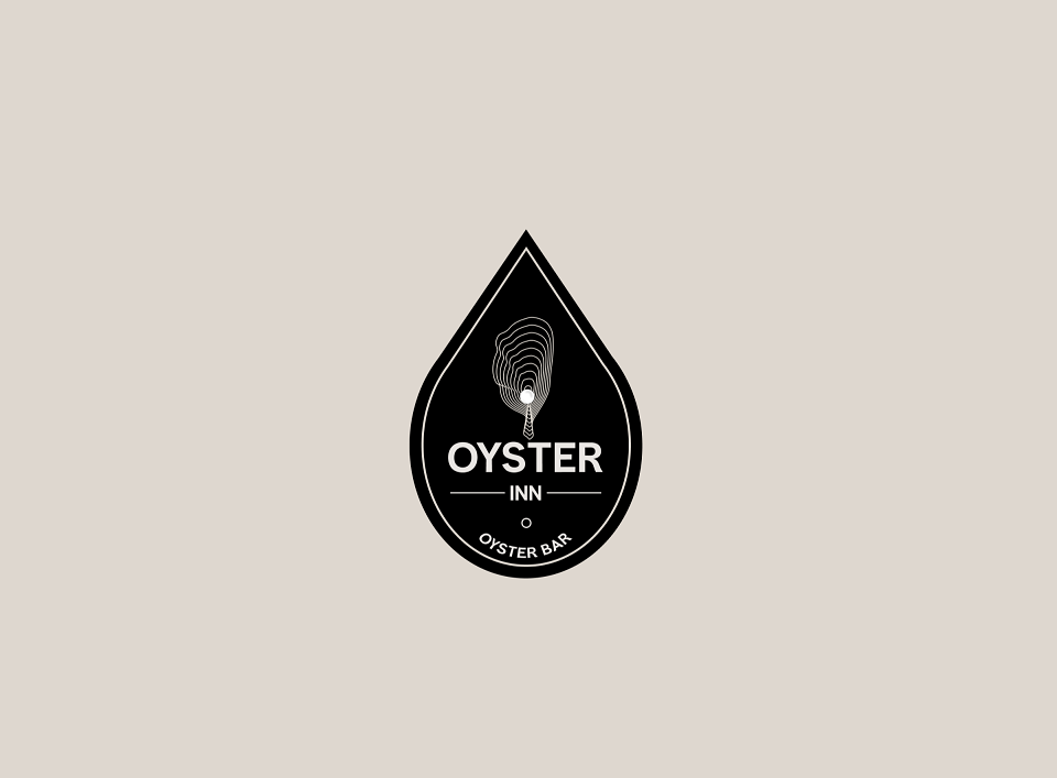
The logo of *The Oyster Inn* is a blend of simplicity and sophistication. We used a modern, sleek font that emphasizes purity and aesthetics, evoking trust and clarity. At the center of the logo is a stylized oyster, which simultaneously resembles a wave and a pearl. It’s a symbol of the sea’s treasures, waiting to be discovered in the menu.
Menu: A Journey of Taste
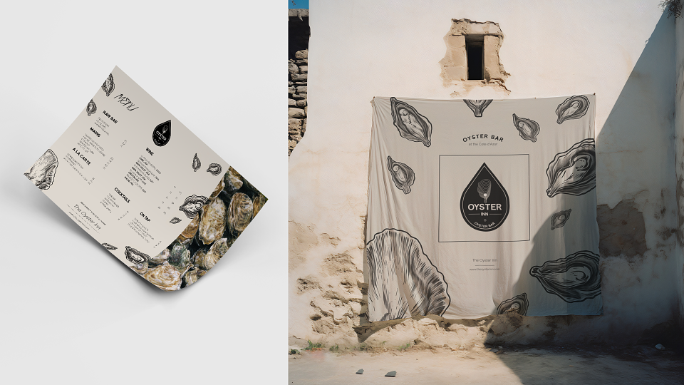
The menu is more than just a list of dishes—it’s a guide to the treasures of the sea. We designed it using the same color palette, adding subtle illustrations that evoke special places of indulgence, where everyone feels at home. It’s a story that begins with oysters sourced from the finest farms and ends with drinks inspired by the unique flavors of the Mediterranean.
The Emotions We Created
When you step into *The Oyster Inn*, you feel time slow down. You breathe in the scent of the sea, see the soft light reflecting off the creamy walls, and realize this place was made for savoring. It’s not just a meal—it’s a journey that starts with the first glance at the menu and ends with the last sip of the finest drink.
Why This Matters to You
If you dream of creating a brand that’s not just memorable but also emotionally resonant—welcome to DeVila. We know how to turn your idea into a story that inspires.
*The Oyster Inn* is more than just a bar. It’s an atmosphere, an emotion, a lifestyle. And we’re proud to have brought that to life through branding.
If you want your brand to be just as refined, elegant, and unforgettable—let’s create something unique together. Reach out to us, and we’ll start your story.
Let’s begin a journey where every moment is pure indulgence.