Design Marie
Senior Graphic Designer
ABOUT
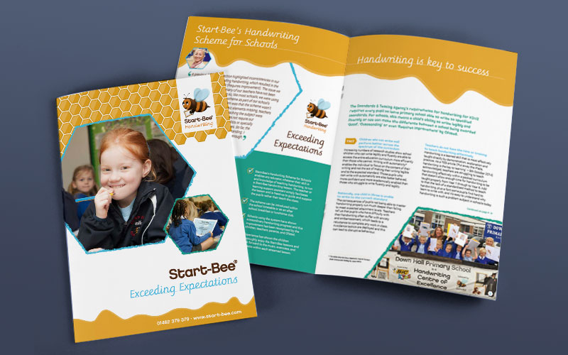
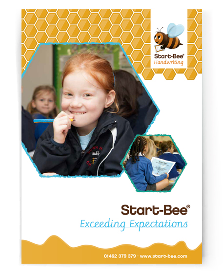
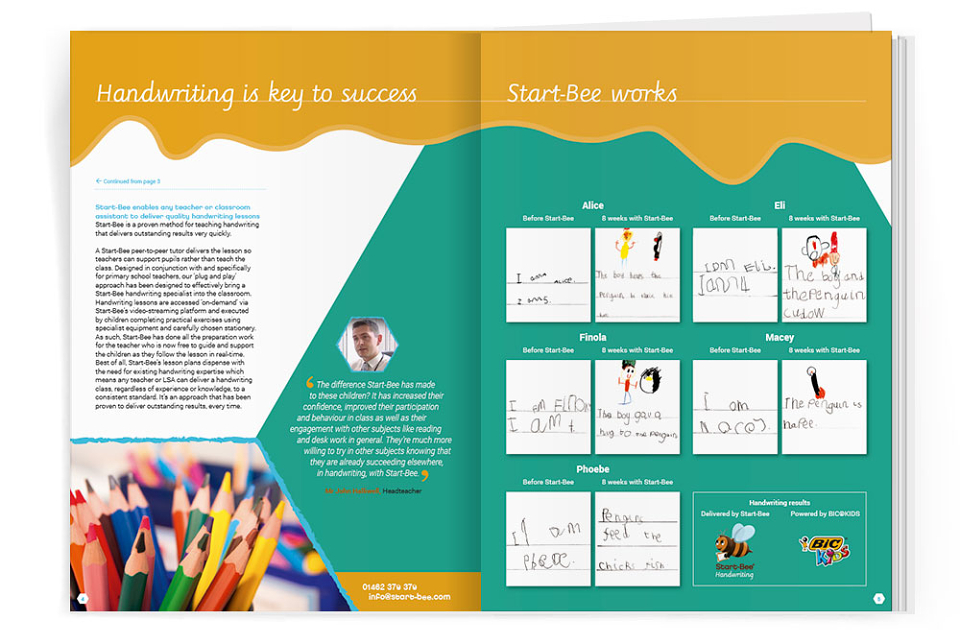
Recently I had the pleasure to welcome Start-Bee into my clientpool and much fun setting up their new brochure. As with many start-ups, there were no written design guidelines and, although some design elements (i.e. logo, basic colour palette, type of images) were decided on, they hadn't been applied in a consistent way.
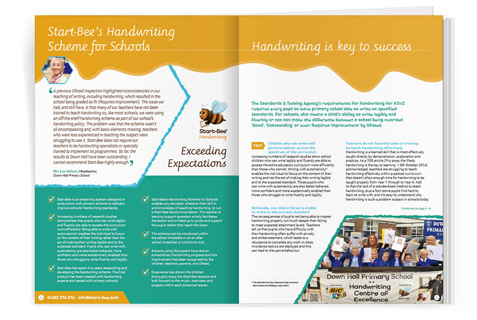
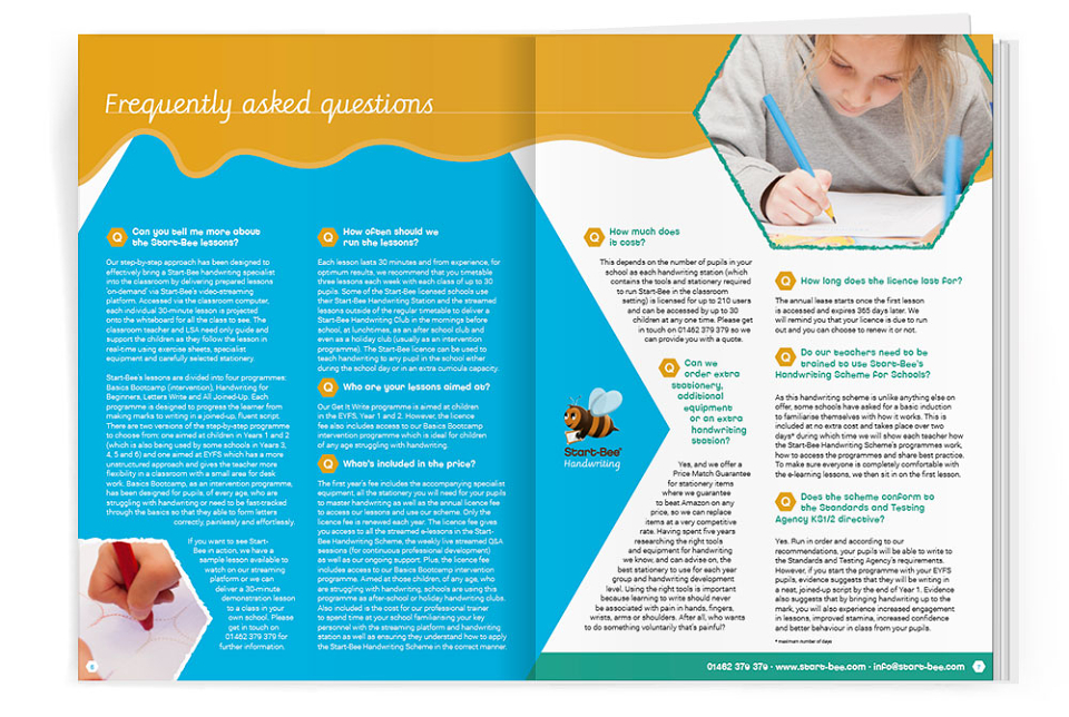
I was asked to set up a brochure that would consolidate the existing print and online design approaches, and create a first step to a more consistent visual brand. The brief asked for a look and feel that was fun but professional at the same time, appealing to teachers and parents without being too corporate.
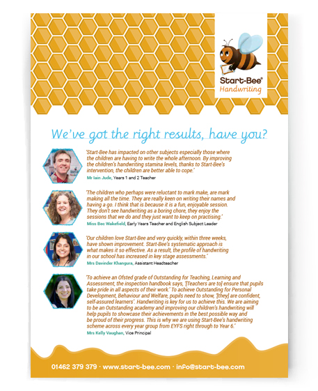
My first step was to investigate the huge amount of files I was sent and get my head around the different styles and colours that had been used. I advised on cutting down the house fonts to three legible typefaces that would build one of the core elements of Start-Bee's brand. Based on this, the logo was tweaked and, while designing the brochure, I worked out a colour palette that underlined the brand values.
The end product was a clean, professional looking brochure with elements that can be taken forward to be used in other publications and online. The client was so happy with the outcome and the way I worked, they appointed me as their new go-to designer and I'm already working on other projects for them.