Design Marie
Senior Graphic Designer
ABOUT
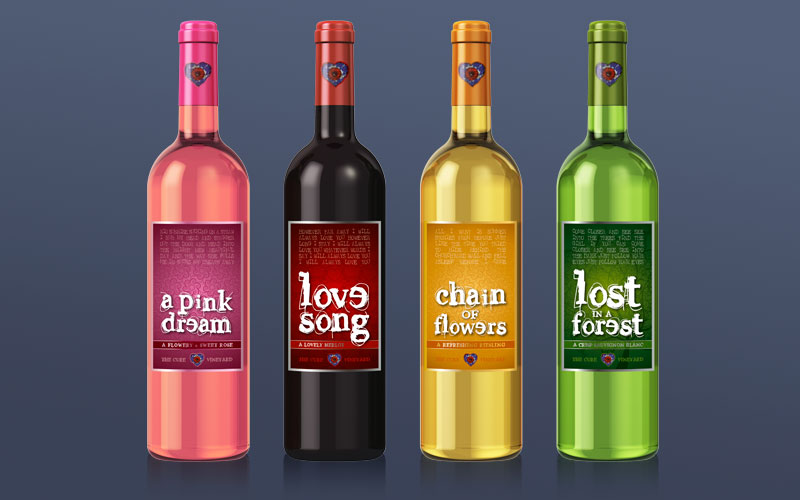
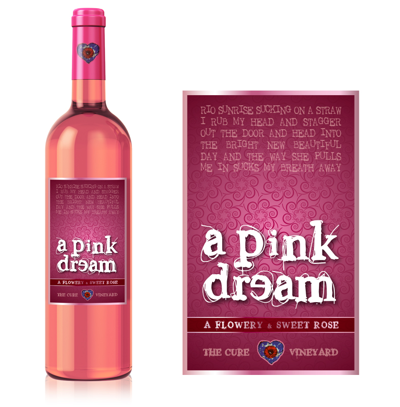
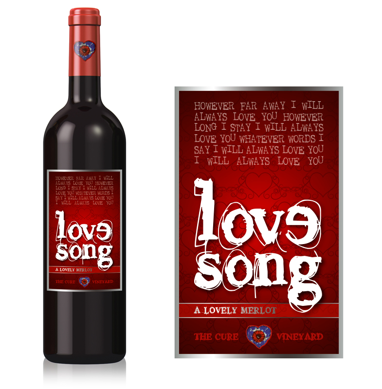
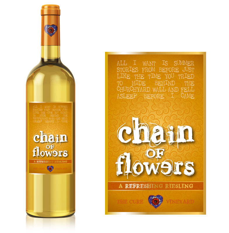
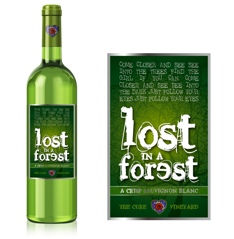
As part of my super skills series, I have created a series of wine bottle labels to appeal to a young(ish) market. Influenced by the tunes of ever-popular band The Cure and working with Illustrator and Photoshop, I felt inspired to design these four lyric-based labels and mock up artwork that could easily be displayed in advertising.
I used colour to subliminally differentiate the types of wines: pink for the sweet and fruity Rosé, yellow for the refreshing summer Riesling and so on. The typefaces and the use of lyrics were chosen to appeal to a target group of 30 to 45-year-olds. Using swirls and metallic foiled highlights, the labels sell a medium-priced product to buyers who like to enjoy a lovely glass of wine with their friends while listening to great music. The bottles also lend themselves nicely as collector's items.