Design Bridge and Partners
London
ABOUT
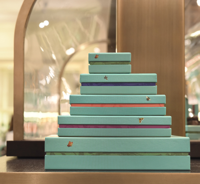
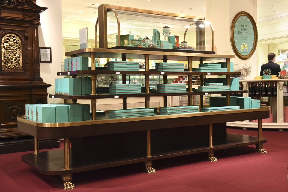
Fortnum & Mason approached us to reimagine the packaging for every ginger spiced and sugar dusted corner of their handmade English chocolate range. It was a proposal we were very happy to accept. The tasting (research) began in earnest.
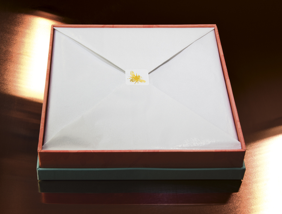
Only when you see how the expert confectioners create these chocolates, as we did, do you get a sense of what makes them so special. There’s a precision and delicacy that combines to create these exquisite chocolates. Our job was to express this in every detail of the packaging. There was a balance to strike too, a distinct caveat; we must respect the tradition of this paragon of Englishness whilst seducing a new audience of chocolate lovers. The previous packaging, despite the treasures within, felt dated and just a little ordinary.
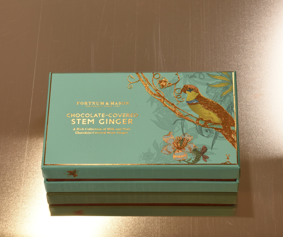
We explored Fortnum’s rich visual archives and immersed ourselves in their iconic store. We spent time capturing the Georgian grandeur of Fortnum & Mason. The resulting design captured the magic of the regency period without feeling like a pastiche of a bygone era. It managed to feel very now.
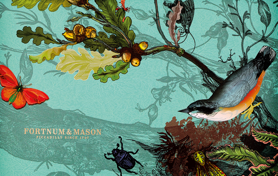
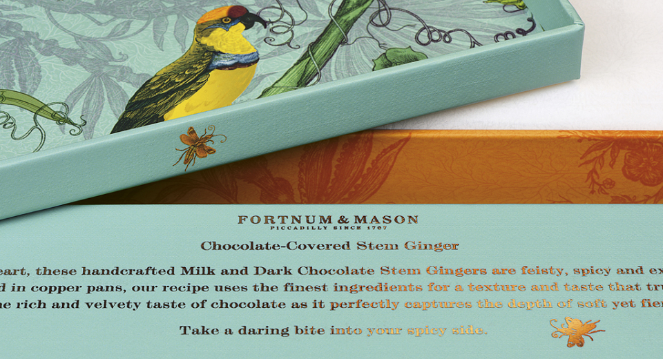
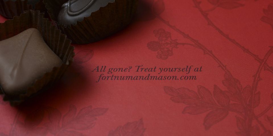
Working with Timorous Beasties, makers of wallpapers and textiles influenced by Georgian Styling, we created a series of patterns featuring a menagerie of English flora and fauna. The kind of multi-sensory, multi-layered design that makes you look and then look again. Elegant illustrations vividly bring the different flavours to life in an imaginative and enticing way. The cleverly crafted copy became the final act, adding real theatre to the consumer experience, even after consumption.
What results feels like something you would like to keep forever and even pass down through the generations; luxurious, hand crafted and unique, a real homage to the contents within.
AWARDS
Creative Review Annual - In-book
D&AD Award - Yellow Pencil/White pencil
DBA Design Effectiveness Award
New York Festival - Finalist
PentAward - Silver
The Drum Award