Design Bridge and Partners
London
ABOUT
Durex doesn’t just do condoms, but it’s a good place to start if you want to “liberate good sex for all” - sex is normal, healthy, and yes, it’s also a little bit naughty.
The world of sex has changed, and talking about it is more crucial than ever. There’s a new Gen Z of first timers who are more open, honest, and expressive than ever before, and they have a lifetime of choices and sexual experiences ahead of them.
So what do they need?
They don’t need serious, abstract and medical. They do need positive, simple and fun.
For Durex's 18,000 SKUs in 50+ markets, our design idea of “Playfully Provocative” means:
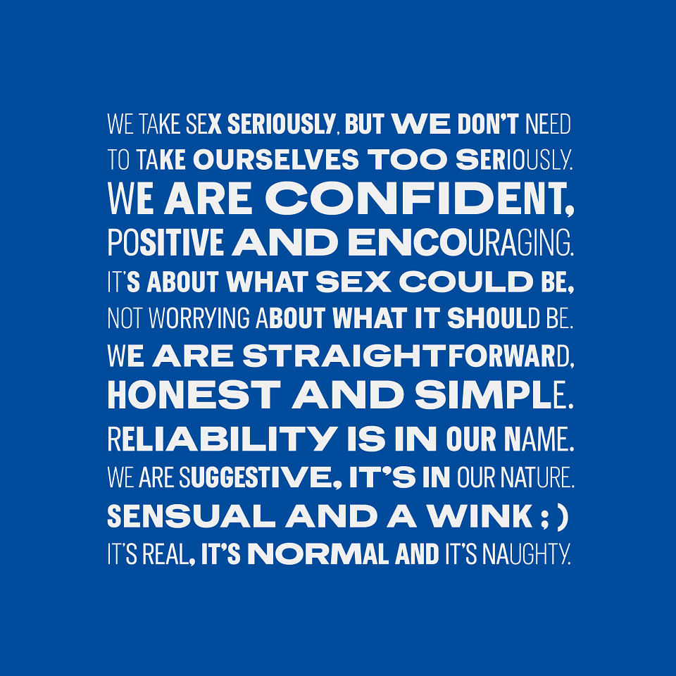
• We take sex seriously, but we don’t need to take ourselves seriously.
• We are confident, positive and encouraging.
• It’s about what sex could be, not worrying about what it should be.
• We are straightforward, honest and simple.
• Reliability is in our name.
• We are suggestive; it’s in our nature.
• Sensual and a wink
Nobody wants to hang around next to a condom display looking baffled. As this is one of the fastest at-shelf decisions people make, Durex needed to:
• Stand for a new generation of good sex.
• Jump out on a crowded shelf.
• Be confident as the world leader that it is.
• Help people navigate the options at high speed.
So what did we do?
We have redesigned Durex for today.
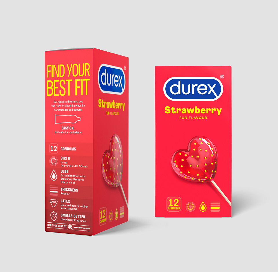
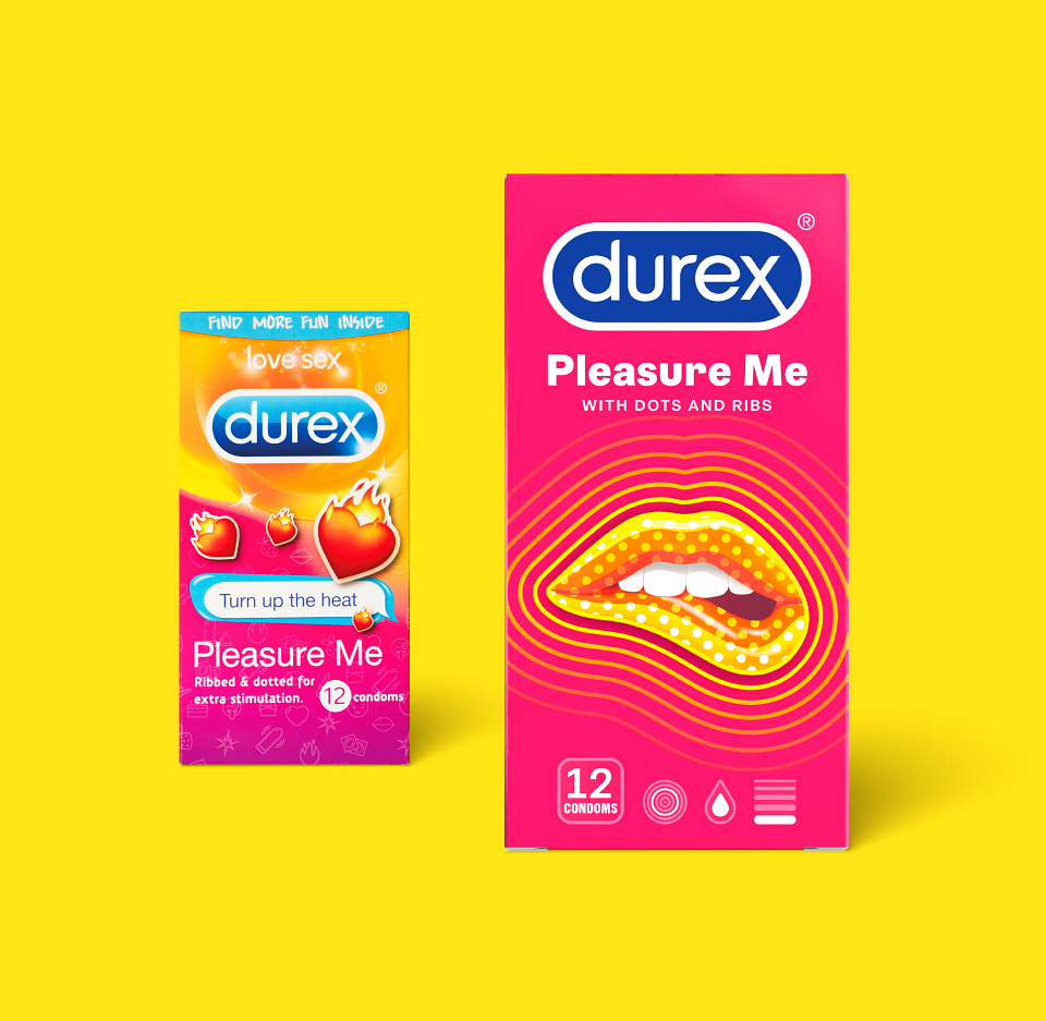
The iconic Durex logo has been re-crafted so that is is now appropriate for use across all channels and touchpoints. We have created a simplified and consistent new pack architecture, and bespoke illustrations and illustration guidelines for local market adaptations.
Our simple and direct naming, descriptors and illustrations help to ensure instant communication of each product's key attributes, whilst a clearly defined colour strategy further aids navigation of the huge range of products, benefits and ingredients.
We have also created a category first: the “find your fit” system, complete with a bespoke icon suite to locate size and fit on pack, online and at some points-of-sale.
As part of the brand's new visual identity system, we also co-created a bespoke font, “One Night Sans”, with Havas London, which is used in comms and on pack.
The new packaging designs have begun to roll out around the world, and watch this space for the rest of the Durex sexual wellbeing range, which includes lubes, toys and special editions, that will follow the same creative strategy...
MADEIT CREDITS
-

RBClient
-
Anthony LettereseDesigner -
Dan NorrisDesigner -
Jess O’DonovanClient Service -
Leia BygraveDesigner -
Sebastian DarkClient Service -
Sophie HusseinClient Service -
Tim VaryCreative Director -

Design Bridge and Partners -

Hannah McDermidStrategy Team -
Sam EllisDesigner -
Charlotte HarrisonDesigner -

Damian HughesImage Creation -
Claire RobertshawExecutive Creative Director -
Laura FordStrategy Team -

David HelpsStrategy Team -
Natasha DowdallImage Creation
Annual 2020 ShortlistDurex: Global Range RedesignPackaging
Contributor:
Invite
x3
Design Bridge and Partners has been a Contributor since 25th November 2015.