Design Happy
Kingston upon thames
ABOUT
The Brief
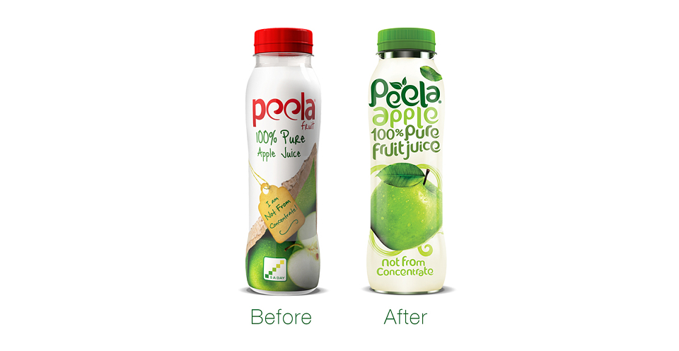
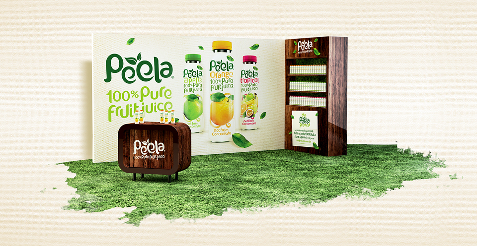
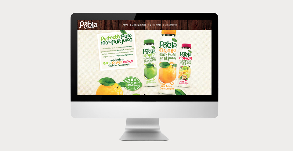
Peela wanted a new brand identity, packaging range, website and point of sale as fresh and hearty as the 100% pure fruit juice it sells.
...........................................
Our Approach
We broke the rules and made the flavour descriptor as prominent as the Peela logo. That way we create a strong visual link between the brand and its 100% pure credentials. Couple this with the bright, lush photography and vivid colourways – Peela had become a brand that radiated health, taste and refreshment.
...........................................
The Results
The re-designs have been a great success. Peela is selling well on major airlines, so much so that they plan to move into retail spaces soon.