David Germain
Creative Director
ABOUT
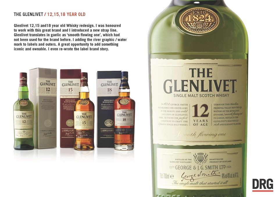
The Glenlivet brief was to redesign the core range, 12,15 & 18. Including Bottle shape, graphics and outers. The re - design started with re - aligning the brand story. Through the research and strategy stage, I discovered the main story behind the company, was the stream where the distillery began... 'The Glenlivet'. This translates into 'The smooth flowing one'. From this the story on the bottle was re written, the label design began with a water mark to echo the story and ' The smooth flowing one ' became the new strap line globally.
MADEIT CREDITS
-

David Germainstratagy, concept, Copy writer, Art Director