David
Creative
ABOUT
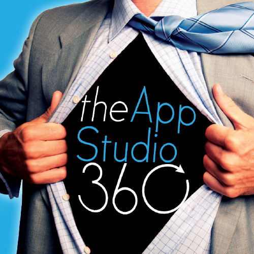
After only a few weeks at theAppStudio, I was asked to rebrand it to become theAppStudio360. The previous style was very dark and somewhat dated with the letter ‘A’ being drawn using “blue-print” construction lines.
For the new style, I introduced a fresh highlight colour and developed an icon. The ‘loading’ timer on the ‘O’ shows a 360 view and gives a sense of movement. For the website and exhibition panels, we collectively agreed to a ‘super hero’ theme. I wrote the copy line “We don’t have X-RAY vision…. but we do build super apps!” to embody this theme.