David
Creative
ABOUT
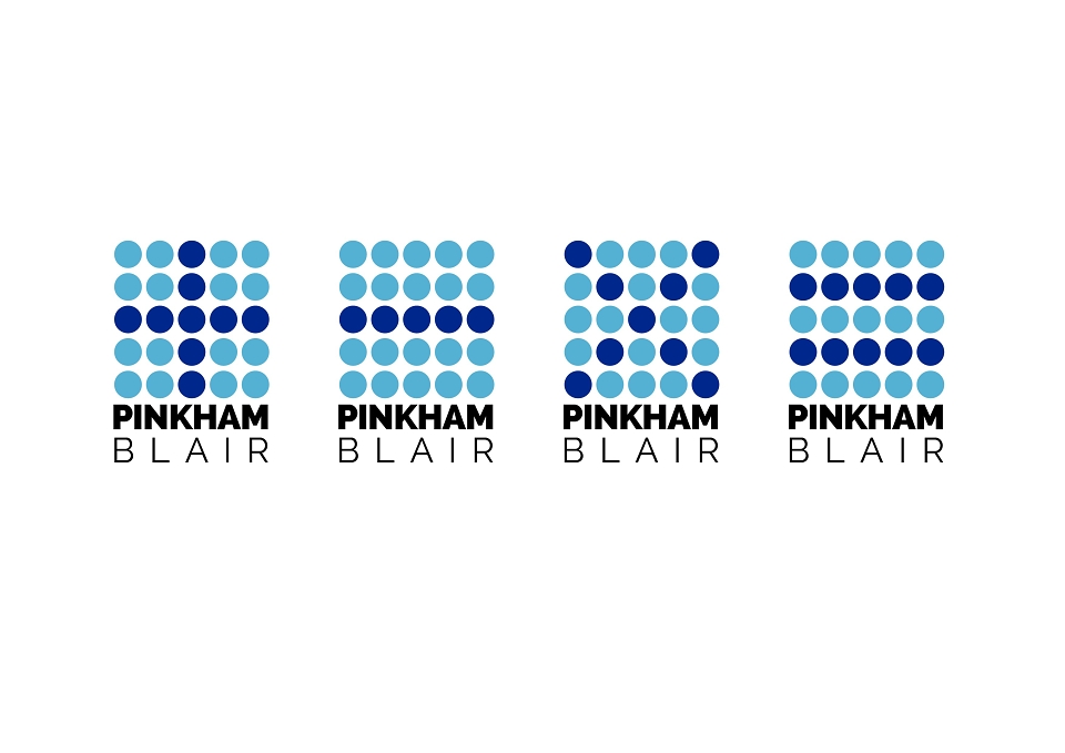
The Accountancy firm Pinkham Blair had embarked on the process of rebranding, approaching me to redesign their logo - and if successful carry through to a new website. Their service was very collaborative and engaging - something their old logo failed to show. So it was time for a fresh new look to communicate this.
The original concept had formed the basis of a campaign using the dots above the logo to display each mathematical symbol. The client preferred the equals sign the best however, as that personified their role as accountants more succinctly.