David Watson
Graphic Designer
ABOUT
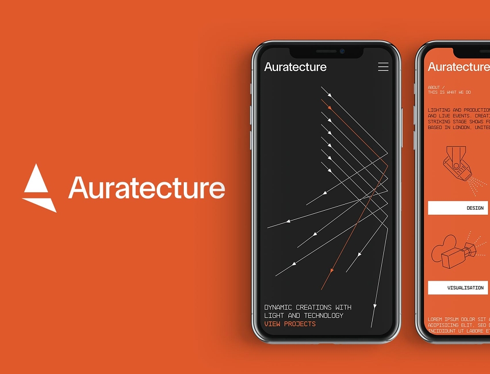
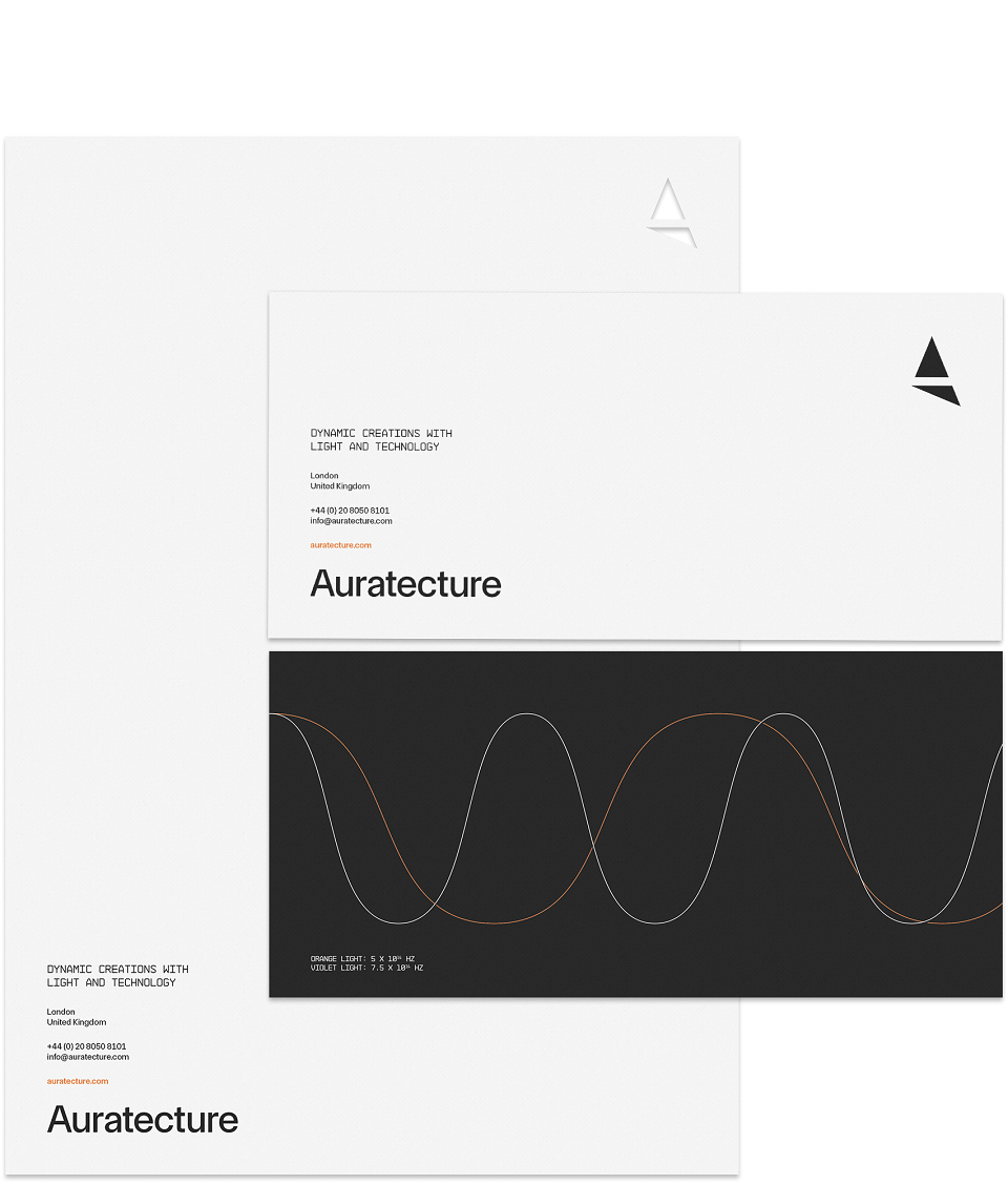
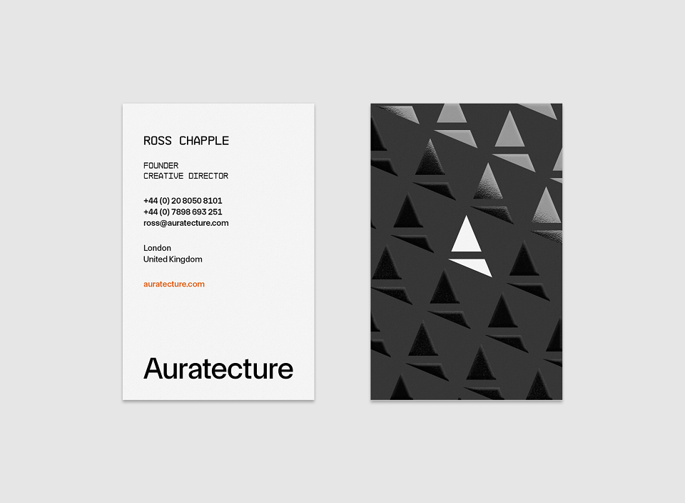
Logo, business stationery and website designs for a company specialising in stage concepts for concerts and music events.
The client wanted to rebrand with a new name and identity and become a lighting/production design studio providing cutting edge stage shows to the music and touring industry. The brief called for a high-end minimal look that leans to the monochromatic.
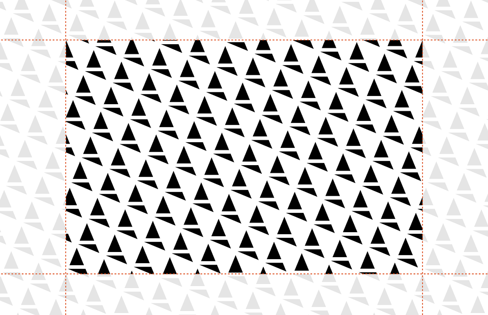
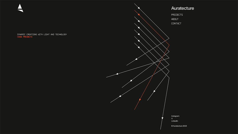
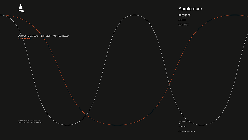
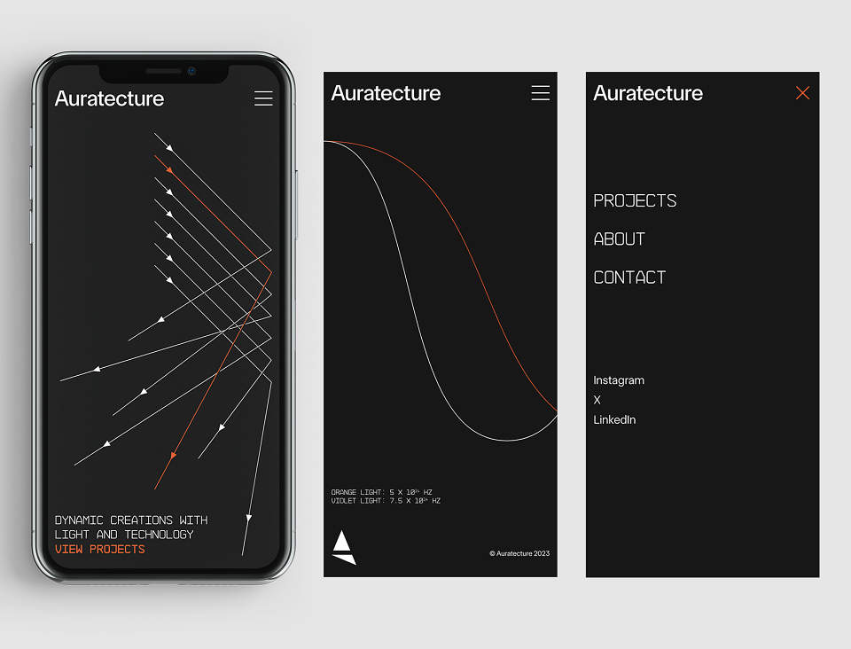
Light in its various forms was the motivation for the identity, from the A icon being inspired by a spotlight casting a shadow, to the wavelengths of light for various brand assets. The minimal look is primarily an off black with elements or assets highlighted in Aura Orange. Various weights of TASA Orbiter Display in combination with NB Architekt for the strapline and headings complete the identity.
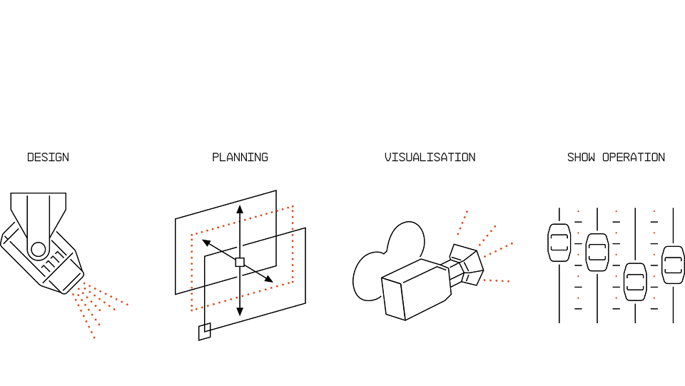
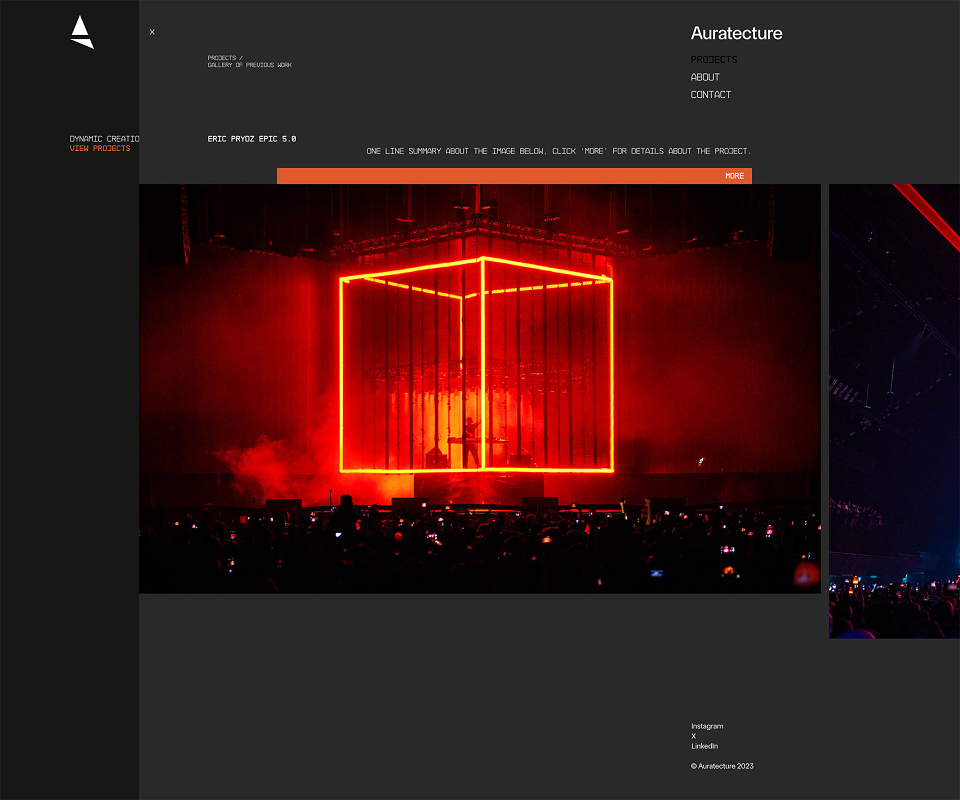
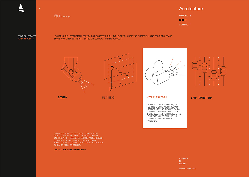
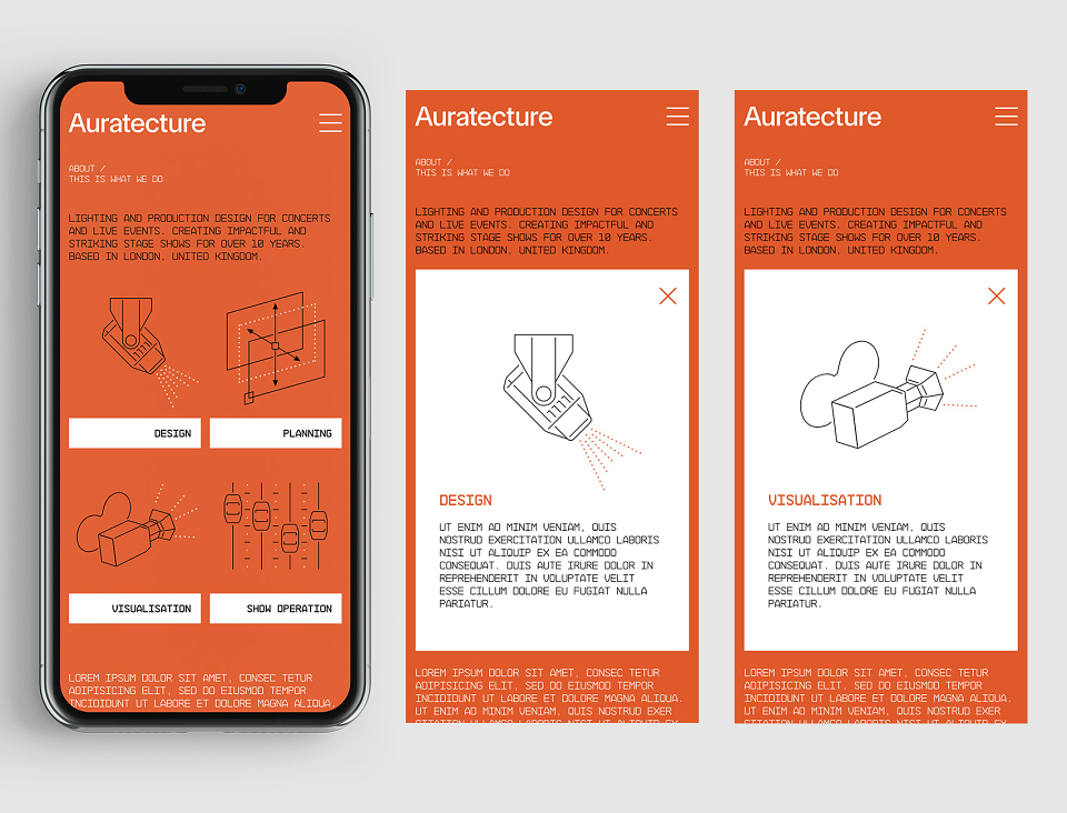
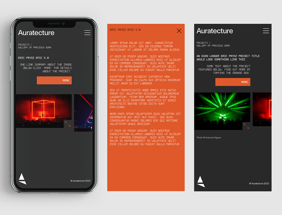
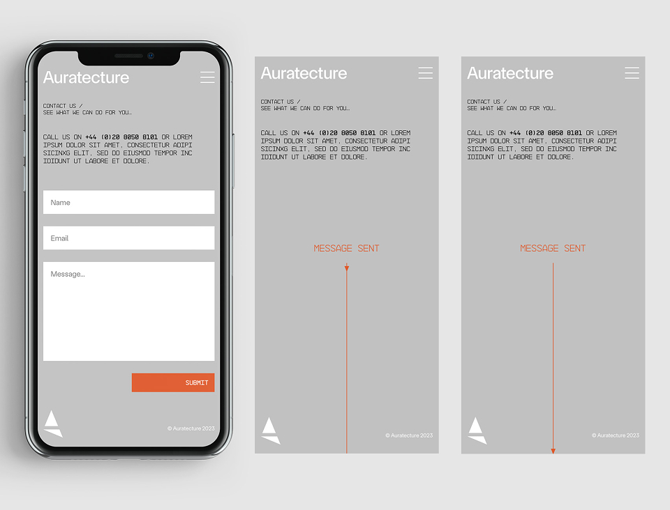
At the bottom are a selection of designs I did for the website (desktop and mobile), the illustrations are designed with subtle animation in mind. The final website was built by Fresh Pies in London.
Testimonial
"I was drawn to Grid Pattern due to David's body of previous work, containing stylish and recognisable album artwork for a credible portfolio of artists. The branding design that David created for Auratecture was exactly what I had hoped for when I set out to establish the look of the company. The entire process was friendly, professional and collaborative. David turned the project around in a very reasonable period of time and the quality of his work is exceptional. I have received nothing but positive feedback for the look and branding of the company, and I am very grateful for David’s hard work and creativity on the project."
Ross Chapple
Founder, Auratecture