David Preece
Creative
ABOUT
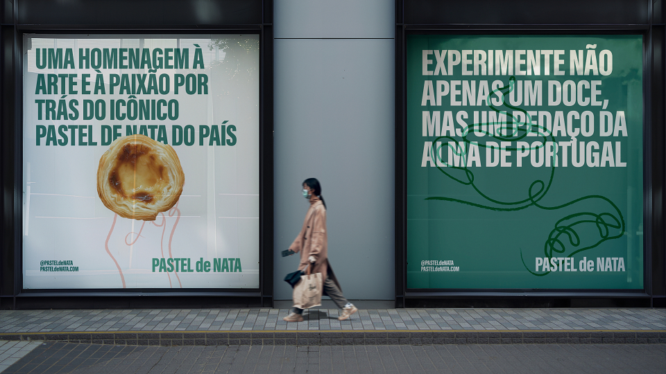
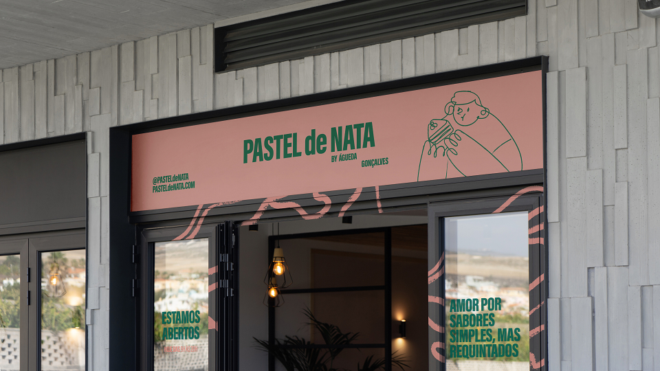
Our collaboration with Pastel de Nata, a conceptual pastry and coffee brand, set out to prove that design can transform everyday rituals into multisensory experiences. Inspired by the indulgence of traditional Portuguese custard tarts and the richness of 100% Arabica coffee, we created a brand identity rooted in vitality, clarity, and timeless aesthetic appeal.
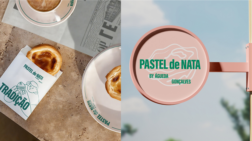
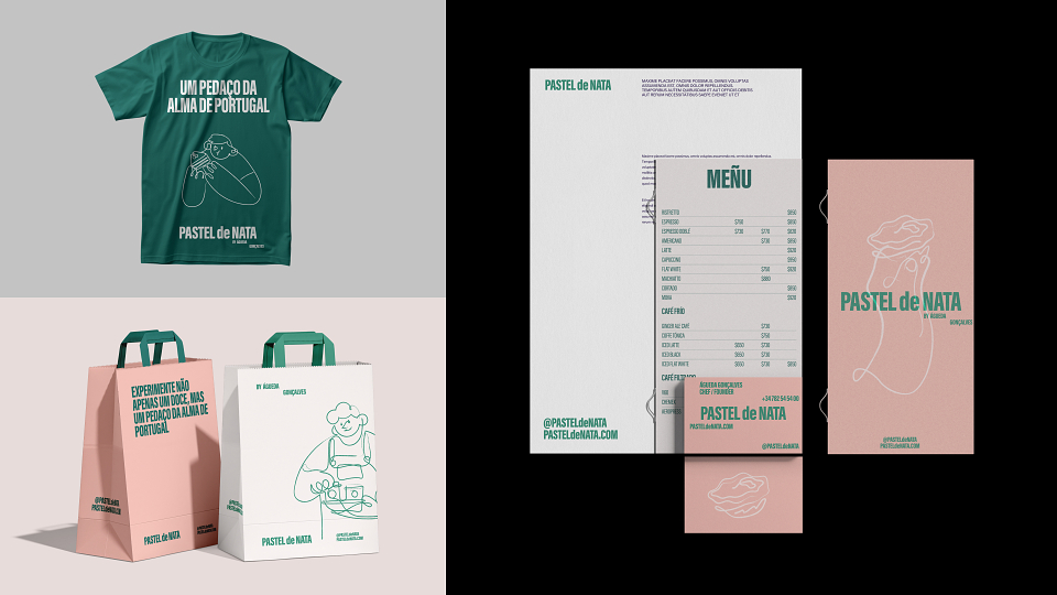
At the heart of the identity is a bold typographic wordmark built from Acumin Variable Concept Extra Condensed. The lowercase “de,” elegantly framed between the capitals of PASTEL and NATA, symbolizes the balance between nature and sophistication—a brand signature that informed the entire visual system.
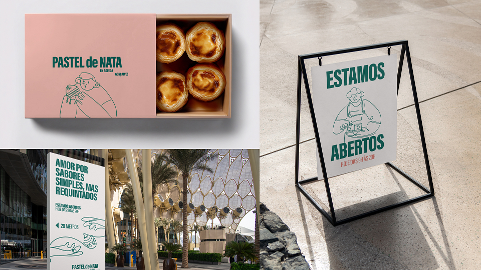
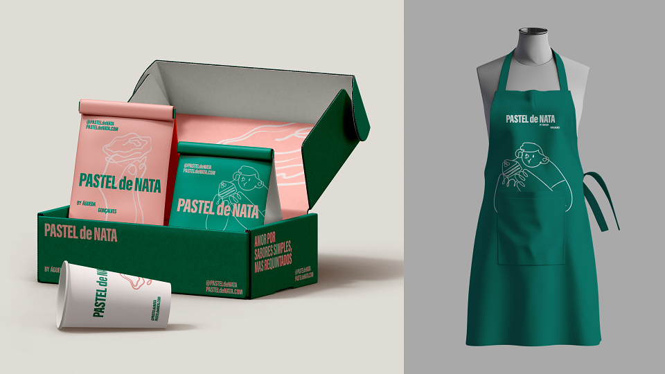
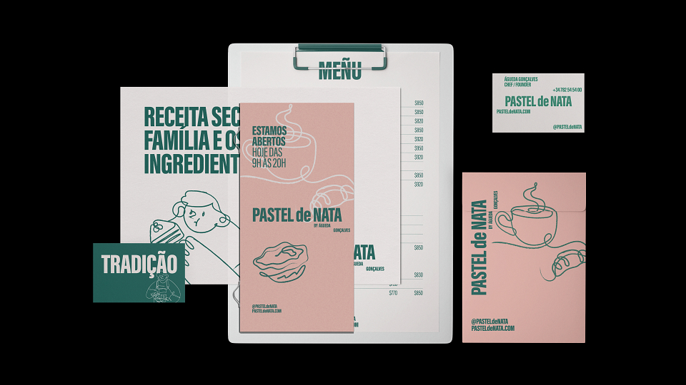
Guided by a minimalist design philosophy, whitespace was treated as an active element, bringing consistency, flexibility, and space for narrative expression. Complementing this, illustrations fuse organic and geometric motifs, adding warmth and personality across touchpoints, from packaging to digital.
The packaging system reflects this harmony: clean, modern layouts anchored in refined typography and enriched with vibrant, modular artwork. Supporting typefaces enhance legibility and modernity, ensuring clarity across both brand communications and product applications.
The result is a future-ready identity that mirrors the richness of Pastel de Nata’s offering—where structural simplicity meets sensory delight. This project redefines how branding in food and beverage can capture cultural tradition while shaping a contemporary, elevated customer experience.
MADEIT CREDITS
-

Jordan PearmanArt Director -

VNSH Creative HouseCreative Agency -

David PreeceArt Director