DAVANGARTE Design
Graphic Designer
ABOUT
The "PantonBox" brand concept was created to reflect the company's specific identity:
the international, modern, dynamic, friendly, and unique approach in providing SOLUTIONS and NEW IDEAS in the area of the digital and printing industries; complete integration of services offered with the understanding that ANY TASK can be discussed and executed, safe and fast, for all type of clients regardless of their size, required volumes, or complexity level of the project, even with the most unusual requirements because the PASSION and EXPERIENCE to make it happen are existing. The company offers a unique system of KNOW-HOW, experience, enthusiasm and genuine PERSONAL ATTITUDE; the artistry of professional, high-quality and SMART digital and print services; ALL-IN-ONE, simple, easy, accessible, flexible, sustainable; for everyone.
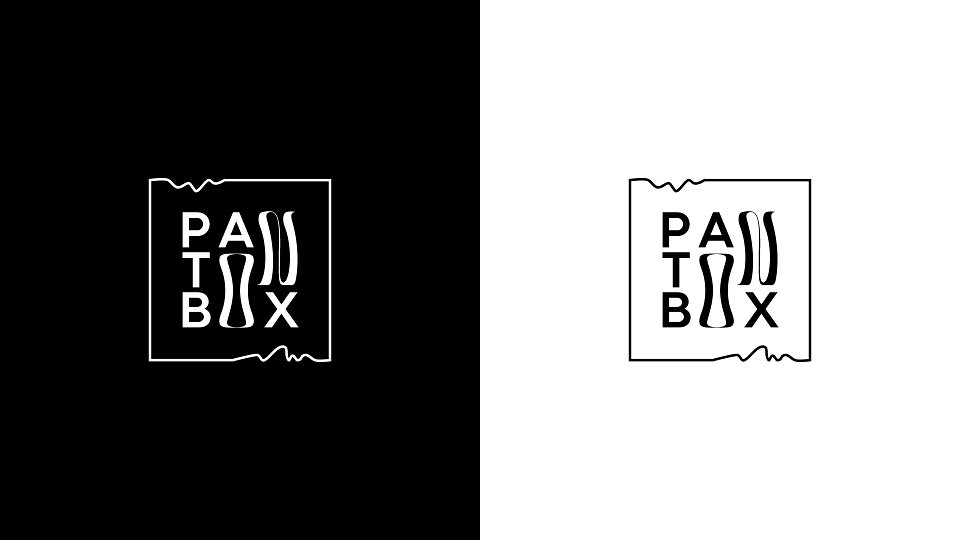
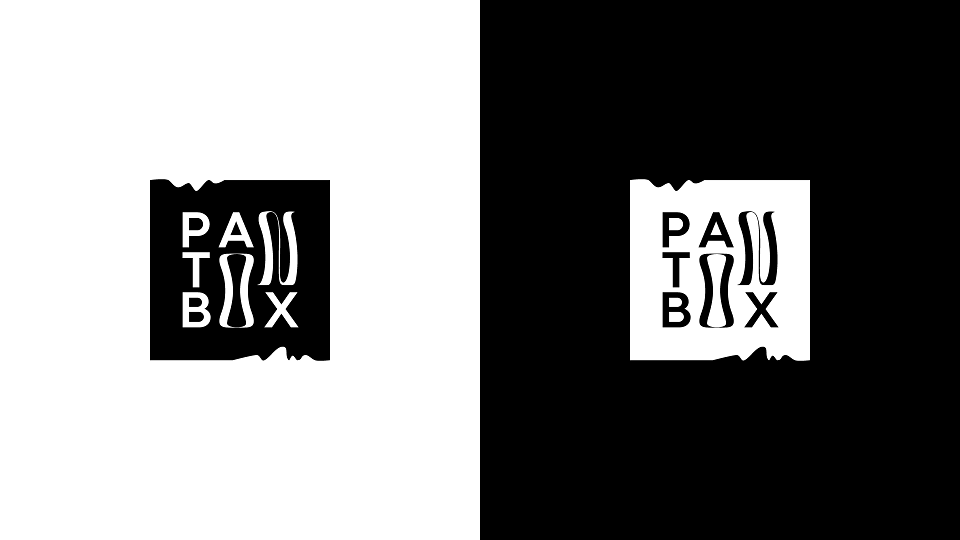
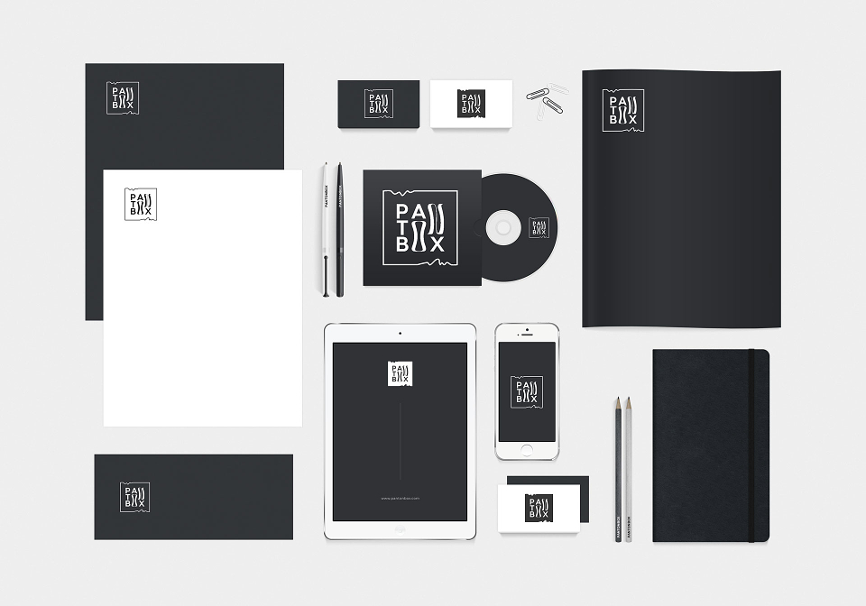
This special project demanded a unique approach, resulting in a minimal and stylish design with an almost abstract illusion. It achieves a harmonious blend of symbols, opposites, and secret messages, combining sustainable traditions with dynamic innovations.
We've started with the square - the multi-functional perfect geometric form, a symbol of the universe, sustainability, balance, equality, wisdom, honor, unification... solid and bold... but with the addition of dynamic elements to declare the company's ability to “think out of the box" as well.
The 3D-like illusion of paper/textile shape adds a tactile dimension to the digital representation, a material feeling to the digital component.
The liquid shape of the letters "O" (resembling a sand clock) and "N" introduces movement to the composition and emphasizes "ON" (e.g. "You are on!"). The letters 'O' and 'A' hide a simple pencil/pen inside, while the letter 'X' incorporates pointing arrows for the viewer.
Timeless black and white are chosen for the color palette. The 2 fundamental colors that result from the collection of all colors into one: black - for the printing (subtractive color model, CMYK) and white - for the digital (additive color model, RGB). Because the brand name "Pan-ton-box" signifies "all colors in one place" as well as "a palette of endless possibilities"!
The typography - a balanced combination of simple serif and playful sans serif conveys the harmony of the traditional sustainability and modern innovations.
It was crucial to implement all controversial characteristics, elements, and specifics in a clear, simple, and subconscious/intuitive manner, it was meant to be felt rather than directly understood.
Have you felt it yet?