


Objective
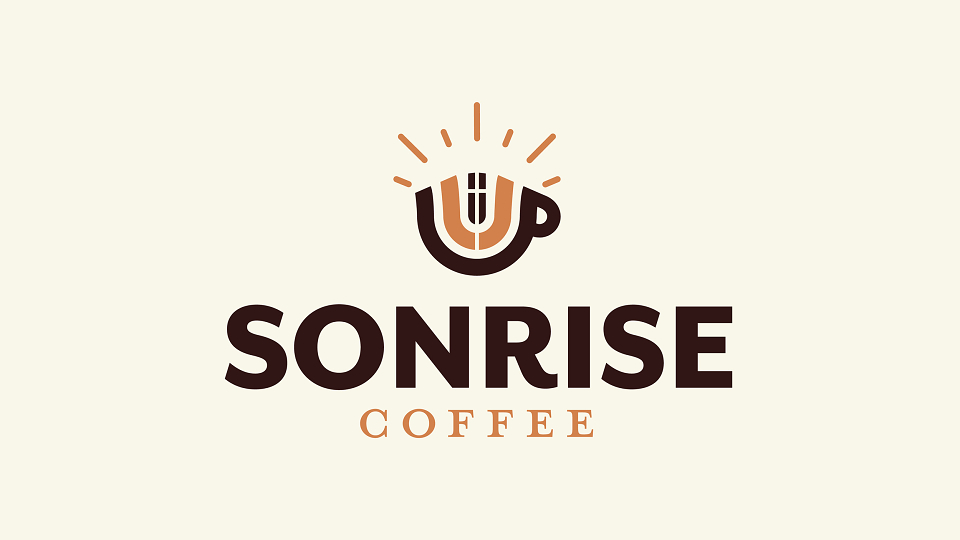
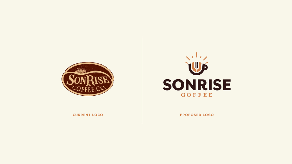
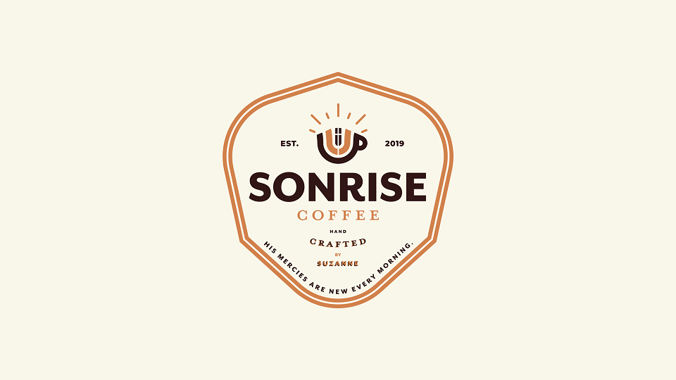
SonRise Coffee published a design brief requesting a logo that combined various brand nouns: a coffee theme, a sun/sunrise, a cross, a crown, and a king reflecting their Christian foundations. The logo needed to reflect faith and warmth, while remaining accessible to a broad customer base.
Challenges
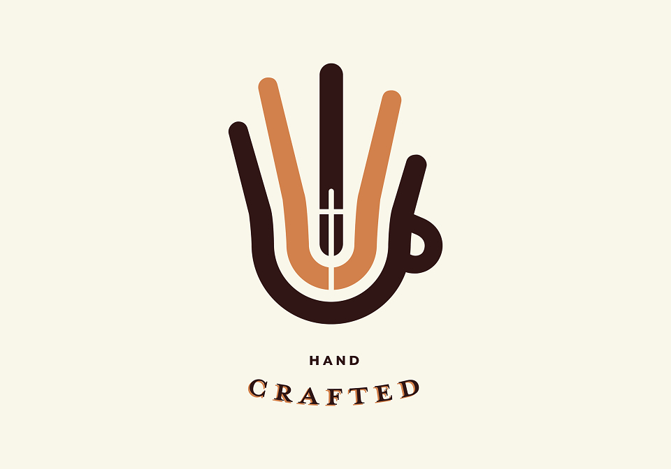
The key creative challenge was to ensure that the religious reference (the cross) was subtle and thoughtfully integrated, strong enough to resonate with their identity, yet discreet enough to appeal to a wide customer base who may prefer a more understated symbol.
Outcome
My approach prioritized clarity, balance, and meaning. I experimented with forms and negative space to weave the cross into the sunrise motif without making it the focal point, while still honouring the brand’s spiritual values. The final concept aimed to evoke warmth, hope, and community feelings appropriate for a coffee brand rooted in faith.
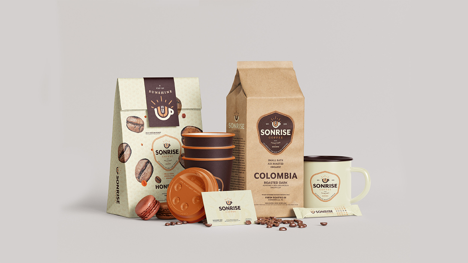
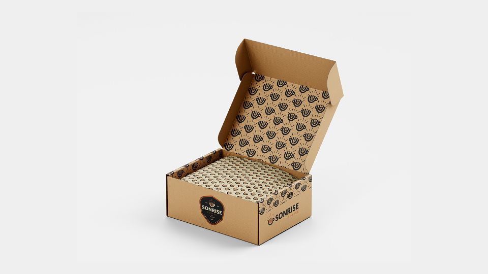
Although the client ultimately did not finalize a decision, the project reflects a complete design process from interpreting the brief to delivering polished logo concepts. The work demonstrates my ability to translate symbolic brand values into meaningful, marketable identity design.
“Developed as part of a client brief for Sonrise Coffee. Although the project did not move into production, it highlights my ability to translate brand values into impactful design concepts.”
