Daniel Esqueda
Creative Director
ABOUT
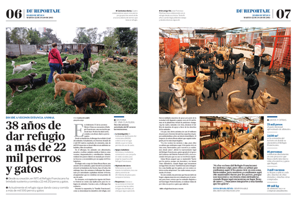
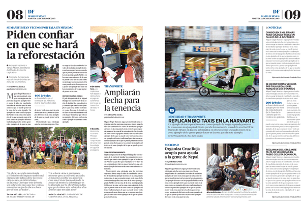
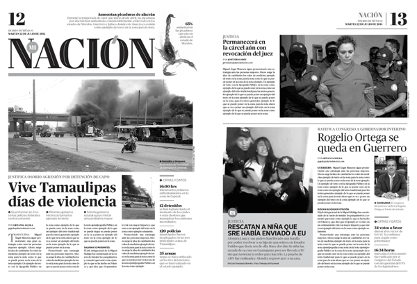
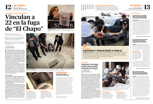
Diario de Mexico’s newspaper redesign.
DIARIO DE MÉXICO
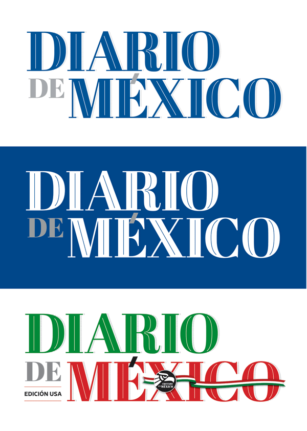
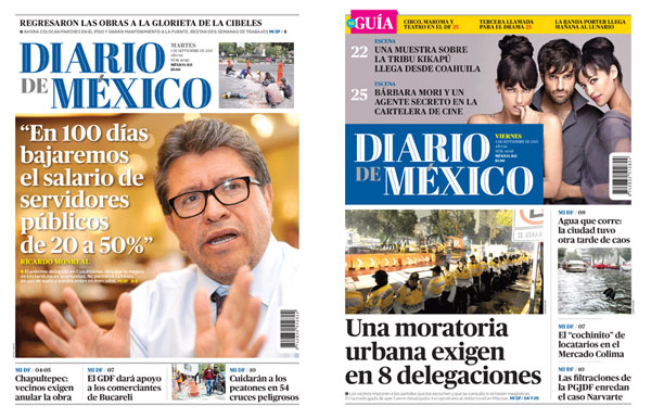
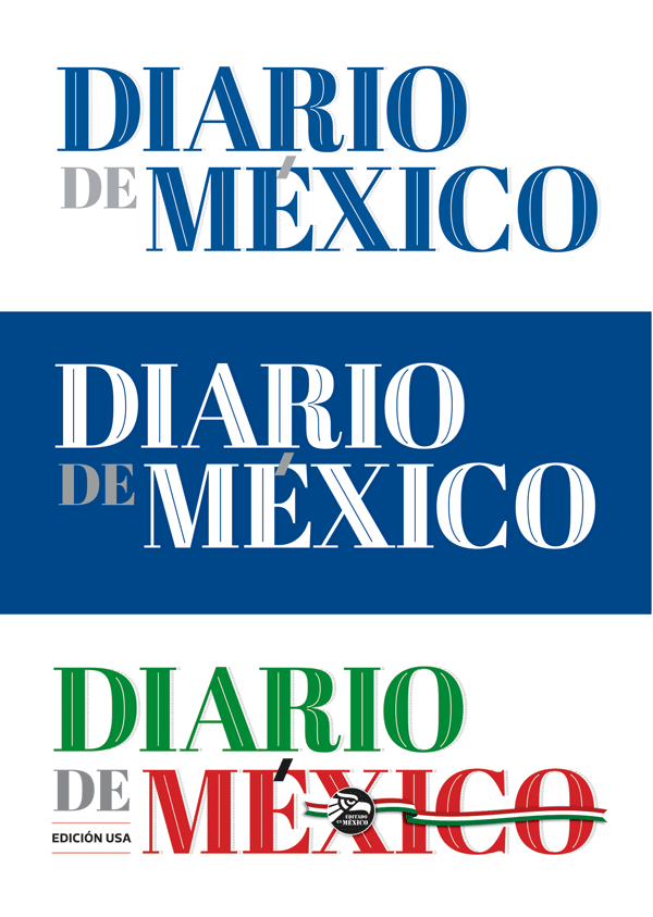
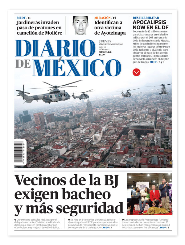
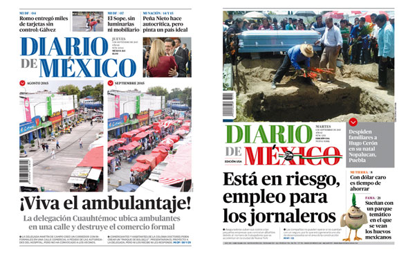
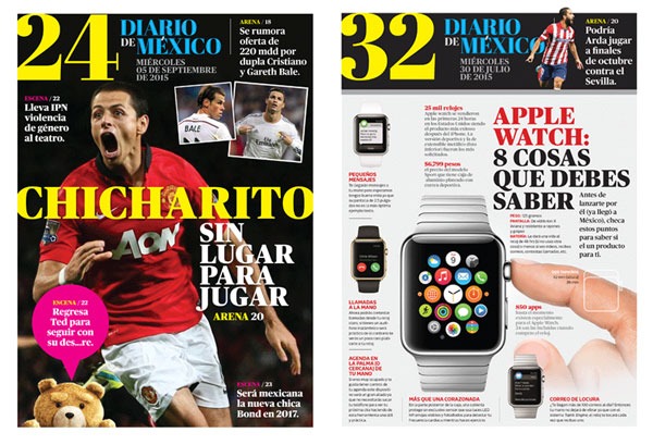
After 5 years (of its first redesign) and a careful analysis of new informational and readership needs, Diario de Mexico renews itself with a fresh look, and a lighter, content rich product, with new sections and the fusion of its Mexican and US brands (which share 40% of their information). Friday edition has a reversed color logo for the newspaper as well as for special editions.
Key content issues where solved during the redesign:
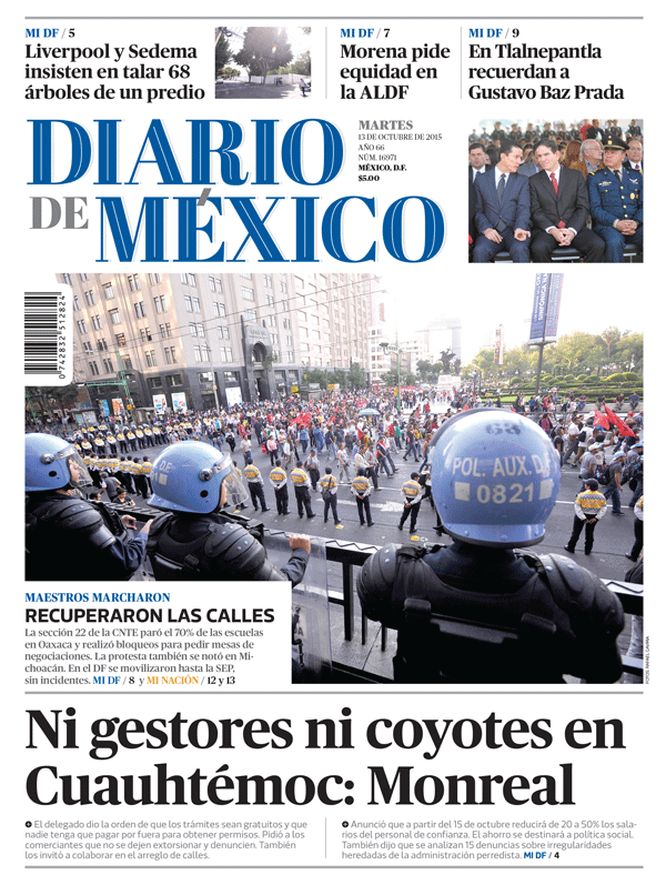
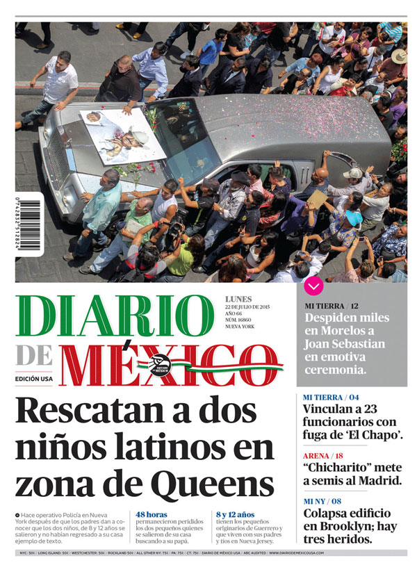
• NEW LETTERHEAD WITH GREATER STRENGTH AND WEIGHT ON FRONT COVERS
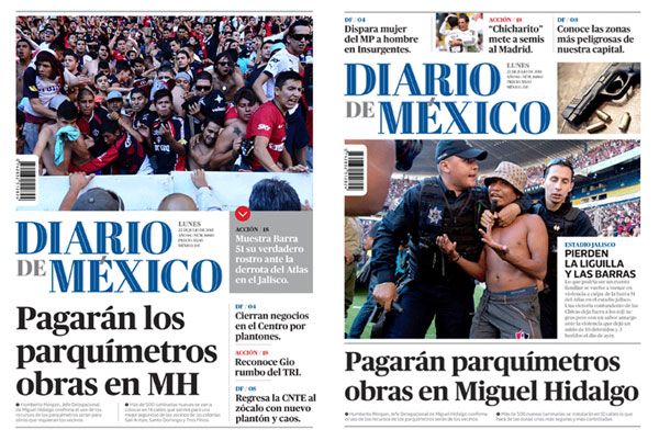
• MEXICO‘S AND US COVERS HAVE DIFERENT NEWS CONTENT BUT IS DESIGN STYLE REMAINS THE SAME
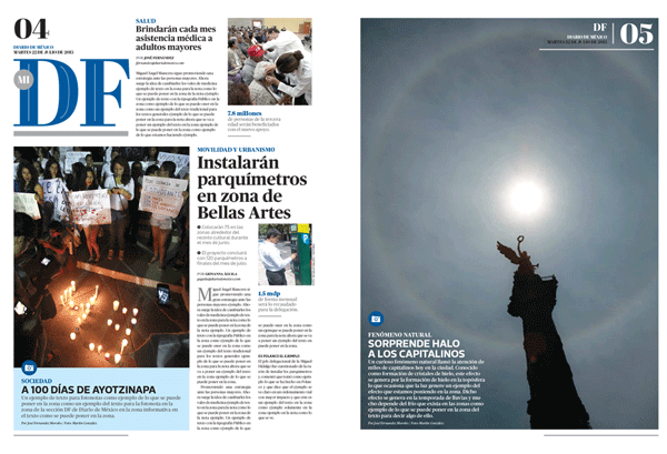
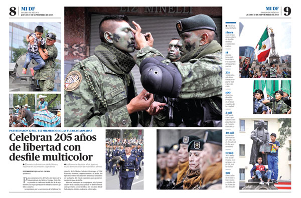
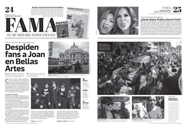
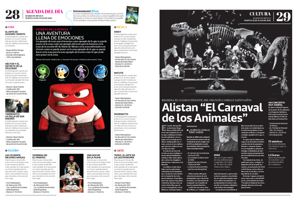
• MODULAR DESIGN HELPS THE CONTENT TEAM CREATE COVER OPTIONS IN LESS TIME. DIARIO DE MEXICO‘S BRAND ALWAYS STANDS OUT EVEN WITH A BIG PICTURE
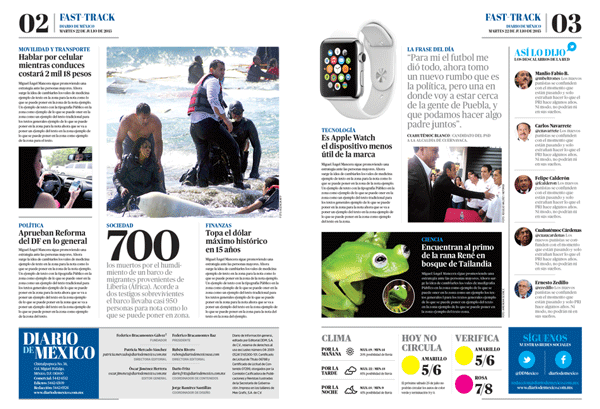
• BRIEF AND LAST MINUTE INFORMATION GOES TO A SECTION CALLED FAST-TRACK
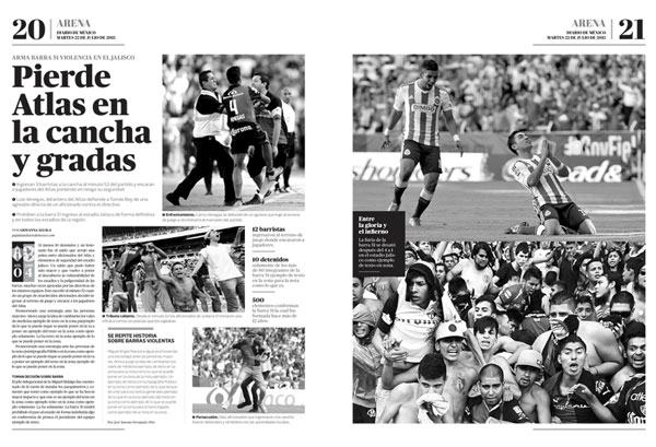
• STRONG ENFASIS ON PHOTOGRAPHY IS ONE OF THE KEY ELEMENTS IN THE NEW REDESIGN
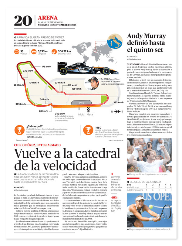
• SINCE ISSUES (MEXICO AND US EDITION) SHARE 40% OF THEIR INFORMATION, MODULAR DESIGN ALLOWS EASY CONTENT MODIFICATION.
MADEIT CREDITS
-

Daniel EsquedaCreative Director