Daisy Tobin
Graphic Designer
ABOUT
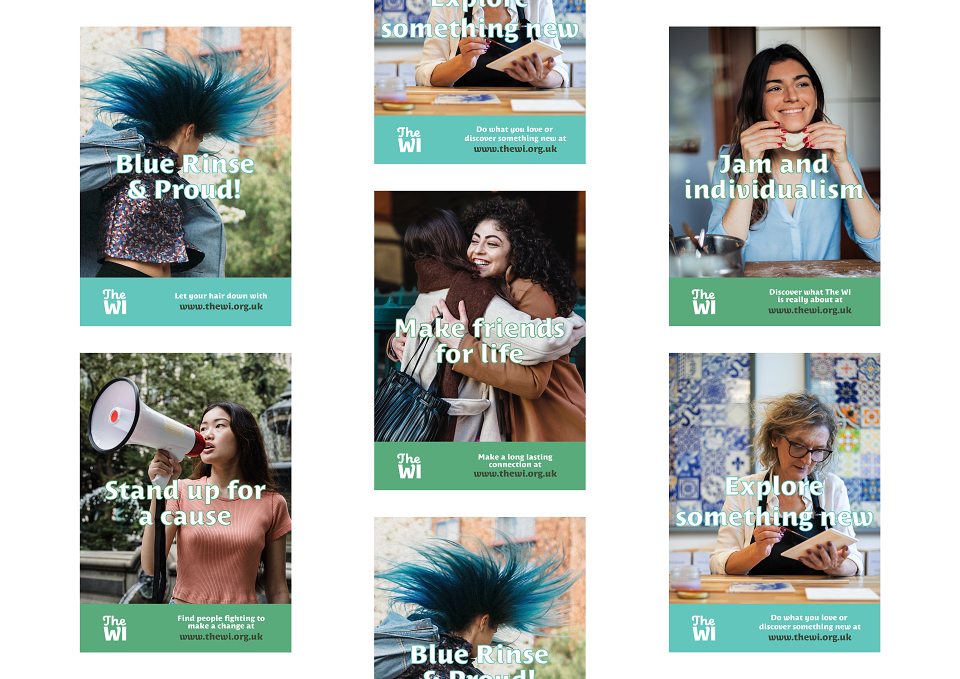
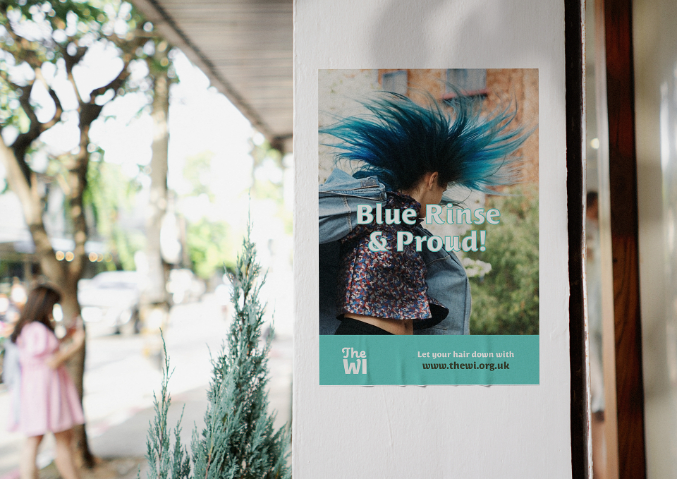
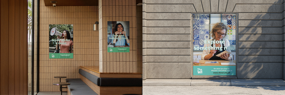
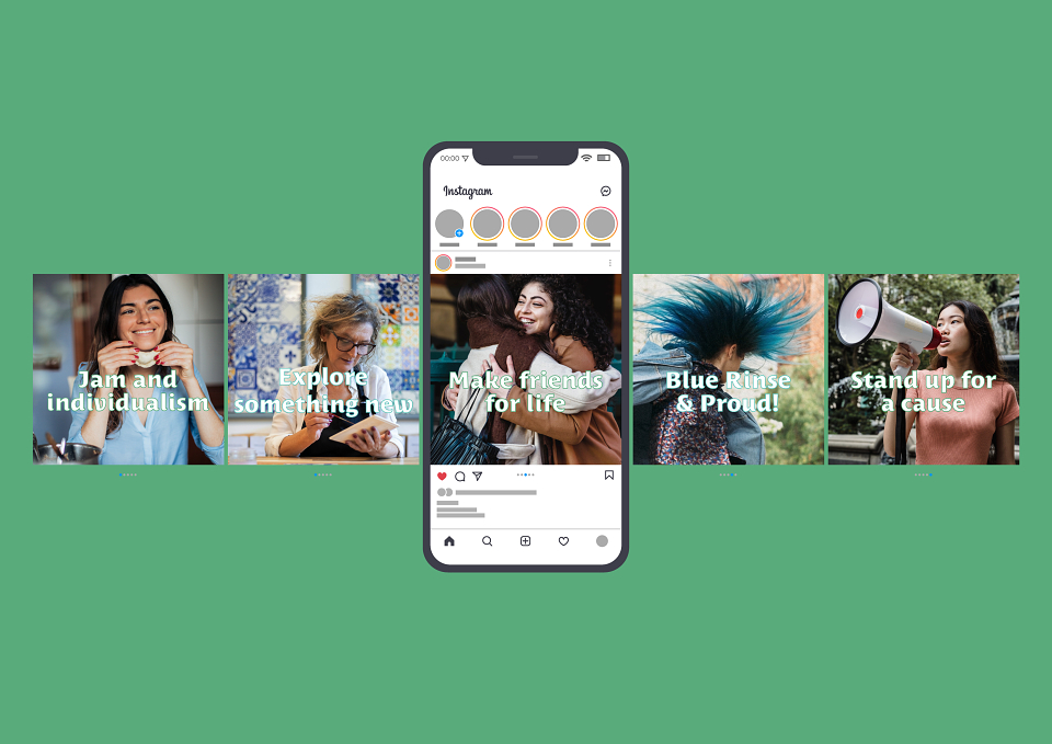
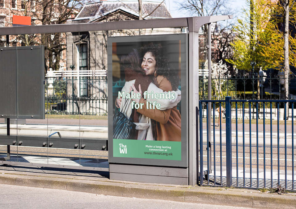
The brief was a week-long university project to reimagine the Women’s Institute as a powerful connector between women. The Women’s Institute, at its core, is about celebrating and inspiring all different kinds of women, giving them a space to connect, learn and make a change in their lives and communities. This rebrand reflects that, reclaiming past stereotypes and turning them into something positive. It also targets a larger and more diverse demographic than previous messaging for the brand.
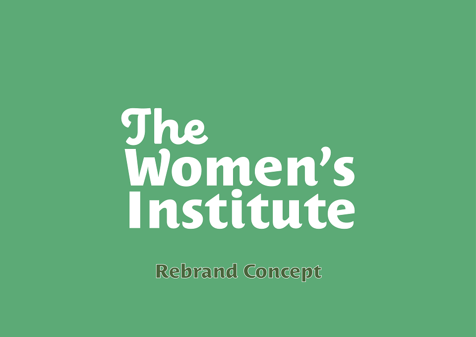
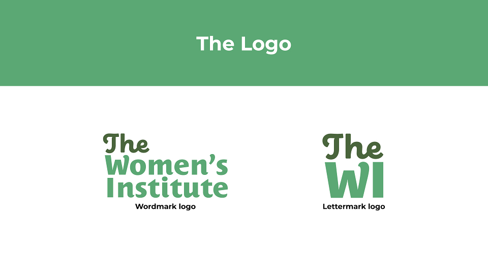
The rebrand brings the Women’s Institute into the 21st Century. A combination of old and new is shown in the logo with a serif type inspired by handwritten text paired with a modernised serif. The green was chosen to represent growth, energy, positivity and friendship. The message of this campaign is not ‘out with the old and in with the new’ but celebrating both old and new as one, spinning the stereotypes into positives and embracing them.
MADEIT CREDITS
-

Daisy TobinGraphic Designer