Cristea Cristian
Graphic Designer
ABOUT
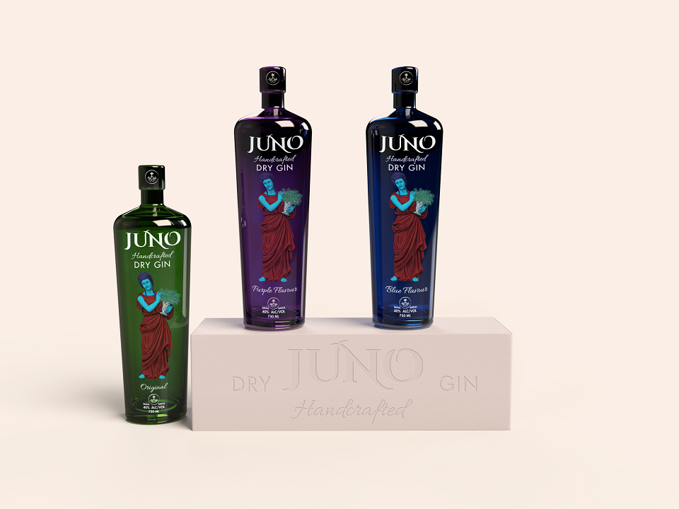
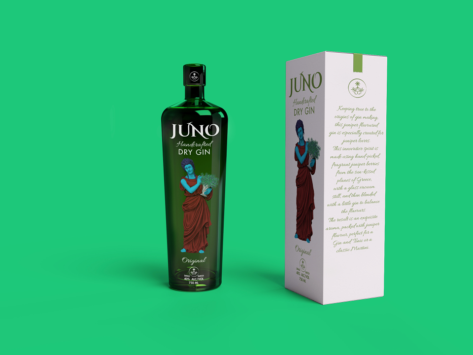
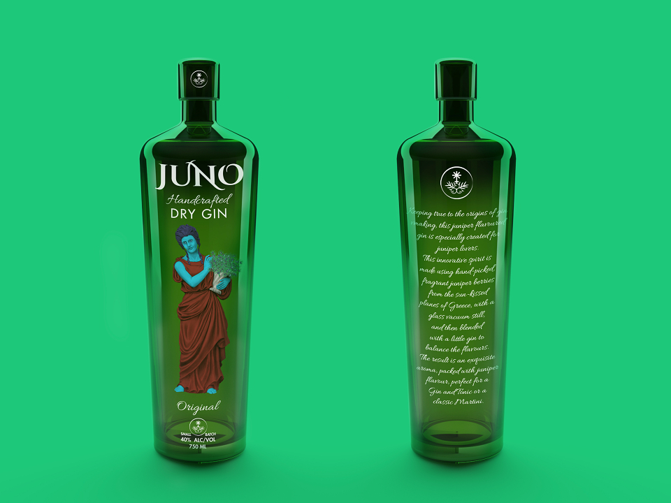
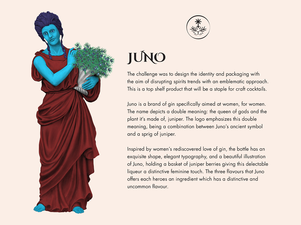
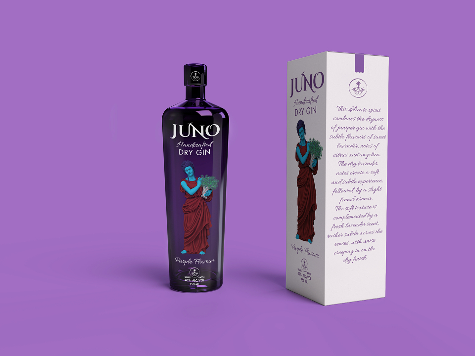
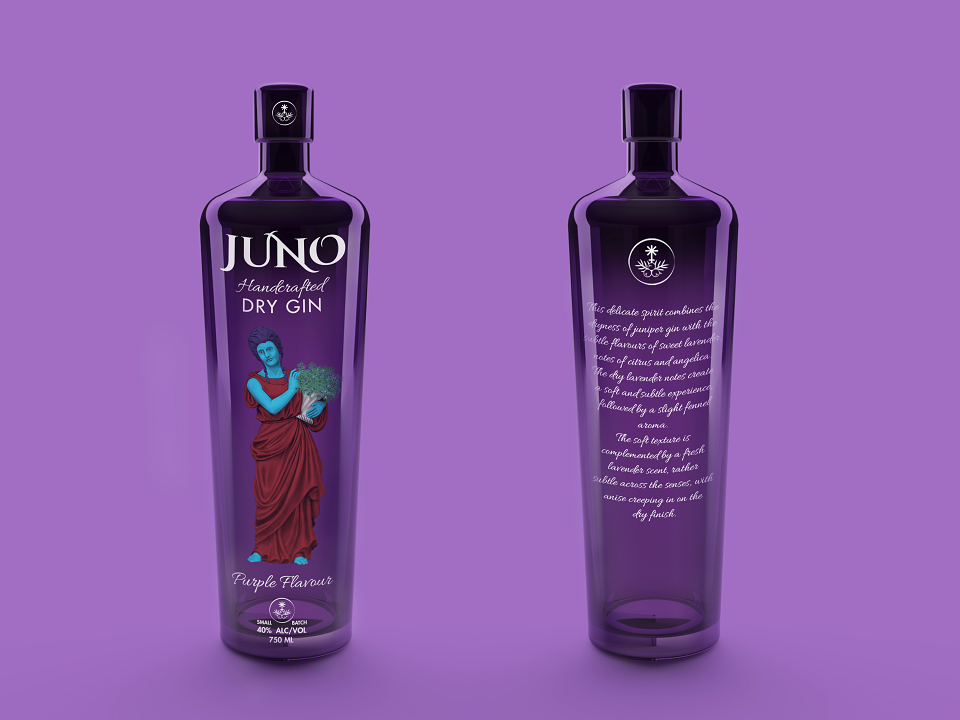
The challenge was to design the branding and packaging with the aim of disrupting spirits trends with an emblematic approach. This is a top-shelf product that will be a staple for craft cocktails.
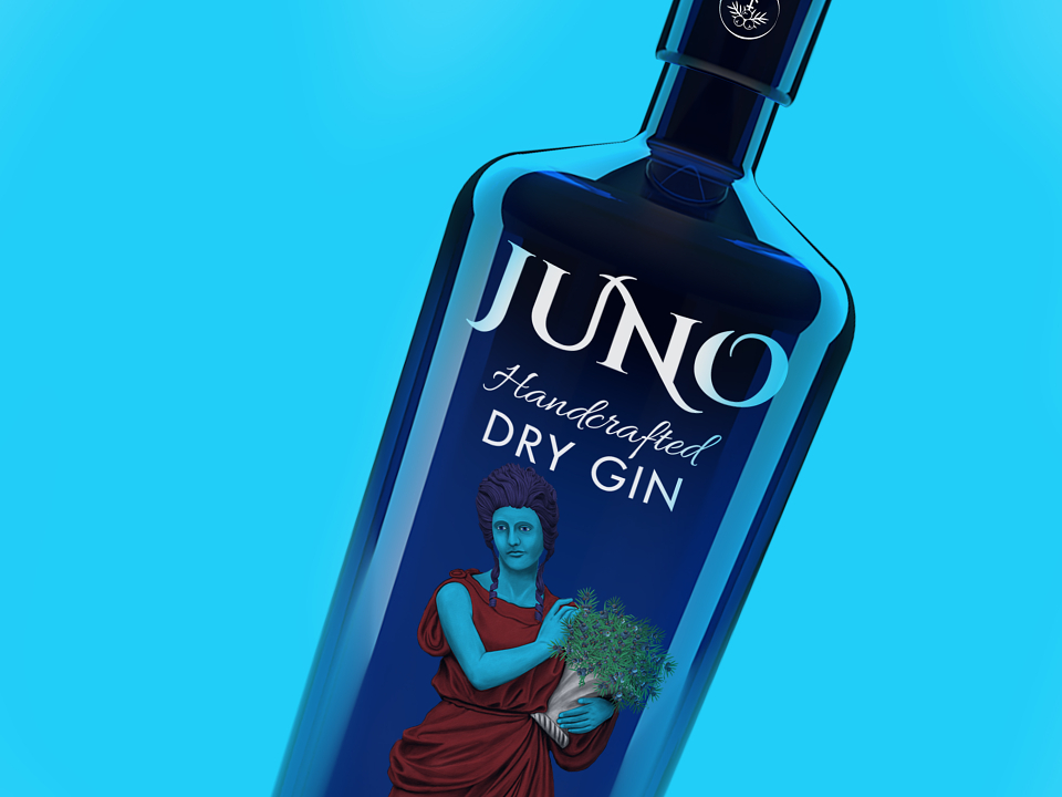
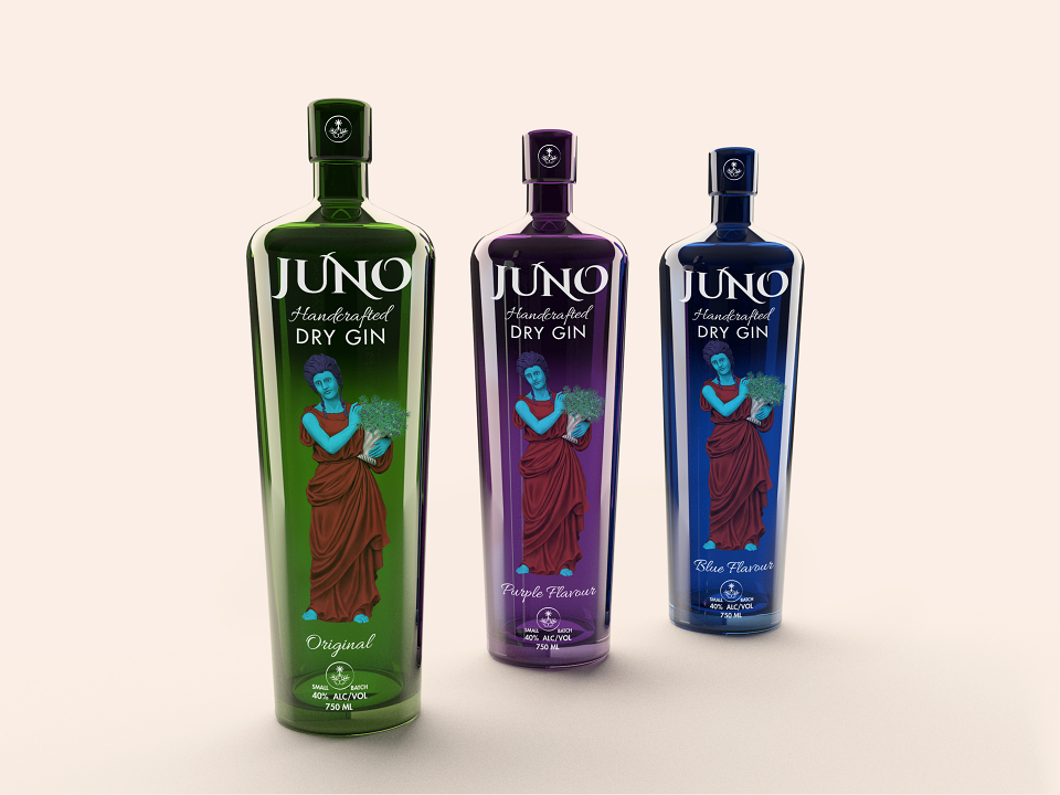
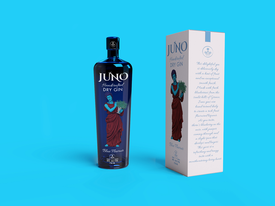
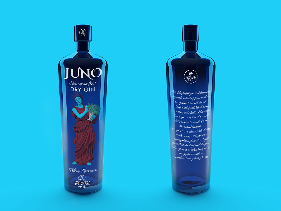
Juno is a brand of gin specifically aimed at women, for women. The name depicts a double meaning: the queen of gods and the plant it’s made of, juniper. The logo emphasizes this double meaning, being a combination between Juno’s ancient symbol and a sprig of juniper.
Inspired by women’s rediscovered love of gin, the bottle has an exquisite shape, elegant typography and a beautiful illustration of Juno, holding a basket of juniper berries giving this delectable liqueur a distinctive feminine touch. The three flavors that Juno offers each heroes an ingredient which has a distinctive and uncommon flavor.
MADEIT CREDITS
-

Cristea CristianGraphic Designer - Production