

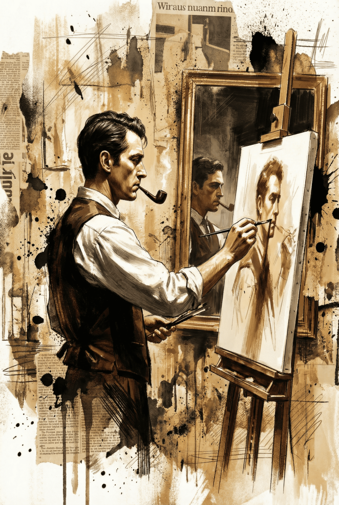
Felix Eroma’s illustration practice sits at the intersection of precision and disruption, where finely rendered realism collides with raw, expressive mixed-media elements. In this project, he set out to create more than a likeness, developing a portrait that reflects the subject’s inner life as much as their outward appearance. Through ink, texture, and digital collage, the work captures identity as something layered, evolving, and shaped by both personal history and external influence.
In this interview, Felix walks through the full creative journey behind the piece, from early conversations around tone and intent to the technical decisions that helped balance clarity with chaos. He discusses how editorial textures, handwritten marks, and unexpected visual moments became narrative devices, and why embracing imperfection was central to the project’s message. The result is a portrait that feels human, complex, and emotionally resonant, designed to linger in the viewer’s mind long after the first look.
What was the brief?
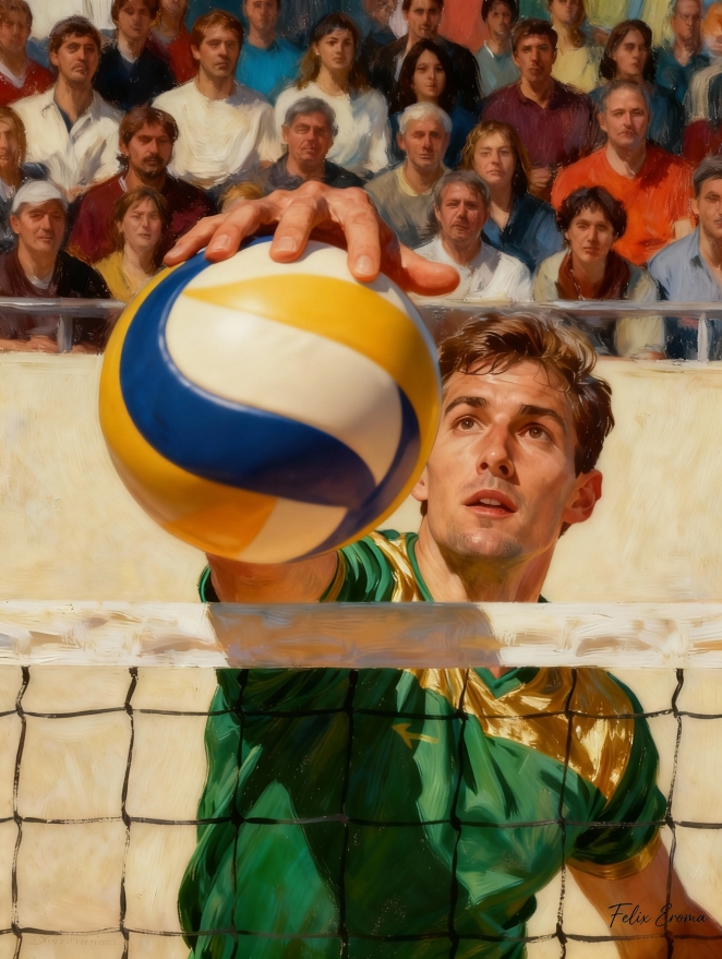 The brief was to create a highly expressive mixed-media portrait that revealed not only the subject’s physical presence, but also the layers of identity, memory, and context surrounding him. The client wanted an illustration that blended realism with editorial textures, evoking both emotional depth and narrative complexity.
How did the initial pitch/brainstorming phase go?
It started with an open conversation about tone and intent. We explored whether the piece should feel intimate, heroic, analytical, or nostalgic. Together, we aligned on the idea of merging a realistic portrait with graphic overlay newspaper fragments, diagrams, scribbles to create a visual metaphor for the subject’s story.
What was the process behind ideating the concept?
The concept grew from observing how people are shaped by environments, history, and personal evolution. I wanted to portray the subject not as a static figure, but as someone layered with experiences. The idea of integrating technical notes, crowd imagery, and ink splashes emerged naturally as a way to represent external pressures and internal reflections.
What was the production process like?
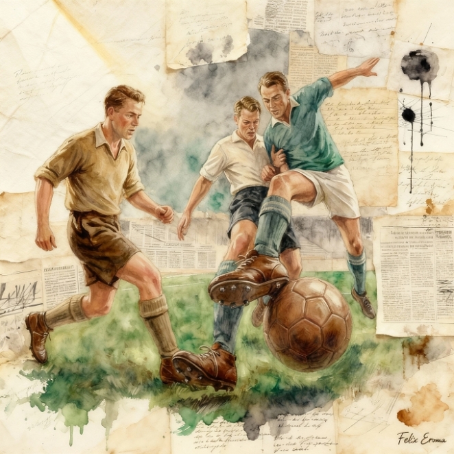
I started with a detailed pencil and ink drawing to establish structure and expression. Then I built up the portrait digitally using textured brushes, watercolor washes, and controlled lighting. Parallel to that, I assembled a background collage of vintage papers, diagrams, and mixed-media stains. The final stage was harmonizing both worlds so the figure and textures felt seamlessly interwoven.
What was the biggest challenge during production? How did you overcome it?
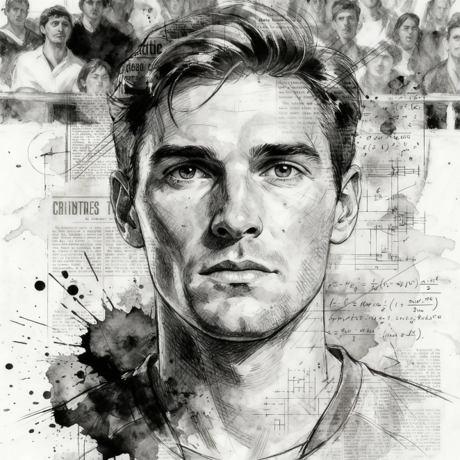 The challenge was balancing realism with the chaotic energy of the mixed-media elements. Too much texture would overwhelm the portrait; too little would weaken the narrative. I solved this by gradually layering effects, constantly stepping back to evaluate composition and emotional clarity.
What kit/tools/software were used to create the project?
I used a combination of traditional sketching tools, pencil, ink, textured paper and digital software such as Procreate and Photoshop for painting, layering, and compositing. Custom brushes and scanned analog textures were essential to achieving the organic, imperfect look.
What is one funny or notable thing that happened during production?
At one point I accidentally inverted an ink splash layer, and it unexpectedly created a shape that resembled a shouting face in the background crowd. It was so striking that I refined it and kept it in the final illustration as a subtle detail.
What’s the main message of this project and why does it matter?
The message is that every individual carries visible and invisible stories, skills, struggles, history, and identity. The piece matters because it visually celebrates complexity rather than perfection, reminding viewers that people are textured, layered, and multidimensional.
How long did it take from inception to delivery?
 From the first briefing to final delivery, the project took around two weeks, including research, concept development, sketching, painting, and refinement.
Can you describe the creative spark or inspiration behind the initial concept? Was there a specific moment or insight that ignited the idea?
The spark came when I saw the subject in a crowded context and realized how his expression contrasted with the noise around him. That contrast inspired the idea of isolating him through realism while surrounding him with mixed-media fragments representing external pressures and internal thoughts.
How did you ensure that the concept aligned with the brand's values, goals, and target audience?
I aligned the piece with the brand’s narrative by choosing a human-centred approach, focusing on authenticity and emotional storytelling. The mixed-media elements also reflect the brand’s emphasis on innovation, while the realistic rendering appeals to an audience that values craftsmanship and credibility.
Were there any alternative concepts or ideas considered during the ideation phase? If so, what led to the selection of the final concept?
We considered a fully digital collage with a more abstract portrait, and a purely realistic version without graphic elements. However, the hybrid approach stood out because it offered both emotional resonance and visual uniqueness, making it far more memorable and aligned with the project’s message.
Can you discuss any collaborative or interdisciplinary aspects of the ideation process, such as working with other departments or external partners?
 The concept benefited from input from the editorial and communication teams, who provided insights on narrative direction and audience perception. Their perspective helped refine the storytelling layers embedded within the background textures.
What role did consumer research or market analysis play in shaping the concept and its execution?
Market analysis showed that audiences respond strongly to portraits that feel both personal and visually distinct. This reinforced the decision to maintain a strong human presence while experimenting with mixed-media treatment that sets the work apart from typical portraiture.
Can you discuss any unique or unconventional production techniques or approaches used to bring the idea to life?
I intentionally combined hand-drawn ink splatters with mathematically precise diagrams to create a tension between chaos and structure. This juxtaposition is uncommon in traditional portrait illustration and contributes to the piece’s layered, analytical aesthetic.
How did you ensure that the concept remained innovative and stood out in a crowded marketplace?
I pushed the contrast between realism and abstraction further than usual, crafting a hybrid style where neither element dominates. The result is a visual signature, expressive, raw, yet controlled, that distinguishes the illustration in any visual landscape.
What do you hope it achieves for the brand?
I hope it strengthens the brand’s identity as one that values authenticity, depth, and innovative storytelling. The illustration is designed to evoke emotion, spark curiosity, and leave a lasting impression that aligns with the brand’s vision.
Credit list for the work?
Illustration and concept by Felix Eroma. Mixed-media textures, digital painting, and compositing entirely crafted by the artist.