

In this project, illustrator and graphic artist Matthew Broughton undertakes an ambitious reimagining of Mary Shelley’s Frankenstein, commissioned by Stephen Hipkiss of Hipkiss Publishing. Initiated as a personal proposal, the brief was deliberately open: to create a complete series of illustrations that remained faithful to the original text and the era in which it was written, rather than relying on familiar Hollywood interpretations.
Drawing inspiration from the dark, expressive line work of masters such as Rembrandt and Goya, Broughton set out to capture the novel’s emotional intensity and Gothic atmosphere. The result is a visually striking, handcrafted book that reconnects readers with the unsettling power of Shelley’s original vision, positioning the publication as a contemporary yet authentic interpretation of a literary classic.
What was the brief?
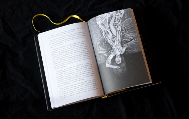 The project was a very open commission from Stephen Hipkiss from Hipkiss Publishing for a complete series of illustrations for Mary Shelley’s Frankenstein. I initiated the project by presenting the idea of publishing Frankenstein as a personal project, with the core objective to illustrate the book and stay true to the original text and the era in which it was written.
How did the initial pitch/brainstorming phase go?
Initiation: The project was initiated by myself, who presented Stephen Hipkiss with the idea of publishing Frankenstein.
Core Goal: My central artistic goal was to create illustrations that would stay true to the original text and the era in which it was written.
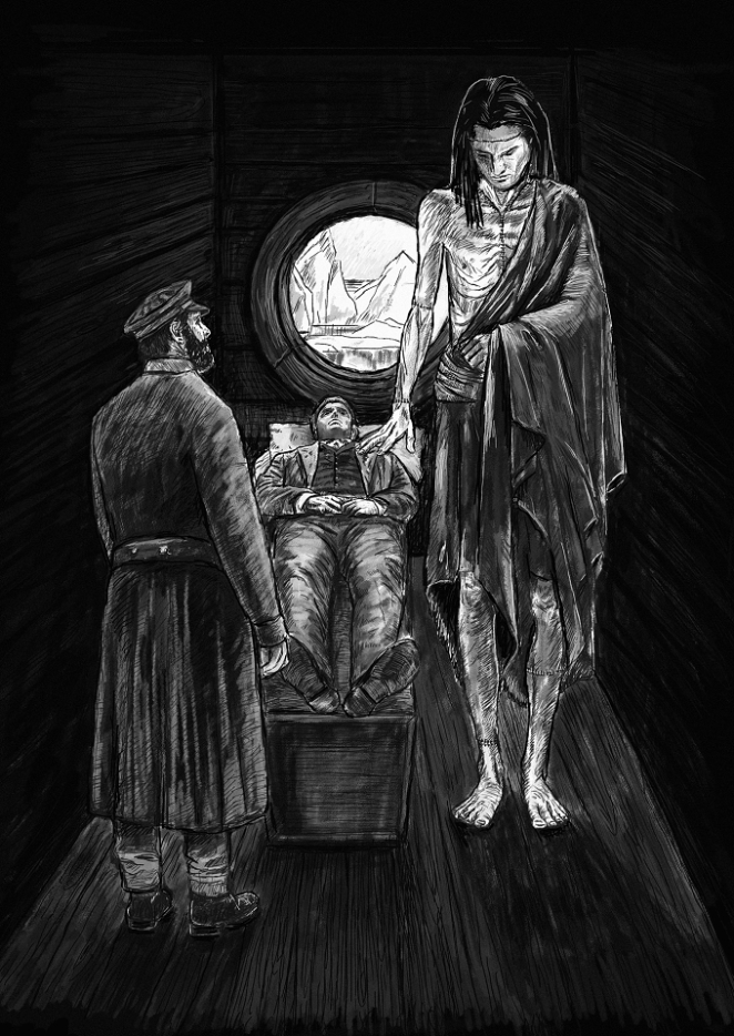
Artistic Study/Inspiration: I studied the dark, expressive line drawing work of masters like Rembrandt and Goya to capture emotional intensity. Specifically, the narrator studied Goya's works, including "The Sleep of Reason Produces Monsters" (or "The Dream of Reason Produces Monsters") and "The Disasters of War".
What was the process behind ideating the concept?
The process involved setting a goal to ignore the Hollywood clichés and dive deep into Shelley's original text to create illustrations that reflect a dark, Gothic atmosphere true to the novel's mood. The artist was heavily inspired by the dramatic, expressive line drawing work of masters like Rembrandt and Goya to capture the deep, emotional intensity.
What kit/tools/software were used to create the project?
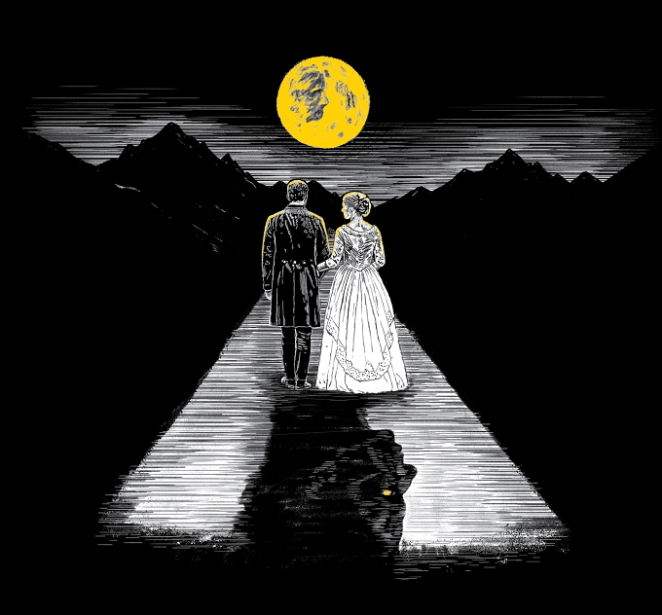 I did most of the roughs on paper and then work in Photoshop using different brush and pen tools to create the illustrations.
What’s the main message of this project and why does it matter?
The main message of the illustrations is to return to the original novel’s core feeling and imagery, away from pop culture tropes, by reflecting a dark, Gothic atmosphere and the deep, emotional intensity of Shelley’s text.
How long did it take from inception to delivery?
The whole process took about 6 months.
Can you describe the creative spark or inspiration behind the initial concept? Was there a specific moment or insight that ignited the idea?
The inspiration was the desire to reflect the novel’s original dark, Gothic atmosphere and the dramatic, expressive work of masters like Rembrandt and Goya for the line drawing style. A key image/motif was the Creature’s “yellow eye,” which sparked the use of yellow on the cover, leading to the yellow lightning bolt design.
How did you ensure that the concept aligned with the brand’s values, goals, and target audience?
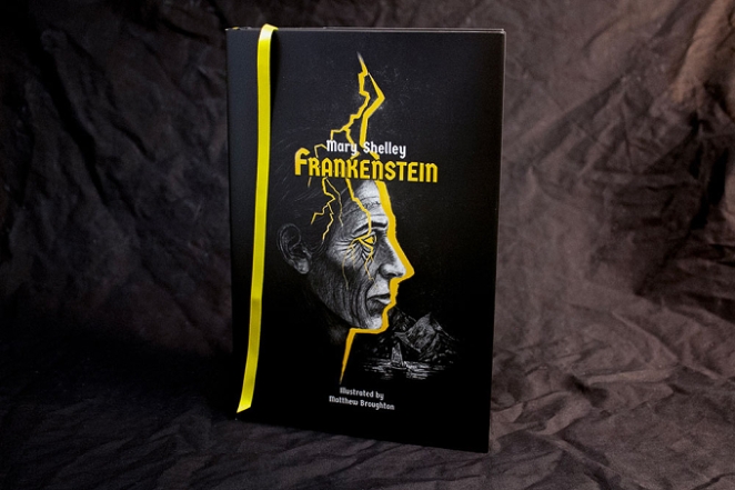 The concept aligned with the goal of presenting a new, textually authentic vision of Frankenstein by focusing on the novel’s original dark, Gothic mood and ignoring Hollywood clichés.
Were there any alternative concepts or ideas considered during the ideation phase? If so, what led to the selection of the final concept?
No
Can you discuss any collaborative or interdisciplinary aspects of the ideation process, such as working with other departments or external partners?
The project was a commission from Stephen Hipkiss from Hipkiss Publishing.
What role did consumer research or market analysis play in shaping the concept and its execution?
This project did rely on consumer research. The creative decisions were driven by the goal to create a beautiful book that had a handcrafted feel.
Can you discuss any unique or unconventional production techniques or approaches used to bring the idea to life?
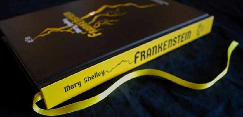
 The book cover and dust jacket are printed with spot UV over the Pantone yellow. The book is hardbound with a yellow bookmark ribbon.
Unique elements include the focus on a line drawing style inspired by Rembrandt and Goya, and the use of the Creature’s chilling “yellow eye” description as the central colour motif (yellow) for the cover design.
How did you ensure that the concept remained innovative and stood out in a crowded marketplace?
The concept stood out by actively choosing to ignore the Hollywood clichés and instead focusing on a faithful, dark, Gothic interpretation of the original text, using a dramatic line drawing style.
What do you hope it achieves for the brand?
I hope to create a book that people would treasure. Beyond this, the project aimed to make Hipkiss Publishing a leader in classic bespoke books within Australia and internationally.
Credit list for the work?
Illustrator/Designer: Matthew Broughton
Publisher: Stephen Hipkiss from Hipkiss Publishing
Printers: Ligare Book Printers