

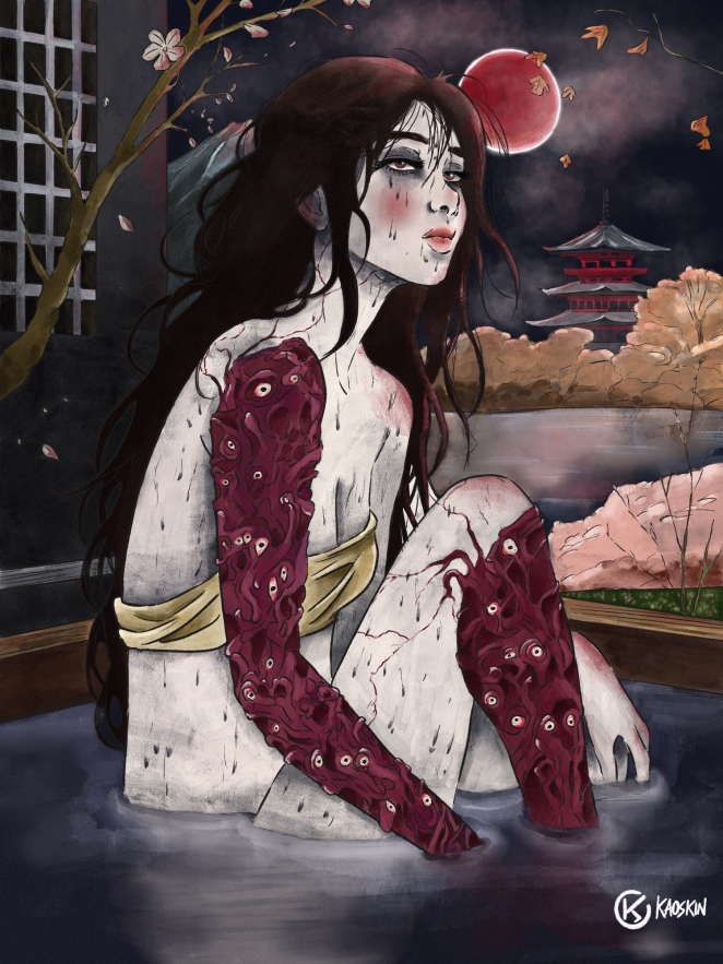
Mattia Ercolani, known as Kaoskin, created this personal artwork to establish a new visual direction for his brand. Focused on minimalism, strong linework and controlled detail, the piece blends traditional Japanese aesthetics with contemporary cyber-inspired elements. Set against a beige paper-like background, the illustration aims to deliver a handcrafted feel within a digital medium.
Through a carefully developed process of ideation, sketching and refined linework in Procreate, Mattia balanced cultural motifs, mechanical structures and character-driven design. The result is a cohesive and recognizable style intended to strengthen Kaoskin’s identity and support future opportunities in editorial, publishing and entertainment.
What was the brief?
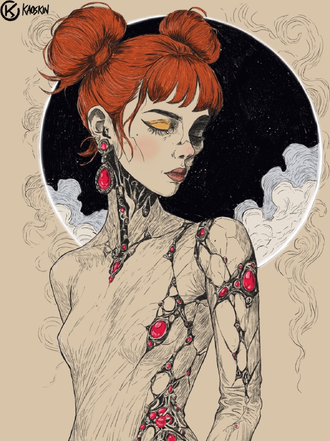 The project was a personal artwork focused on developing and showcasing a new visual direction for my brand, Kaoskin. The goal was to define a unique and minimal visual language, emphasizing strong linework, controlled detail and clean composition.
The artwork was designed on a beige background reminiscent of traditional paper, reinforcing a handcrafted and tactile aesthetic within a digital medium.
How did the initial pitch/brainstorming phase go?
The concept began with a clear intention: to merge traditional Japanese aesthetics with a contemporary cyber-inspired identity. During the brainstorming phase, I focused on the contrast between elegance and artificiality, selecting visual elements such a kimono, symbolic floral patterns and mechanical structures embedded within the character.
I refined the idea by exploring sketches that balanced culture, technology and personality, ensuring the final design remained cohesive and minimal.
What was the process behind ideating the concept?
I defined the character first, focusing on posture, anatomy and silhouette.
Then I selected specific elements that represented both vulnerability and structure: floral details, clean face features and subtle mechanical components. I simplified the overall design to maintain a minimal and readable composition while giving priority to line quality and visual balance. Every choice was made to support a distinct and recognizable style for Kaoskin, with a controlled level of detail that enhances the illustration without overcrowding it.
What was the production process like?
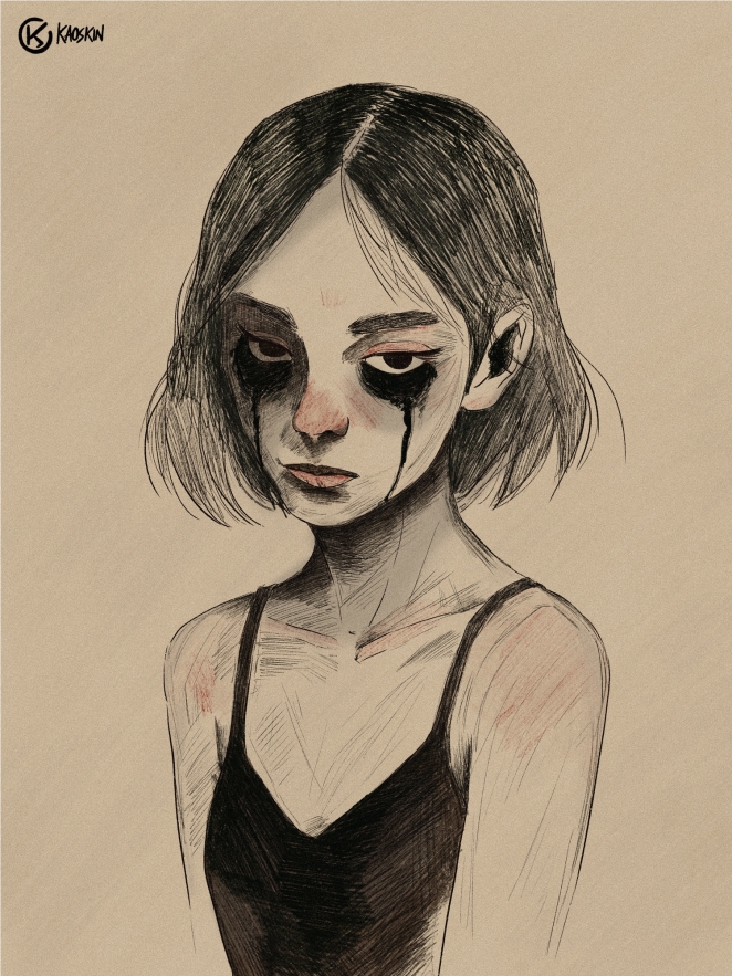
The artwork was created digitally on Procreate, starting with a refined sketch based on anatomical reference. I developed the lineart with textured brushes to achieve precise but organic contours, then added selective areas of shading to control depth while keeping a minimal look. The beige paper-style background and subtle surface texture were applied at the end to support a more traditional feed within the digital medium.
What was the biggest challenge during production? How did you overcome it?
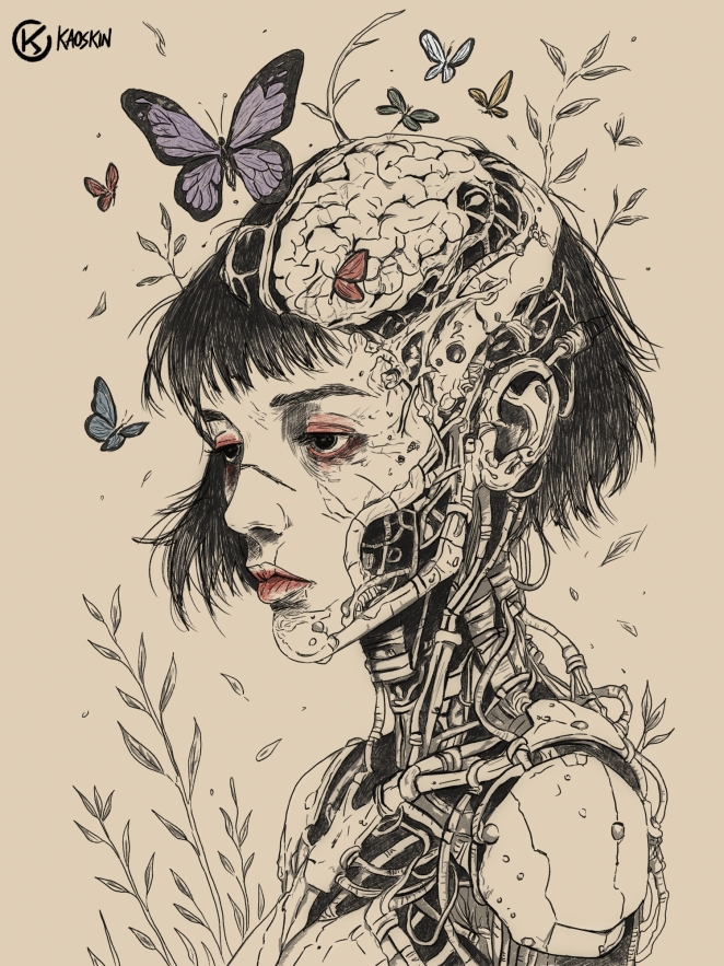 The main challenge was integrating a high number of mechanical details while keeping them visually consistent with the floral motifs and the traditional clothing. To solve this, I carefully planned the placement and scale of each component, simplifying shapes where necessary to maintain harmony and a clean visual hierarchy throughout the illustration.
What kit/tools/software were used to create the project?
The artwork was created in Procreate, on iPad. I used the 6B pencil brush for the initial sketch, Dry ink brush for the lineart to achieve a textured effect and a minimal set of Soft brushes to apply colour accents and light shading. The final texture and paper-like background were also refined within Procreate to preserve a handcrafted aesthetic.
What is one funny or notable thing that happened during production?
At one point, I experimented with a more decorative floral pattern that almost turned the character into a fashion illustration. It was a useful reminder that every detail needed to serve the identity of Kaoskin, not distract from it, so I simplified the elements to maintain a clean an coherent direction.
What’s the main message of this project and why does it matter?
The purpose of the project was to establish a clear stylistic identity for Kaoskin by demonstrating how minimal design, precise linework and controlled detail can still deliver strong visual impact. It matters because defining a consistent and recognizable visual language is essential for presenting a cohesive professional portfolio in the digital art market.
How long did it take from inception to delivery?
 The project required approximately 20 hours of work, including sketching, lineart and final refinements.
Can you describe the creative spark or inspiration behind the initial concept? Was there a specific moment or insight that ignited the idea?
The concept was inspired by two areas I’m strongly connected to: Japanese culture and cyberpunk visual language. I combined traditional clothing and floral motifs with mechanical elements to create a contemporary character design that reflects both influences.
How did you ensure that the concept aligned with the brand's values, goals, and target audience?
The work aligns with Kaoskin’s direction by maintaining a clean aesthetic, precise linework and focus on character-driven design. These elements are consistent with the brand’s goal of presenting high-quality digital illustrations targeted at clients in editorial, publishing and entertainment who look for a distinctive and visual refined style.
Were there any alternative concepts or ideas considered during the ideation phase? If so, what led to the selection of the final concept?
I initially explored different placements and densities of both the floral and mechanical elements. Some early compositions gave too much attention to a single area of the character, so I redesigned the distribution of details to achieve a balanced structure and a more controlled visual impact.
Can you discuss any collaborative or interdisciplinary aspects of the ideation process, such as working with other departments or external partners?
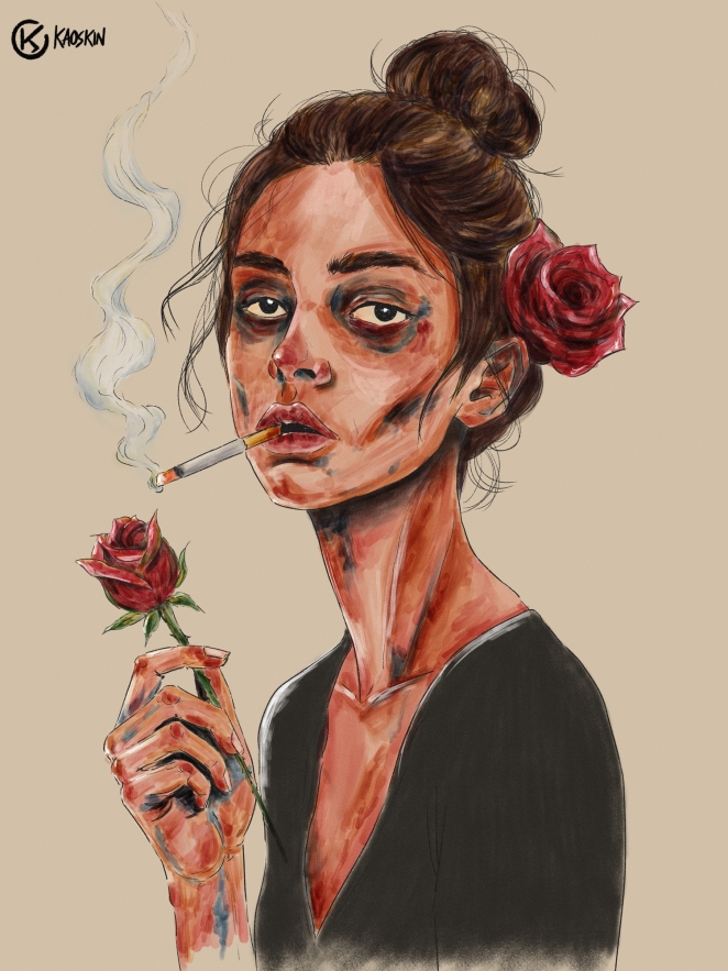 The project was fully developed independently. I handled concept design, illustration and execution myself a s a part of building a consistent visual identity for Kaoskin. No external collaborators were involved.
What role did consumer research or market analysis play in shaping the concept and its execution?
As a personal portfolio artwork, the development did not rely on direct consumer research. However, I focused on creating a visually strong and recognizable style that aligns with current professional expectations in digital illustration and character-focused content for editorial and entertainment fields.
Can you discuss any unique or unconventional production techniques or approaches used to bring the idea to life?
I used a subtractive shading workflow to maintain clean shapes while introducing depth: instead of adding multiple layers of tones, I removed mid-values to reveal highlights. In addition, I used textured lineart brushes to simulate a traditional ink-on-paper look while preserving the precision of digital illustration.
How did you ensure that the concept remained innovative and stood out in a crowded marketplace?
By combining a clean character-driven composition with a high level of controlled detail. The combination of cultural influences and technical elements was developed in a balanced way that keeps the illustration visually recognizable and aligned with the long-term direction of the Kaoskin brand.
What do you hope it achieves for the brand?
 My goal is to strengthen the Kaoskin identity by presenting a high-quality and consistent character illustration. I hope this project will help position my work for collaboration opportunities in editorial, publishing and entertainment and support the development of a recognizable visual direction for the brand.
Credit list for the work?
Concept, illustration and creative execution: Mattia “Kaoskin” Ercolani