

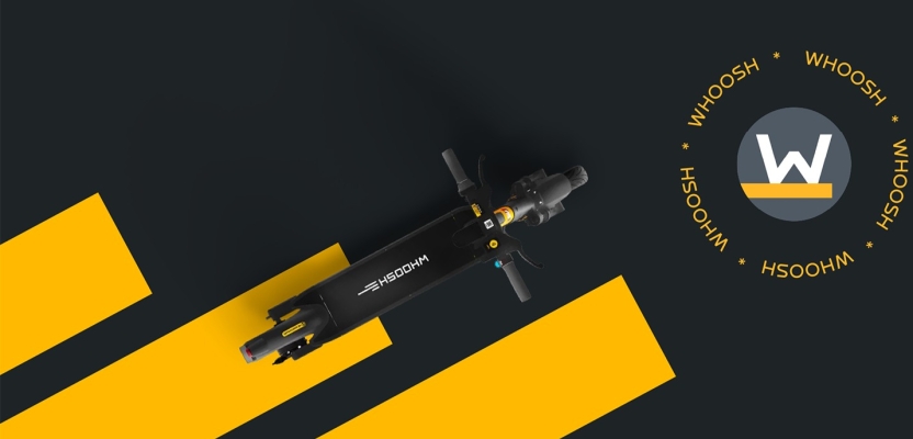

Launching a European micro-mobility brand in Latin America might sound like a cultural leap but for Rosy Duarte, Head of Design at Sherlock Communications, it was an opportunity to blend minimalism with Latin flair. Tasked with building Whoosh’s brand presence from scratch in Peru and Chile, Rosy and her team combined global design standards with region-specific insights to create a compelling social media identity that truly connected with local audiences.
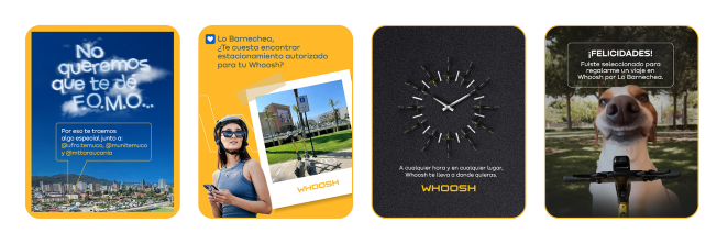
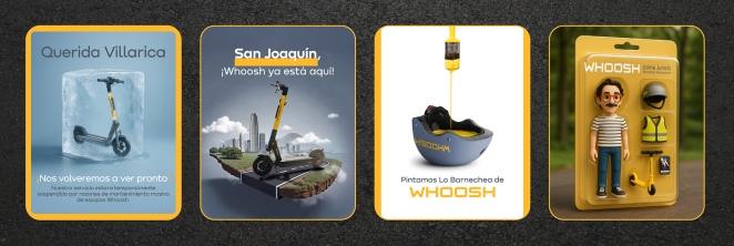
At the heart of the campaign was the challenge of communicating bold ideas through a visual system that leaned heavily on white space and a limited color palette. By carefully adapting the brand’s existing identity and combining it with animated storytelling and vibrant urban energy, Sherlock Communications created a feed that felt clean, modern, and deeply relevant. From photoshoots and illustrations to motion graphics and playful animation, every asset was designed to build recognition and trust.
What began as a blank canvas quickly became a dynamic and visually engaging campaign, ultimately earning public recognition, including the Creativepool People’s Choice Award. In this spotlight, Rosy shares the story behind the design process, the creative risks her team took, and how they successfully translated a brand's global identity into something that resonates with Latin American users on the move.
What was the brief?
Launch a European urban micro-mobility brand in two Latin American markets: Peru and Chile. Working with our content specialists based in Colombia, the team aimed to connect with the target audience, boost engagement, and build a strong brand presence on social media. A continuous content strategy was developed to raise awareness and educate the public on the benefits of smart urban mobility, focusing on sustainability, safety, and innovation.
How did the initial pitch/brainstorming phase go?
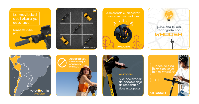
At the start, our social media team identified the content pillars that resonated most with the Latin American audience and used them to structure a strategic calendar to guide the design development. Since the brand’s social media channels in the region were built from scratch, we carefully planned each post to ensure a visually cohesive feed, especially on Instagram, where visual impact is key. For this task, we created a collaborative tracker to align styles, color palettes, and the balance between photos and illustrations, ensuring consistency across posts and forming a unified expression of the brand’s identity.
What was the process behind ideating the concept?
On the design side, we paid special attention to adapting the visual identity for the Latin American market. At first, we anticipated a challenge in aligning the communication with the local audience, as the identity is quite minimalist, with a limited color palette and a predominance of white. However, we managed to find a balance by adapting ideas and assets, gradually shaping a unique personality for the brand’s feed and making it both authentic and relevant to the region.
What was the production process like?
Our team is made up of specialists from diverse fields who complement each other, bringing creativity and innovation to every design. For Whoosh, I brought in motion designers Fabiano Castro and Ana Carolina Barbosa, who gave life to the content team’s ideas through movement, along with the creativity of Jaime Jurado, our Colombia-based expert and a master of AI-powered retouching and compositing. This dream team made award-winning campaigns a reality, including the 2024 Creative Pool People’s Choice on Social category.
What was the biggest challenge during production? How did you overcome it?
Adapting the audiovisual content was an interesting challenge. The brand had two photo shoots, one in Europe and another with a more Latin style, but no videos were available. We used a lot of creativity to combine these images with motion design, transforming static photos into videos that brought the brand’s communication to life. Creating a unique animation identity was an important part of the process. Through study and testing, we achieved smooth and dynamic transitions, animated lettering, and parallax effects that added depth and movement to the landscapes and photos of major cities. All of this was done to connect the movements in the videos with the light and natural flow experienced when riding a Whoosh.
What kit/tools/software were used to create the project?
We made extensive use of Photoshop and Illustrator. After Effects played a key role by bringing the content to life. Initially, we didn’t have any videos to use as assets, so we relied on motion design to make the material more impactful on social media.
What is one funny or notable thing that happened during production?
At first, I imagined a meme-style reel with the scooter floating in space to highlight the product’s indicator lights. The motion designer took the idea to another level, filling the scene with funny floating elements like spaceships, satellites, and astronauts, a true cosmic party. Since we were still testing the client’s boundaries, we set that idea aside and followed a more conservative path, which also turned out amazing. Now, we’re totally comfortable mixing memes and fun into the brand’s communication.
What’s the main message of this project and why does it matter?
In terms of design, the main message has always been to convey urban mobility as easy, sustainable, bold, and stylish. This message reflects the needs and values of today’s audience, who seek practical solutions for getting around the city without compromising environmental responsibility and innovative design. Moreover, communicating these aspects strengthens the emotional connection with the brand, making it more relevant and distinctive in the competitive mobility market.
How did you ensure that the concept aligned with the brand's values, goals, and target audience?
Connecting the essence of the brand to the vibrant rhythm of Latin American cities was a challenge that intrigued us from the start, and it’s precisely this kind of cultural crossover that we specialise in. We deeply immersed ourselves in Whoosh’s values while keeping a keen eye on the flow, aesthetics, and urban dynamics of Latin American capitals. The result of this meeting is a visual and verbal proposal that preserves the brand’s DNA while connecting naturally and authentically with the local streets.
Were there any alternative concepts or ideas considered during the ideation phase? If so, what led to the selection of the final concept?
We aimed to include secondary colors from the palette, which are vibrant and full of personality, to add a special touch to the designs. However, the client preferred to stick to the main palette, which is more limited and features plenty of white. This challenge motivated us to create a visual identity that not only attracts attention but also sparks the desire of Chilean and Peruvian audiences to try the product. The restriction pushed us to find creative solutions capable of conveying emotion even with a more restrained palette.
What do you hope it achieves for the brand?
I see our work as a milestone that not only strengthened Whoosh’s presence in Latin America but also set a standard of innovation and quality that can be replicated in other markets.
Credit list for the work?
Design:
Rosy Duarte
Fabiano Castro
Ana Carolina Barbosa
Jaime Jurado
Content:
Mariana Nadaleto
Esteban Marroquín