

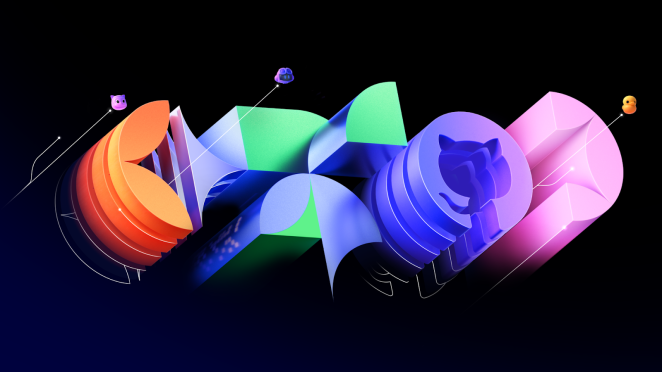
The rebranding of GitHub Universe ’24, spearheaded by BUCK, embodies a celebration of innovation and community. Tasked with crafting a visual identity for "The World’s Fair of Software," BUCK reimagined GitHub’s brand to mark the event’s tenth anniversary. Through a meticulous six-week design sprint, the creative team drew inspiration from iconic World Fair architecture and the dynamic spirit of the coding community. The result? A striking blend of 2D and 3D design elements that not only celebrates the milestones of GitHub’s journey but also sets a visionary tone for its future.
In this exclusive interview, BUCK’s Creative Director, Ward Graumans, and Art Director, Estefan Richter, delve into the creative process behind the rebrand. From brainstorming and design challenges to innovative approaches and behind-the-scenes moments, the team shares how they turned GitHub’s vision into a compelling visual narrative. Join us as we uncover the story behind "Monuments of Progress" and explore how this project bridges creativity, technology, and community.
What was the brief for the rebrand?
- BUCK and GitHub have been friends for a while, collaborating on a variety of projects from films and campaigns, to visual design systems and event branding.
- After teaming up on the branding for GitHub Universe ‘23, we were asked to craft a visual design system for the ’24 edition - The World's Fair of Software.
- As the tenth GitHub Universe, our challenge was to create a look that celebrates this milestone as well as the event’s progressive spirit.
- The brief was to build on the existing brand while elevating it to new heights for this special occasion and look beyond to make parts of the design system an evergreen toolkit.
How did the initial pitch/brainstorming phase go?
- We set out on a six week design sprint that was part research, part concepting, and part exploration.
- In weekly updates, we shared creative territories, designs, and directions with GitHub, their design studio and the external Universe production partners.
- This helped us to quickly land on a concept and visual direction to explore in design further and enabled all collaborators to take our ideas and designs to their own team and project in an early stage.
Describe the purpose of the brand and its target audience
- Over the years, GitHub has developed from an open source platform for the developer community to a state of the art, enterprise-building AI-powered developer platform.
- GitHub is a future forward brand with big ambitions, but they always stay true to their original community (and GitHub character).
- The combination of an enterprise audience and a developer community leads us to fun directions and conversations. It’s an invitation to go BIG, but stay true to the brand at the same time.
What was your thinking behind the rebranding solution?
- In our design sprint we explored various directions that could elevate GitHub’s existing brand elements.
- The event’s theme ‘The World’s Fair of Software’ sparked tons of ideas, from iconic minimal to playful maximal.
- Inspired by World Fair architecture from past decades and the vast array of products and projects that exist thanks to coding, we defined our rebrand as ‘Monuments of Progress’.
Did you learn anything new during the project?
- This project had different workstreams and timelines which required a smart and flexible approach. By being open, transparent, assertive and collaborative, we could deliver what we aimed for and approach any issues in early stages.
What kit/tools/software were used to create it?
- We kickstarted this project with a creative workshop where the BUCK team stepped away from the screen to engage with themes of progress and code.
- One particularly intriguing aspect was the incorporation of GitHub's scalable grid into our designs, which effectively bridged our physical creativity with the digital realm.
- Landing on the concept of Monuments of Progress, we wanted to bring our ideas to life in an epic 3D realm with 2D elements, in both design and animation.
- The whole project has been an ongoing back and forth between Illustrator, Photoshop, After Effects and Cinema 4D.
What details are you most proud of and why?
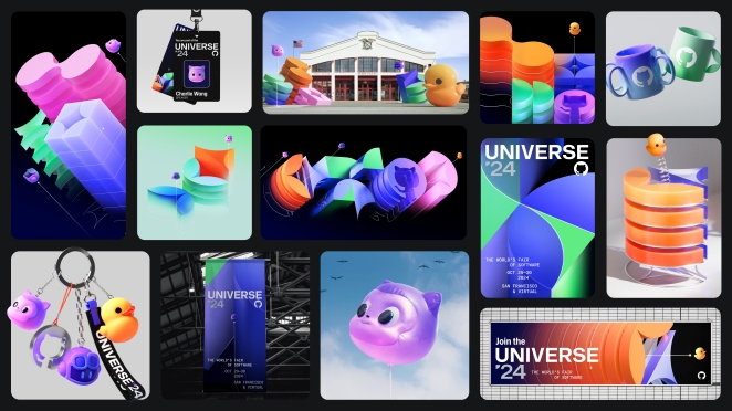
- The static design work has loads of gems and beautiful details. The subtle nods to code in typography, the treatment of color, the crops and layouts.
- The animation featured in short bumpers, speaker cards and an opening film brought the idea ‘from code to reality’ to life.
What visual influences fuelled your solution?
- The event’s theme of World Fair Architecture and Identities sparked a lot of ideas for our team and were a big inspiration for design, layouts, crops and assets. We were keen to bring those iconic design principles to a new era.
What do you hope it achieves for the brand?
- The design and animation system we created for GitHub Universe ‘24 was a celebration of all things GitHub. The event looked amazing!
- Through Universe ‘24, GitHub showed up as a future-forward company with the heart of the developer. We hope that spirit and design language stays part of the brand’s visual identity.
How do you ensure consistency in brand messaging and visual identity across various channels and touchpoints?
- We defined a few core brand elements as part of our visual language - the GitGrid and the GitLines - that helped to tie the project together.
- This is where all shapes, layouts and animations started from. It was the base of our brand guide that helped BUCK, the inhouse design team and external collaborators to show up in similar ways.
What role did consumer research or market analysis play in shaping the direction of the rebrand?
- We relied on GitHub’s input and knowledge of their audience and community and our own research and learnings from contributing to previous GitHub projects.
Can you discuss any innovative or unconventional approaches you took in developing the rebranding solution?
- Every designer and animator has that moment where they (literally) put a pen to paper. For a brand rooted in technology, it was an extra refreshing approach to start ‘analogue’.
- Our initial workshop sparked loads of ideas, conversations and design concepts, which you might not expect looking at the end result.
Were there any unexpected insights or discoveries about the brand that emerged during the rebranding process?
- After many collaborations, the odd ‘curveball’ is expected and helps us make the idea, the story, the design even better, and therefore help the brand stand out.
How did you ensure that the new brand identity resonated with the brand's existing audience while also attracting new ones?
- We’ve added some easter eggs in our visual language to always connect to the original GitHub audience: the developer community.
- We introduced the Rubber Duckie in the ‘What is GitHub?’ film, a reference to a phenomena called Rubber Duck Debugging, used by developers. This has become an icon to salute the community.
- There are also more subtle nodes to coding, contribution graphs and other GitHub projects like when their Co Pilot flies by.
Can you share any behind-the-scenes anecdotes or memorable moments from the rebranding project?
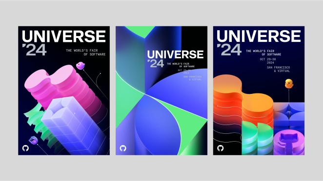
- Inspired by coding screens we started out in ‘dark mode’ designs. Dark backgrounds, bright and shiny monuments. We added some ‘light mode’ designs, too, for web purposes.
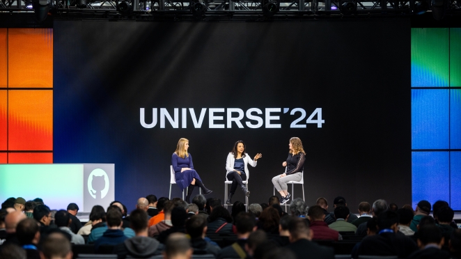
- The event venue, Fort Mason in San Francisco turned out to have a lot of daylight in the presentation room. This encouraged us to think of a way to use our ‘light mode’ designs more often, for legibility’s sake and made the whole project more optimistic and fun.
- It’s one of those ‘happy accidents’ where you have to let go of the initial plan to find out it only makes the project better.
How do you ensure consistency in brand messaging and visual identity across various channels and touchpoints?
- Set up clear guidelines in the first phase of work and have all conversations needed with all collaborators to pivot and adjust where needed.
What would you do differently if you could do it over again?
- Nothing. we’d take the same plunge, with the same people, into the same GitHub Universe anytime.
Credit list for the work?
Executive Creative Director
Vincent Lammers
Creative Director
Ward Graumans
Art Director
Estefan Richter
Executive Producer
Chance Woodward
Producer
Katie Liston
Bénédicte Gold-Dalg
Design
Yana Abramova
Bernd Bousard
Brian Hermelijn
Jonas Nunes
Matheus Sakita
Sandro Rybak
2D Animation
Daniel Rodrigues
Joe Brooks
Jardeson Rocha
Adrián Doménech
Fabien Rousseau
Tomasz Czajka
Greta Sennekamp
Otilija Morozait
John Stewart
3D
Joao Rema
Will Burkart
Esther Beije
Jonas Nunes
Florent Porta
Doma Harkai
Modeler
Saskia Bulletti
Music & Sound
Antfood
Magma