

When Starbucks decided to break new ground in China’s fiercely competitive ready-to-drink (RTD) market, they weren’t just launching another beverage; they were creating a premium brand identity that blends coffee and tea into a unique coffee-tea hybrid. Enter Marks, the global design agency tasked with crafting an innovative RTD packaging design that would elevate Starbucks’ position and resonate with China’s new wave of healthy hedonists.
The result? A bold, tactile bottle and premium RTD packaging solution that tells a visual story of East meets West, tradition meets modernity, and tea meets coffee.
We caught up with Danny Lye, Vice President, Creative, Greater Asia at Marks, to learn how his team reimagined Starbucks RTD packaging, overcame design challenges, and delivered a standout product in the RTD category in China.
What was the brief for the design?
The brief was to create a premium brand identity for Starbucks’ ‘Tea-Coffee', a highly innovative addition to the RTD (ready-to-drink) category in China, through a visually striking bottle structure and label for both dairy and non-dairy tea-coffee products.
While the bottle had to meet the aesthetic preferences of the target audience, the brief required a design that maintained a cohesive family look with the existing Starbucks RTD portfolio.
How did the initial brainstorming phase go?
We explored three creative territories to shape the identity. The first, which we named "Refined Authenticity", focused on simplicity and elegance to highlight premium ingredients and craftsmanship. The second, "Opulent Delight”, leaned into sensory indulgence and richness, and the third, "Creative Fusion”, blended influences from East and West for a bold, modern vibe.
"Refined Authenticity” was agreed as the final route, as it aligned best with the brief by showcasing authenticity and premiumness while standing out sharply in the market.

Describe the purpose of the brand and its target audience
Tea Coffee was introduced to redefine the boundaries of RTD by merging premium coffee with the finest Chinese teas. It was also about elevating Starbucks’ presence in the category while introducing the coffee-tea hybrid to the mainstream, helping build the brand’s association with quality ingredients and innovative offerings.
We identified the key target audience, whom we call “healthy hedonists”. These are Gen Z and young professionals, aged 18-35, who crave authentic ingredients, innovative flavours, and a balance of health and indulgence. They’re trendsetters who value self-expression, creativity, and contemporary yet uncomplicated experiences. We wanted the design and the product to speak directly to their aspirations.
What was your thinking behind the design solution?
The design needed to be engaging on multiple levels, so we leaned heavily into visual storytelling and structural innovation under our "Refined Authenticity" concept. The result was a beautiful interplay of simplicity and elegance that conveys Starbucks’ commitment to quality and innovation.
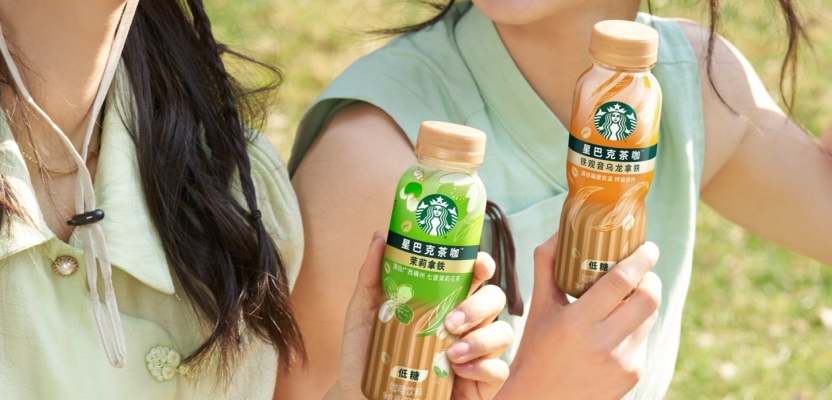
Every design decision aimed to captivate our audience while differentiating the drink in an extremely competitive market. For example, the merging of two worlds, tea and coffee, was portrayed through the elegant, graduated twist in the bottle structure, creating a beautifully tactile experience in the hand, representing the blending process of the drink itself.
Did you learn anything new during the project?
Starbucks shared their initial consumer research with the team early in the project which, when supported by our online social listening in the Chinese market, helped us nail down the target audience, explore key insights and visual cues from the category, and also map the competition in RTD to define a unique positioning for Starbucks.
Being a global agency, we were able to have a dedicated team on the ground in China, who used consumer insights and cultural semiotics, alongside social listening and qualitative research.
These two core streams of information found that visual cues in the category were evolving, from function-led to emotion-led, which helped us define our “healthy hedonists”.

What was the biggest challenge? How did you overcome it?
Being tasked to understand the category with the intention of innovating and disrupting was a really energising challenge for the team. Especially in a category as crowded and competitive as RTD, there was so much for the team to explore and pull from.
The next challenge came when translating our design intent onto the bottle through technology and engineering. Our 3D designers iterated with a number of different ridges for the bottle to ensure we had the best combination when sculpting the final bottle design.
What kit/tools/software were used to create it?
We had design teams collaborating in both the UK and China on the project, so it was vital for us to utilise collaborative platforms like Miro to share and review concepts in real time, in one place.
What details are you most proud of and why?
We’re really proud of the tactility of the bottle structure, the textured base, and the translucent label design, which speaks to the RTD convenience.
The ingredient graphics elevate the design and speak to the origins and quality of the product, with colours that were carefully selected to complement the touches of gold across the label. All of these details work together beautifully to signify the blend of coffee and tea, while creating a premium experience.
What visual influences fuelled your solution?
We pulled from a lot of the emerging trends in the RTD market, and the shift from function-based visuals to modern, emotional storytelling that was previously mentioned. Tactile patterns, calligraphy-inspired design elements, and contemporary minimalism played a big role in shaping our approach.
Our illustration work was inspired by the real ingredients used in the product, which helped to bring a sense of elegance and refinement to the final design.
What do you hope it achieves for the brand?
We hope the launch will be a true game-changer for Starbucks in the RTD category. Our goal was to help drive sales, introduce the coffee-tea hybrid to the mainstream, and elevate Starbucks as a leader in innovation, quality, and authenticity.
And the ultimate goal is that ‘Tea-Coffee’ will resonate with the Chinese consumer in a way that feels fresh, exciting, and meaningful.
How do you ensure consistency in brand messaging and visual identity across various channels and touchpoints?
First and foremost, the design had to immediately read as a Starbucks product to consumers. It was crucial that it aligned seamlessly with the brand's existing RTD portfolio, so we integrated shared branding elements like the logo, colour palette, and the hierarchy of information.
At the same time, we introduced refreshing premium details to help ‘Tea-Coffee’ carve its own identity while still feeling like part of the Starbucks family.
What role did consumer research or market analysis play in shaping the direction of the rebrand?
Starbucks conducted online research to identify to select the best design route. We worked with them to apply a shopper approach to ensure the packaging design has strong shelf stand out, and that the colours were both appealing and differentiated.
This research was foundational to the project and manifested in a number of ways. It informed everything from the height of the product (to ensure cohesion with the rest of the RTD portfolio) and the readability of information, to the copy around ingredient origin and taste descriptors and ergonomics of the bottle design.
Can you discuss any innovative or unconventional approaches you took in developing the rebranding solution?
Using the translucent label combined with a textured bottle structure was one of the more daring decisions we made. It’s not something you see often in the RTD market, and it allowed us to create a one-of-a-kind sensory and visual experience. The colour variants and the use of gold throughout were designed to convey the blend, almost like the ingredients are dancing on the pack.
The way the bottle invites touch and reveals the product itself was carefully designed to feel innovative and premium.

Were there any unexpected insights or discoveries about the brand that emerged during the rebranding process?
We already knew that the team at Starbucks were big innovators, but this project confirmed the level of care and respect they bring to everything they do.
Marrying coffee, a traditional ‘Western’ bean, with the tea leaves of the ‘East’ really is a celebration of Starbucks’ relevance across both global and local markets – and it was great to see how seriously they took it. The tea leaves used were sourced from the best plantation in China, which demonstrates their commitment to quality and willingness to make their consumers proud.
What would you do differently if you could do it over again?
We were really proud of what we achieved within the time we were given. Through close collaboration with the client, research and development, and manufacturing teams, we were able to reach a final product that all parties were happy with.
As the product rolls out, we’ll be continuing to work with the client to monitor the reception and look for areas that can be improved further in future rounds of development.
Credit list for the work?
Our Creative, Strategy and Client team included Peter Lam (Regional Creative Director) and our Art Directors, Rhoda Chan and Jill Chan, from concept to finalisation.
Lawrence Lee (Senior Design Production Manager) provided production expertise, while Stella Tung (Senior Strategist) brought insights and trends together to uncover new white spaces for the RTD brand.
Simon Newbegin (Design Director 3D), Mark Armstrong (Design Director) brought design aesthetics, technical expertise and engineering together. Last, but not least, Celine Rao (Account Manager) tenaciously drove our partnership with Starbucks forward, with more exciting work ahead.