
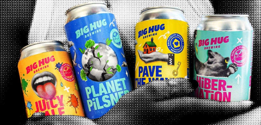

Big Hug Brewing has always been more than just another craft beer brand. With its tagline “Brewing for Better”, the company set out to create drinks with purpose, balancing flavour with a social conscience. But as the brand grew, its story became fragmented, and the playful personality that made it unique risked getting lost in the noise of the crowded craft beer market.
To address this, Design Director Dan Bowstead of JDO Global and his team set out to create a bold new identity that captured both the heart and eccentricity of Big Hug Brewing while bringing clarity and consistency across packaging, online platforms, and storytelling. The result is a rebrand full of riotous colour, optimism, and a unified brand hierarchy that celebrates both people and planet.
What was the brief for the rebrand?
Big Hug Brewing wanted a brand identity that put their social cause and positive impact at the forefront while maintaining their playful personality. The aim was to develop a cohesive visual identity that could work seamlessly across packaging, online platforms, storytelling, and brand hierarchy for clarity and consistency. “It’s an amazing brand that wasn’t clearly communicating its story,” says Dan. “It felt fragmented and lacked a true brand system with their main message getting lost. Our job was to define their personality, retain their eccentricity and bring order to the chaos.”
How did the initial pitch/brainstorming phase go?
From the outset, the team connected with Big Hug’s purpose. “We shared a vision early on for bold, riotous colour and an optimistic tone,” Dan recalls. “They gave us full license to explore a new direction, which was exciting and energising. It felt like we were revolutionising what they already had but keeping it fresh and relevant for a saturated craft beer market.
Describe the purpose of the brand and its target audience.
Big Hug’s purpose is summed up in its tagline: brewing for better. The target audience is socially conscious beer drinkers aged 25–45 who value both flavour and purpose. The brand appeals to loyal craft beer fans as well as newcomers drawn to ethical products. “Part of the challenge was defining that purpose, so it felt perfectly in sync for both the audience and the client,” says Dan. “We wanted positivity front and centre - brewing for better people and planet.”
What was your thinking behind the rebranding solution?
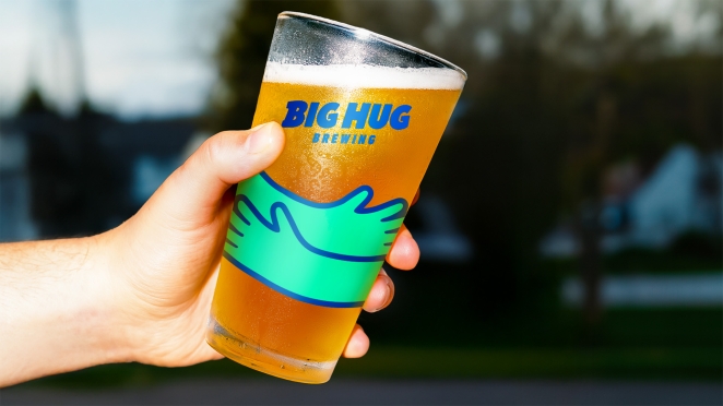
The strategy was to lead with purpose and make it visible. The team radically change Big Hug’s identity moving from the initialism BHB to Big Hug Brewing putting the unique brand name front and centre. “We wanted something optimistic, bold and full of dynamism, but also clean, immediate and human,” Dan explains. “That came through in the logo’s imperfections and bold bespoke typeface, with its upward trajectory, symbolising positive outreach”.
Did you learn anything new during the project?
Dan describes it as “a deeper understanding of balancing brand design with purpose” and highlights the value of working closely with the founder. “With bigger clients, there can be a disconnect, but here it was an equal partnership. The process was truly collaborative.”
What was the biggest challenge? How did you overcome it?
“The biggest challenge was staying true to the eclectic style the history of the brand while , bringing order and consistency” says Dan. The solution was a unified brand look that still felt playful.
What kit/tools/software were used to create it?
The rebrand was a full in-house effort, involving illustrators, designers, retouchers, and both 2D and 3D animation to elevate the brand.
What details are you most proud of and why?
Dan points to the cohesive brand hierarchy that now works across all touchpoints, paired with a playful yet purposeful tone that feels authentically Big Hug.
What visual influences fuelled your solution?
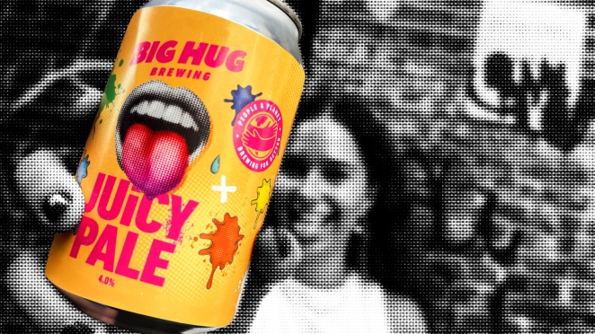
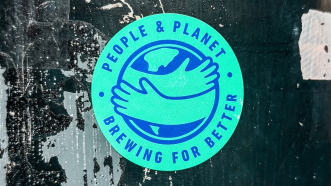
The brand itself, the work drew on the brands historical use of halftone illustration leaning into that slightly anarchic, DIY look and feel whilst continuing it keep it contemporary and consistent across the portfolio. “It’s a celebration of colour. Energetic, poppy, and positive,” says Dan.
How do you ensure consistency in brand messaging and visual identity across various channels and touchpoints?
Making sure the touch points where considered from the very beginning of the project, they weren’t just simply and add on at the end, Dan explains that the brand has a strong tone of voice, typographic style, and visual look - foundations that didn’t exist before.
How did you ensure that the new brand identity resonated with the brand’s existing audience while also attracting new ones?
Familiar elements were retained for brand recognition, but the architecture was strengthened so all products felt part of the same family. “We wanted to tell more of the story that wasn’t being communicated before, with positivity at the core”.
Can you share any behind-the-scenes anecdotes or memorable moments from the rebranding project?
A standout moment came when the whole team, including the founder, gathered to taste beers, discuss the brand, and explore his personality, vision, and journey. “That’s when the insight really clicked.”
What would you do differently if you could do it over again?
“I’d bring the client into the design process even earlier. More collaboration makes for an even smoother process.”
Credit list for the work?
Design: Dan Bowstead
Production: Chloe Platt
Visualising: Petter Ogren
Strategy: Rachael Skingle
Retouching: Svala Ragnars
2D animation: Bex Edwards
Client Partnership: Alex Bridger-Wood