
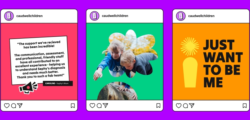

Tom Mitchell, Design Director at Brandon Consultants, led the visual identity redesign for Caudwell Children, an organisation dedicated to empowering disabled and neurodivergent children. The brief centred on aligning the charity’s new purpose with a fresh visual language built around a powerful idea: every child is born with their own unique potential. Drawing on a long-standing relationship between Brandon Consultants and Caudwell Children, Tom and his team were entrusted with translating this purpose into a visual brand world that remained authentic, uplifting, and deeply connected to the charity’s mission.
Over several months, Tom and his team explored how the concept of “Potential” could be expressed across consumer, cultural, and category contexts, eventually developing the now-distinctive “i” brand asset—a symbol of individuality, personality, and the unique journeys of every child. From extensive research and interviews to close collaboration with Caudwell Children’s internal team, the project became a blend of insight, creativity, and intention. The result: a design system that puts children at the heart of the brand while ensuring clarity, accessibility, and differentiation in a crowded charity landscape.
What was the brief?
Caudwell Children is a charity dedicated to empowering disabled and neurodivergent children. Having developed a new brand purpose built around a simple yet powerful idea – that every child is born with their own unique potential – Caudwell asked us to develop a visual brand identity that aligned with this ambitious new direction. We know the Caudwell team well and care deeply about the work the charity does, so this was a dream project for us to collaborate on.
What was the process behind ideating the concept?
We started by digging into what the idea of ‘Potential’ could look, sound, and feel like for Caudwell Children, breaking it down by the different contexts that the brand exists in: Consumer, Cultural, and Category.
We eventually landed on two different creative territories. The first was all about Growth; the growth of the beneficiaries’ potential from within, and how something seemingly small can become hugely fundamental for individual growth and development.
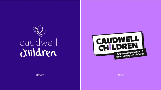
The second territory focused on championing the uniqueness of the individual and achieving their own unique potential. This was the chosen route, and at the heart of it was the new ‘i’ key brand asset. More than just a lowercase ‘i’ in our new logo and type treatments, we transformed it into a positive visual representation of the unique potential and personality of every child to symbolise thriving growth, and shining a light on each child’s individual journey.
What was the biggest challenge during production? How did you overcome it?
The biggest challenge was to create a visual world that represents the children that the charity supports, whilst also resonating with all of the other audiences that the charity needs to communicate with – parents and caregivers, donors, corporate partners, volunteers, and so on.
What’s the main message of this project and why does it matter?
Ultimately, children with additional needs want to feel more comfortable in their day-to-day interactions with the world, but it can often feel like there is pressure on them to change or pretend to be something they’re not. Caudwell Children’s mission is to empower disabled and neurodivergent children to reach their own unique potential, and our redesign needed to reflect this.
How long did it take from inception to delivery?
We took the original brief in April 2025 and delivered the final assets and guidelines at the end of September 2025. Caudwell’s internal team then took the new visual brand identity and ran with it, launching a new website and campaign in October 2025.
Can you describe the creative spark or inspiration behind the initial concept? Was there a specific moment or insight that ignited the idea?
Part of our initial research phase involved gathering insights from interviews with parents and children associated with the charity. This gave us an invaluable look into the world – and the people – we were designing for. A couple of soundbites from these interviews still stick in my mind:
“The world needs to change, not my child.”
“He wants to do things. I don’t want to be the one holding him back.”
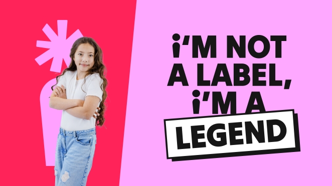
A key learning from this phase of work was understanding that the children didn’t want to be labelled. Instead, they wanted the opportunity to discover who they truly are – and their potential – themselves.
How did you ensure that the concept aligned with the brand's values, goals, and target audience?
We worked very closely with our primary client, Mike Harper, Director of Marketing & Communications at Caudwell Children, right from the outset.
Mike provided a very clear brief and a list of objectives that needed to be achieved by the redesign. These included clear visual differentiation from competitors, shifting away from the more corporate feel of the previous brand into a warmer and more human space, developing a new logo and flexible iconography style that would work across different channels and contexts, and providing clear design guidelines that take accessibility into account. Most importantly, however, was to put the children at the heart of everything.
Can you discuss any collaborative or interdisciplinary aspects of the ideation process, such as working with other departments or external partners?
Our relationship with Caudwell Children goes back a few years, so we had already built a strong relationship with the team and had a good understanding of how we could best collaborate with them. From an internal perspective, several members of our team working on the project have first-hand experience of neurodiversity, whether themselves or family members, and I think that added an extra layer of knowledge and understanding throughout the process.
How did you ensure that the concept remained innovative and stood out in a crowded marketplace?
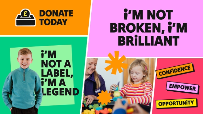
The charity sector is an extremely visually busy space, and design codes are continually recycled across different types of charitable organisations.
We did a deep dive into competitors, broader charity design trends, and also what Caudwell Children had done in the past. We constantly cross-referenced what we were doing with these findings, ensuring that we carved out a unique future for the brand through ownable visual, verbal, and photography approaches.
What do you hope it achieves for the brand?
Our hope is that this rebrand not only elevates national recognition of Caudwell Children and the amazing work the charity does, but also empowers both new and continuing beneficiaries by giving them a stronger voice and the confidence they need to reach their full potential.
It was also our aim to provide Caudwell’s in-house team with a flexible, easy-to-use visual identity system and assets that they could seamlessly roll out across any touchpoint. Feedback since delivery has been overwhelmingly positive, and Mike and his team are bringing the Caudwell brand and mission to life in a beautifully clear, consistent, and always inspiring way. Job done.
Credit list for the work?
Brandon Consultants
Tom Mitchell, Design Director
Amber Cheyne, Senior Designer
Charlie Hurst, Senior Designer
Anna Tolstoluzhska, Brand Strategist
Gabby Blake, Account Manager
Ben Marshall, Creative Director
Tim Leonard, Head of Strategy
Richard Colson, Client Partner
Caudwell Children
Mike Harper, Director of Marketing & Communications