
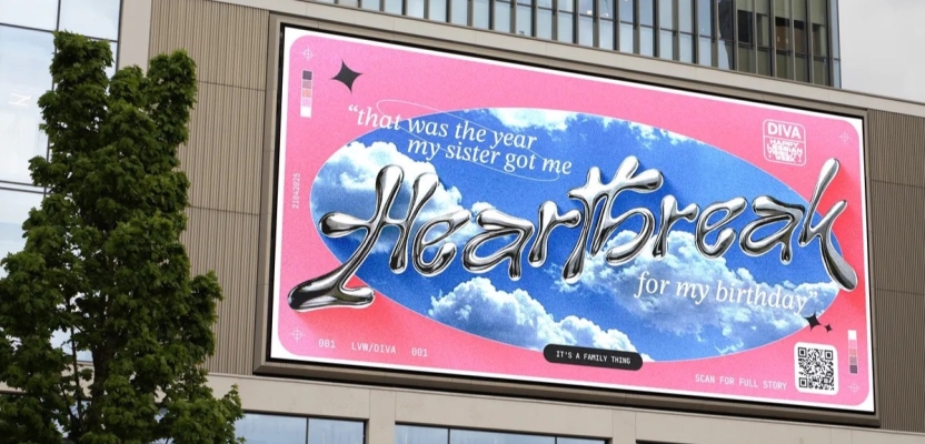

For Lesbian Visibility Week 2025, Grey London didn’t just create a campaign—they built a celebration. Tasked by DIVA to spotlight Rainbow Families, the agency’s queer-led team tapped into something universal: the stories that make families, of all kinds, feel real. Trading glossy perfection for candid humour and heartfelt memories, they crafted a deeply human series of visuals and narratives that remind us (loudly and joyfully) that family is family, no matter what it looks like.
In this exclusive behind-the-scenes look, creatives Bee Pahnke, Gnome Taylor, and India Smith unpack the idea, the process, and why sometimes Plan B ends up being exactly what the world needs.
What was the brief?
Founded by DIVA patron Linda Riley, Lesbian Visibility Week (LVW) has been celebrated globally since 2020. It exists to increase lesbian visibility and champion LGBTQIA+ women and non-binary people.
After the success of our work celebrating previous editions, DIVA, the world’s leading media organisation for LGBTQIA+ women and non-binary people, asked for our help celebrating LVW 2025.
This year, DIVA’s theme for LVW was Rainbow Families - families with LGBTQIA+ members. Whether that’s same-sex parents, queer children, trans aunties, guncles (gay uncles), non-binary cousins or even a queer chosen-family, Rainbow Families come in all shapes and sizes and are as varied as the LGBTQIA+ community itself.
DIVA wanted to build bridges between queer and non-queer people, by making rainbow families visible and relatable.
What was the process behind ideating the concept?
The brief’s most important part was showing connections between families from different communities in a joyful and celebratory manner. We began brainstorming the things all families have in common, where the commonalities lay between our own families, and things everyone could relate to.
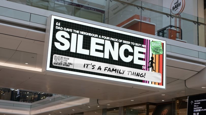
Through that, we naturally started to share our own funny family anecdotes. We found so much joy sharing these stories, even though they were about people we’d never met.
What was the production process like?
This was a fully in-house production led by our crew of queer women and non-binary folks. Embraced by the entire design department and supported by the agency at large, this work is a testament to our own rainbow family.
In previous years, we’ve collaborated with third parties and often wore multiple hats. This year however, the project was established as a dedicated job. We worked closely with the social and strategy team during creative development and the design and business affairs team throughout production. We also maintained regular comms with our exec team to help elevate the work. Securing DE&I support – especially during a time when such backing can be uncertain – has been extremely uplifting.
We’re also incredibly grateful to WPP Unite for staying closely involved, as they have in years past. Special thanks to Matthew Chew from EssenceMediacom who led the media effort and helped secure national screen placements, with generous support from Thanh Catachanas at JCDecaux.
What was the biggest challenge during production? How did you overcome it?
Our original idea was to gather old family photos from the LGBTQIA+ community to demonstrate that everyone has the same embarrassing moments regardless of sexuality. Unfortunately, it proved difficult to get these photos for a variety of reasons (such as photos being buried in the depths of a parent's house!).
Luckily, we had a plan B – written stories, which quickly became our preferred option. It meant we could really lean into the design, typography and storytelling without the worry of low-quality imagery and a stack of signed consent forms.
What kit/tools/software were used to create the project?
Our legendary designers used Illustrator and Photoshop to create the concepts; with a little bit of help from WPP Open’s AI, of course.
What’s the main message of this project and why does it matter?
The campaign’s primary message was to celebrate that all families, no matter what they look like, have more in common than they do differences. That message is so important especially now, where pockets of society push for division and try to highlight the differences between us. Despite all of that, love is love, and family is family. Whatever yours looks like – it’s a family thing.
How long did it take from inception to delivery?
We began creative development in February, which gave us a generous lead time ahead of the April 9th delivery date. However, timelines tightened when our original creative direction didn’t yield the desired results, prompting us to shift to Plan B.
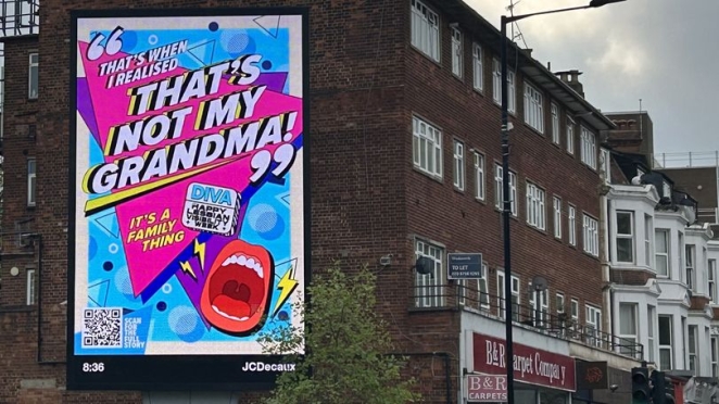
This left us with just over two weeks to source stories, design, and complete the artwork. It was tight with tracking the different creative styles alongside maintaining brand identity across the board, but we kept the team close and collaboration strong.
Can you describe the creative spark or inspiration behind the initial concept? Was there a specific moment or insight that ignited the idea?
The client always wanted a joyful campaign, even with such an important message behind it. In the first briefing, the idea came naturally based off our own experiences of being members of the LGBTQIA+ community.
Regardless of our sexuality, we could all relate to similar embarrassing family moments and use humour to spread joy regardless of gender, identity, race or religion. Just telling each other these stories made it clear that our idea needed to be rooted from here.
How did you ensure that the concept aligned with the brand's values, goals, and target audience?
The target audience differs slightly from that of DIVA’s magazine. While the magazine primarily serves LGBTQIA+ women and non-binary people, this campaign was designed to be more inclusive and engage non-queer audiences.
The creative was developed to reflect DIVA’s ongoing mission (championed through their Rainbow Families theme) to build bridges between communities, challenge stereotypes and create a broader understanding of diverse family structures. By centring around authentic stories and voices, the campaign remained rooted in the brands ethos while maintaining relatability to encourage empathy and allyship.
The only required branding element was the DIVA logo, which allowed for variety in each execution. This enabled a richer and more diverse set of visuals, offering more opportunities for audiences to see themselves represented – aligning beautifully with DIVA’s celebration of diversity. What’s brilliant with these stories is you don’t need to know the family structure to find joy in them.
How did you ensure that the concept remained innovative and stood out in a crowded marketplace?
What we loved about DIVA was that they didn’t have brand guidelines, which allowed us to be creative. They trusted us, which meant we could tailor each story to a different era, by using different fonts, colours and styles.
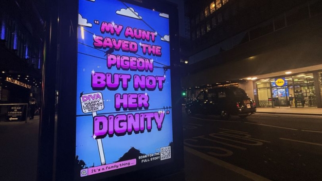
This made every bit of creative feel beautifully different and let them shine on their own stage instead of competing; all whilst giving our design team the freedom to design with their own unique style and skills.
What do you hope it achieves for the brand?
We hope it starts conversations about the things we have in common, but also our own favourite family stories! We hope the queer community feels celebrated, and the people who had preconceptions of us feel a spark of connection.
Credit list for the work?
Grey London
Creative: Bee Pahnke, Gnome Taylor.
Production: India Smith.
Project Management: Monisha Sansoa.
Design: Chris Chapman, Sarah Burns, Ty Zall, Kit Suman, Ollie Flux, Matthew Sankey, Tommy Haste, Tobi Adeyemi, Christine Kawasaki-Chan, Ricardo Stoco.
Social: Harriet Phillips, Lewis Holman, Jennifer La.
Strategy: Asad Shaykh.
Business Affairs: Sarah Scarlett.
Special thanks to: Conrad Persons, Jonny Tennant-Price, Tarek Sioufi, Lindsay Macintyre, James McNichol, Peter McKenzie Jones and Caitlin Horrex.
Essence MediaCom
Matthew Chew.
DIVA
Nancy Kelley, Ella Gauci and Yasmin Vince.
JC Decaux
Thanh Catachanas
Westfield Rise
Chris Lynham