
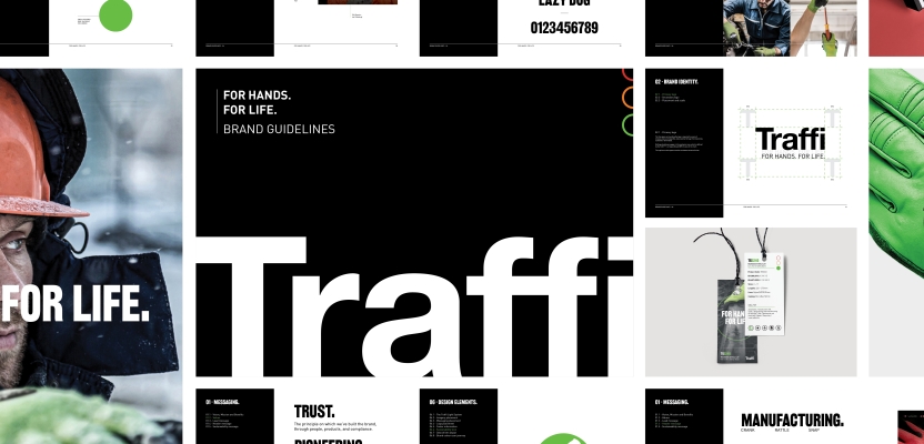

Lancashire-based brand agency SUN has collaborated with PPE leader Traffi to overhaul its visual and verbal identity, which now includes a new typographic system, iconography and sustainability logo.
Around 60% of the UK workforce wear protective gear for their jobs, so the PPE market is huge. Traffi is one of the leading providers of industrial safety gloves, catering to everything from the challenging environments of construction and the complexities of manufacturing to the specialised needs of the utilities, infrastructure, and automotive industries.
The company needed a new brand to prepare it for a future of global growth while showcasing its continued commitment to innovation in this space. SUN was recommended to them via a network of experienced marketing directors with whom the agency has worked for several years.
We spoke to SUN founder and creative director Jamie Kelly to learn more.
What was the brief for the rebrand?
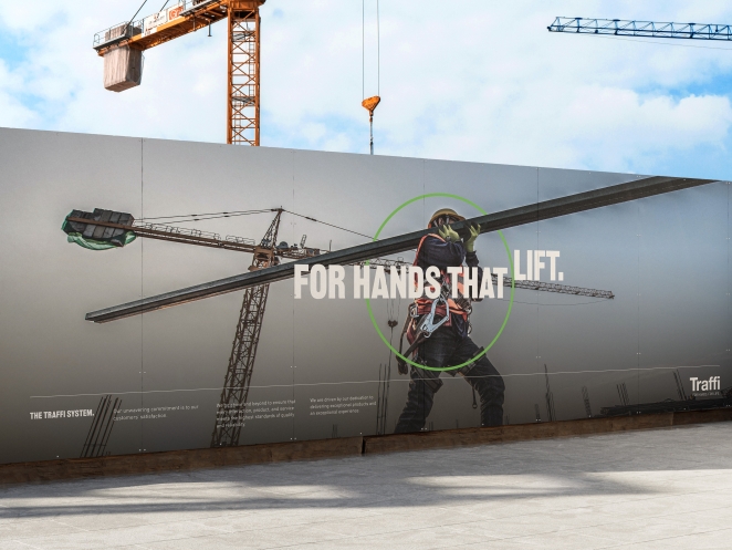
The brief was to modernise and refine Traffi’s visual and verbal identity, ensuring it reflects the company’s reputation as a leader in safety glove technology. The new brand needed to highlight Traffi’s commitment to innovation, sustainability, and customer service while positioning it for future growth in the UK and global markets. It was crucial to retain the brand’s existing equity while enhancing its presence across digital and physical touchpoints.
How did the initial pitch/brainstorming phase go?
Every stage of our process is highly collaborative. We worked closely with Traffi to understand its history, market position, and ambitions. Through workshops and research, we explored what made Traffi unique – its pioneering Traffic Light System, its sustainability leadership, and its deep sector expertise. From there, we developed a brand strategy that balanced continuity with evolution.
Describe the purpose of the brand and its target audience
Traffi exists to protect hands and empower workers by delivering high-quality, innovative safety gloves. Its target audience includes businesses across construction, manufacturing, automotive, and chemical industries – anywhere that high-performance hand protection is critical. The brand serves both safety managers responsible for compliance and frontline workers who depend on reliable gloves every day.
What was your thinking behind the rebranding solution?
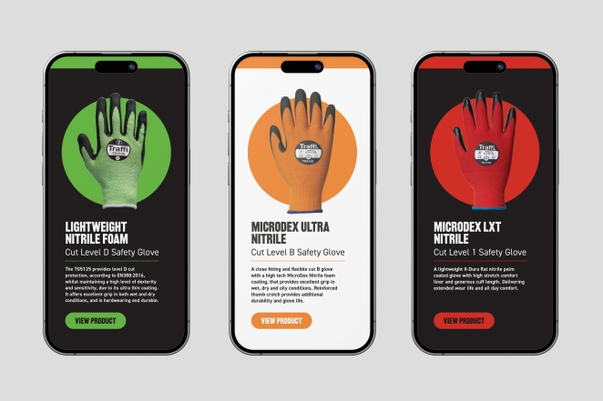
We wanted to build on Traffi’s strengths – its heritage of innovation, customer-centric approach, and sustainability credentials – while creating a more modern, cohesive identity. The reintroduction of the colour-coding system reinforces the unique Traffic Light System, ensuring instant recognition. The new messaging framework – Trust, Innovation, Collaboration – puts the customer at the centre of the brand, and visually, we created a system that is bold, clear, and adaptable across all channels.
Did you learn anything new during the project?
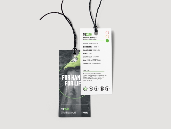
One key insight was just how deeply customers value Traffi’s sustainability credentials. While innovation and safety have always been at the forefront, we were made aware of the growing demand for eco-friendly PPE solutions. This reinforced our decision to integrate sustainability messaging more prominently into the brand identity.
What was the biggest challenge? How did you overcome it?
The biggest challenge was evolving the brand while maintaining the recognition and trust it had built over the years. To address this, we took an iterative approach – strong initial research, gathering feedback, and refining details to ensure the new messaging and visual language felt like a natural progression rather than a radical shift.
What kit/tools/software were used to create it?
The rebrand was developed using industry-standard design and animation software, including Adobe Creative Suite (Illustrator, Photoshop, InDesign, After Effects) for visual assets and animated sequences. Copywriting and messaging strategy were developed through workshops, research and strategic frameworks.
What details are you most proud of and why?
The refined use of the Traffic Light System in the visual identity is a standout element. By integrating the cut level colour-coding system more prominently across collateral, we’ve reinforced Traffi’s signature innovation in a way that is instantly recognisable and functionally useful. It was crucial that the traffic light system played a central, but not dominating, role in the visual language and we were mindful of getting this balance right so it was clear that it was a product coding system and not a product or brand hierarchy.
The sustainability iconography is another key element, helping customers easily identify eco-friendly products.
What visual influences fuelled your solution?
We drew inspiration from high-impact, functional design – clarity, simplicity, and usability were key principles.
What do you hope it achieves for the brand?
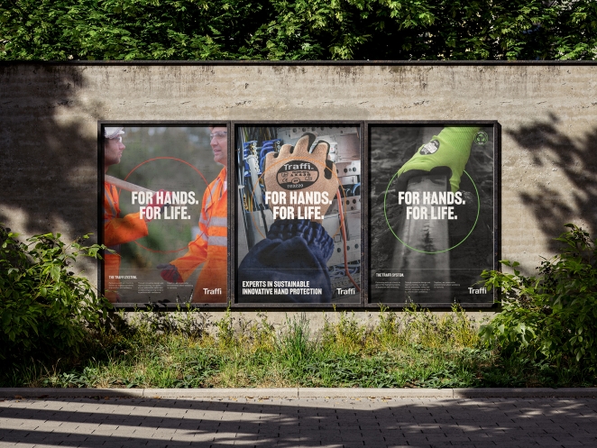
The rebrand aims to cement Traffi’s position as the leading innovator in safety gloves, making it the go-to brand for businesses in key target sectors prioritising safety, sustainability, and quality. It also enhances brand consistency, making Traffi’s messaging and visuals more recognisable across existing and new target markets.
How do you ensure consistency in brand messaging and visual identity across various channels and touchpoints?
We developed a comprehensive brand guidelines document covering typography, colour usage, iconography, tone of voice, and application across digital and physical materials. A brand workbook to be used for onboarding and internal training also helps to ensure consistency.
What role did consumer research or market analysis play in shaping the direction of the rebrand?
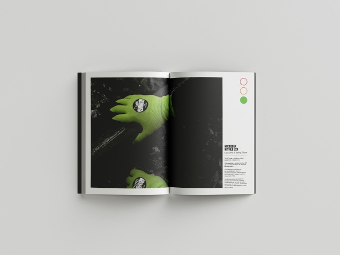
Market analysis highlighted a growing demand for sustainable PPE solutions and clear, easy-to-use safety guidance. Customer feedback reinforced the value of the Traffic Light System and the importance of trust in product performance. These insights shaped our approach, ensuring the brand evolution aligned with customer needs, and the messaging was specific to the key sectors in which Traffi operates.
Can you discuss any innovative or unconventional approaches you took in developing the rebranding solution?
Rather than a total departure, we focused on a strategic evolution – keeping key brand assets while refining them for greater impact. The integration of sustainability messaging and the use of sector-specific ‘language’ allowed Traffi to position themselves as experts in the sectors they currently operate in, and which they are targeting for future growth.
Were there any unexpected insights or discoveries about the brand that emerged during the rebranding process?
One discovery was the extent to which Traffi’s customers saw the brand as a partner rather than just a supplier. The level of trust and reliance customers place on Traffi reinforced the decision to centre the brand’s messaging around Trust, Innovation, and Collaboration.
How did you ensure that the new brand identity resonated with the brand's existing audience while also attracting new ones?
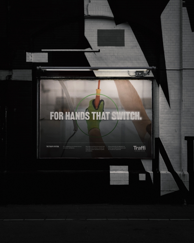
We maintained core brand elements – such as the Traffic Light System – while refining the identity to feel more modern and relevant. The messaging was designed to speak to both existing customers who value reliability and innovation, as well as new audiences looking for sustainable safety glove solutions.
Can you share any behind-the-scenes anecdotes or memorable moments from the rebranding project?
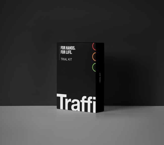
One particularly memorable moment was seeing the first physical prototypes of the new sample kit packaging. Seeing the refined colour-coding system and sustainability icon in a real-world application made the impact of the rebrand tangible.
What would you do differently if you could do it over again?
Every rebrand presents opportunities to refine the process. If we could do it again, we might incorporate more real-world user testing earlier in the process – getting direct feedback from safety managers and actual glove users to fine-tune the sector specific messaging even further.