
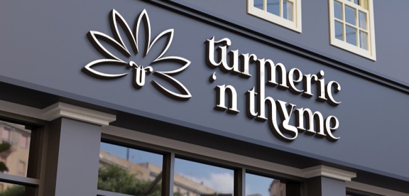

What started as a simple college assignment has transformed into a passion project years later for graphic designer Rhaby K. Originally tasked with creating a logo and packaging for a deli called Turmeric ‘n Thyme, Rhaby revisited the concept with fresh eyes and a deeper vision.
This time, the goal went beyond just visual identity. The rebrand sought to capture the warmth of a “home away from home” dining experience while also championing sustainability and eco-friendly design. By weaving natural patterns, personal storytelling, and a human-centered approach into the brand, Rhaby created a holistic identity that speaks to both heart and planet.
What was the brief?
This was actually a college brief. A few moons ago, we were tasked to create a logo and packaging for a deli called Turmeric ‘n Thyme. Several years later, I’m going through my portfolio, and I realise that I really like this concept, and I’d like to keep it, but it needs a facelift. Fast forward, here we are. So I’d say it turned out to be more of a passion project.
How did the initial pitch/brainstorming phase go?
Since initially, in college, we were tasked to create a logo and packaging, I had limited the brief solution to about four elements: a single logo and three packaging elements. The concept was patterns in nature. A few years later, I decided that I didn’t just want this to be a logo and packaging thing; I wanted it to be an actual brand, with a personality. A restaurant and deli setup. That’s how we got here.
What was the process behind ideating the concept?
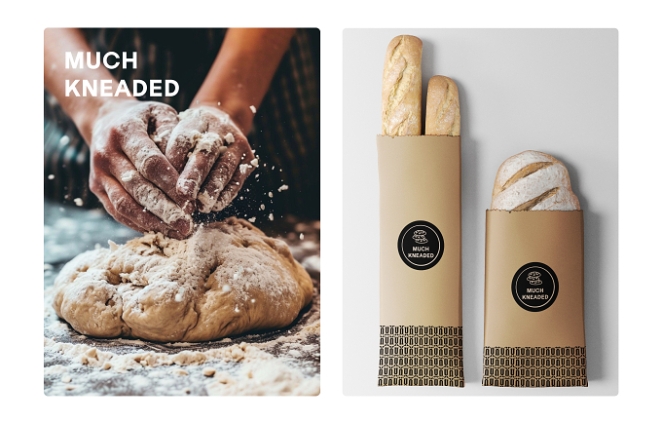
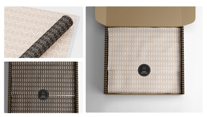
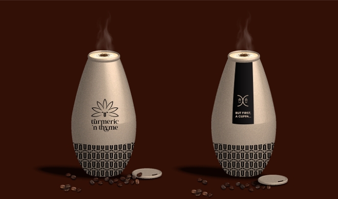
It was important that the brand felt like a personal experience for the patrons. To feel effortlessly interwoven into their daily lives, a feeling of a home away from home. I started researching the relationship between food and patrons, the relationship between food and visual design, and how the two tie in together. Another really important aspect of the design was that the packaging had to be sustainable and environmentally friendly.
What was the production process like?
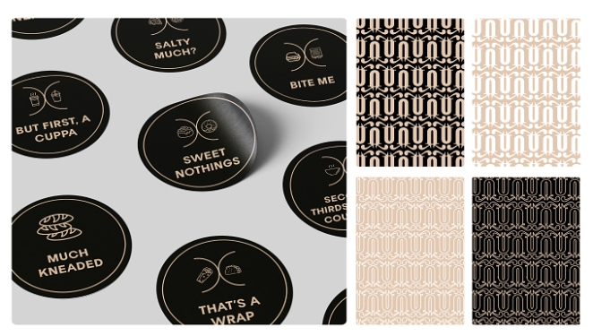
It was both exciting and unnerving. I wanted to make sure that the concept came through and stuck: a comfortable, loved, and trusted space where friends could meet and share stories about whatever was going on in their lives. Maybe for some, a quick sit, unwind, and reset space. With that, I also thought a bit of humour would lighten the experience and leave a smile on everybody’s face. If I could do that, then I would have won.
What was the biggest challenge during production? How did you overcome it?
Making sure that what was in my head translated well and flowed naturally with the brand. For a moment I had forgotten, but my superpower here was that I too am human. I have had experiences, and I know what a comfortable home away from home should feel like and what elements are necessary to make that translate. That, along with studying social media and what makes diverse people tick, helped a lot. Another challenge was the aspect of sustainable and environmentally friendly design. My knowledge in that area had to grow pretty fast; research became my best friend.
What kit/tools/software were used to create the project?
The underrated and sometimes easily unmentionable pen and paper (although less glamorous these days, we can’t forget those), Adobe Photoshop, Illustrator, After Effects, social media, and the internet in general.
What is one funny or notable thing that happened during production?
Since this project was a facelift and didn’t have a strict list of deliverables, the more elements I added, the more I wanted to add. I had to stop myself at some point and remember that it was still important to have a set completion timeline.
What’s the main message of this project and why does it matter?
Brand versus logo. I think often times, even when approached by clients, graphic designers are asked to just design logos, but for any visual identity to be whole, we need to start looking at businesses as brands, not just a logo, and educate our clients about the importance of this approach. This way, we’re able to help clients navigate aspects relating to part of their client-facing communication strategy long after the off-boarding process. So instead of “let’s just design a logo and packaging,” how about we look at designing something a little more holistic? A brand. Also very important was using the brand to promote sustainable design. We cannot emphasise enough the importance of design that reduces adverse effects on the environment, society, and economy over the course of its life cycle to satisfy current demands without endangering the capacity of future generations to satisfy their own.
How long did it take from inception to delivery?
About a few weeks, with days in between where my focus was on other projects with deadlines that were looming much closer.
Can you describe the creative spark or inspiration behind the initial concept? Was there a specific moment or insight that ignited the idea?
The name of the brand set the direction. I knew from the name that the brand had to have a grounded, natural feel to it. Modern, but grounded.
How did you ensure that the concept aligned with the brand's values, goals, and target audience?
By constantly keeping in mind the intention of the brand, the overall experience and feeling the brand set to achieve.
Were there any alternative concepts or ideas considered during the ideation phase? If so, what led to the selection of the final concept?
Yes, the initial ideation phase was limited to specific elements; the focus was on deliverables. The final phase was focused on a more holistic approach, an experience rather than just an end product.
Can you discuss any collaborative or interdisciplinary aspects of the ideation process, such as working with other departments or external partners?
The most collaboration that happened was research; the internet acted as an educational partner, and social media was both a research and experience partner. :)
What role did consumer research or market analysis play in shaping the concept and its execution?
A big role. To know how to create an experience, it’s important to know who you are creating the experience for and what they lean towards. If not, you run the risk of talking past them or maybe even having visual language miscommunication
Can you discuss any unique or unconventional production techniques or approaches used to bring the idea to life?
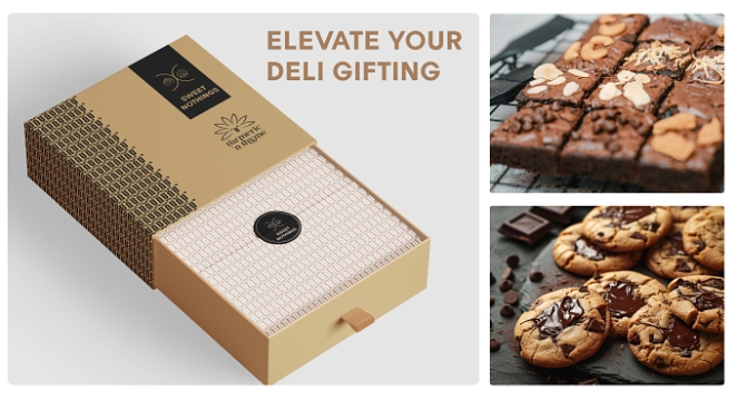
I wouldn’t necessarily call it unconventional, but the visual concept of the logo draws inspiration from the literal forms of turmeric and thyme plants. These botanical elements are translated into typographic features: a curvy ligature with varied thickness between the “h” and “y” evokes the tangled roots of the plants; an extended stroke connecting the “h” to the “m” suggests the upright stem of turmeric; and the organic, expressive crossbar on the “t” resembles sprouting thyme leaves. These metaphorical touches bring a sense of growth and natural rhythm to the design.
How did you ensure that the concept remained innovative and stood out in a crowded marketplace?
By keeping it personal. Not necessarily personal to myself, but human-centered. Instead of focusing on a detached, mass-production, and product-focused process, it was more about the idea of giving a personal experience to every patron. A lighthearted, almost conversational approach that gave it that feeling of a home away from home.
What do you hope it achieves for the brand?
I would hope that a brand of this nature captures its target audience and maintains a growth trajectory. That it lives up to its intention for the patrons and also encourages other brands and society to promote sustainability through its own continued practices.
Credit list for the work?
I would credit the internet and social media; it’s through information gathered in these spaces that this project was successfully completed. And of course, my former college—it is after all a college brief that got us here.