Craig Francis
Creative Director & Freelance Artist
ABOUT
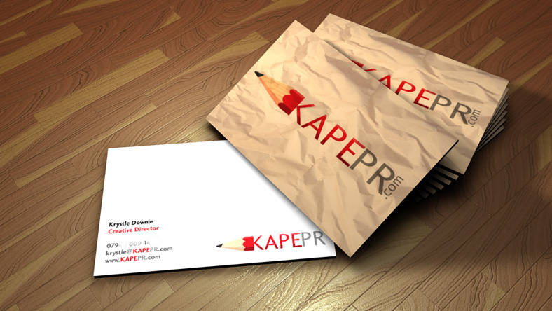
The brief was to develop a clean logo which incorporated a pencil in the logo to show the creative side of this small SME. Another requirement of the logo was to include a the colour red.
I began by sketching out a few designs and submitting the initial ideas to the client.
The selected idea was then developed refined to what you see here.
Once the logo was signed off I then began designing the business cards to compliment the design.
Initially the reverse of the design had a plain white back ground, but the client requested a crumpled paper effect.
Once completed I generated a 3D visualisation on how the finished business card would look once printed.