Contra
London
ABOUT
Since the birth of colour film, filmmakers have manipulated colour to tell their stories; whether it be the the cool tones of a bleak wilderness in The Revenant, the vibrancy of La La Land or the powerful, selective use in Schindler’s List, colour has a profound effect on our psyche.
Danielle Feinberg, director of photography at Pixar, describes herself as “color obsessed” (TED Talk: The magic ingredient that brings Pixar films to life). “I think about it nonstop,” she said. “Lighting and color are part of the backbone of emotion.”
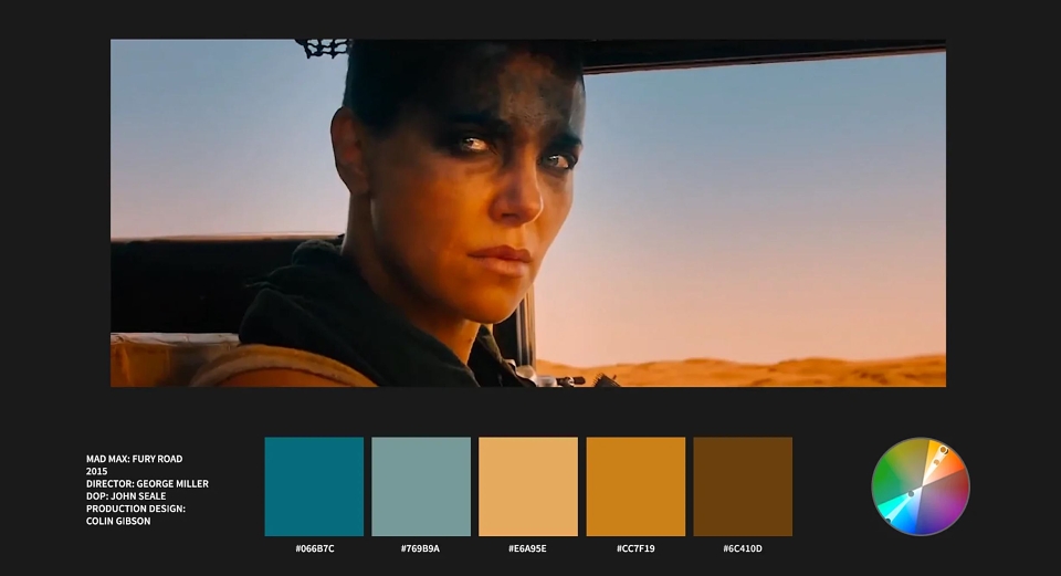
Of all the techniques in colour theory, one of the most effective and frequently used is that of Complementary Colours. The method of pairing the principle colour with that directly opposite it on the colour wheel. Red with green, yellow with purple and the current blockbuster favourite, orange with blue.
Using opposing colours creates a stark contrast that you can use to separate a character from the background, draw attention to something specific or contrast motivations of characters.
As well as being a useful storytelling device, complimentary colours are scientifically proven to look good together (as the name suggests). Colours on opposite sides of the spectrum simultaneously stimulate different parts of the eye and this balance gives an especially pleasing aesthetic.
Achieving this effect on film is particularly difficult with so many different elements and roles that affect the colour pallete. Synchronicity is vital between the lighting, production design, costume design and grade to create this distinct look.
Check out this video of some of our favourite uses of complementary colours in cinema.
John Jeanes, senior editor Contra Film