Conor Hughes
Student
ABOUT
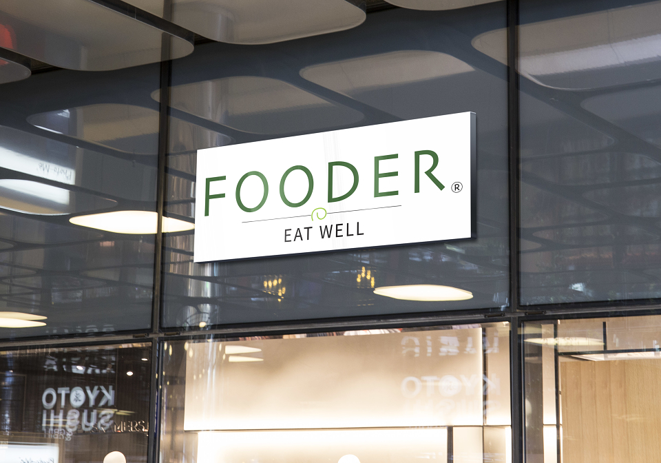
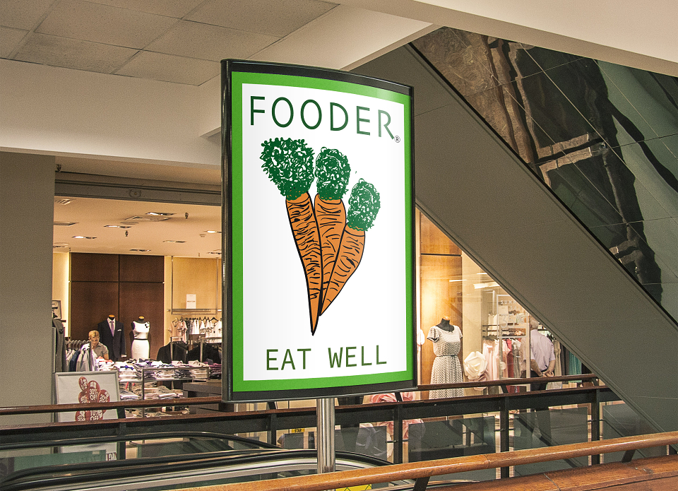
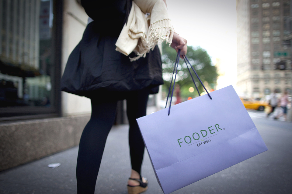
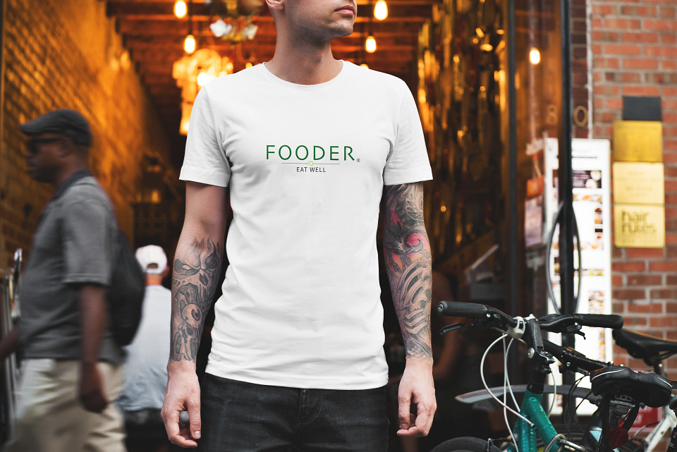
When I was handed the topic of perception I was at first puzzled in what I could design simply because perception was such a massive topic meaning so many different things. However, after a bit of research on perception its self I soon got to grips with what I wanted to design and this is what I came up with, "Fooder".
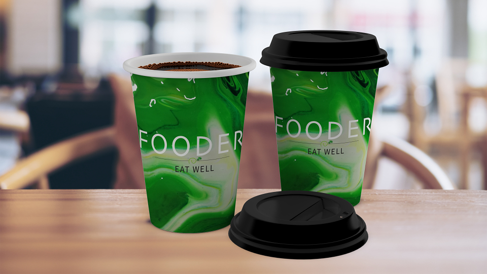
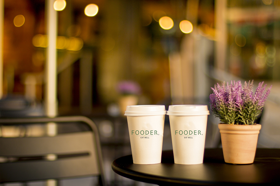
Fooder is a brand which I created and designed and I took a lot of inspiration from other existing fast food brands such as EAT and Leons. I wanted to create an upmarket fast food brand which would sell pure, fresh, healthy food. Therefore, I would say that my target audience would be city worker, or anyone really wanting to eat healthy food where they can grab and go as quickly as possible. Throughout my design work you will notice that colours like green and white are used quite frequently and this is because I wanted my design work to look clean as I felt that this would reflect my company quite well. Green would portray a healthy lifestyle because it is colour which could be associated with natural things and foods like salad which are good for you. The white finishes of the clean look at makes my design work look neat.
MADEIT CREDITS
-

Conor HughesGraphic Designer