Col
Lead brand / Visual designer
ABOUT
The Goodplace case study.
My role: User Experience designer, Brand Designer, User interface designer & Marketing Designer. Software used: Adobe XD, Sketch, Adobe Photoshop, Adobe Illustrator, Figma, Invision & Canva.
About the GoodplaceMental well-being is very important to me, as for years I have suffered personally from Anxiety. In order to help alleviate some of the symptoms of Anxiety, I have come to learn what works and doesn’t work for me. In my quest of finding peace within my mind and body I have tried everything from meditating, counselling through to boxing.What brought about the Goodplace? In my quest of trying to find somewhere that I could get help during the pandemic I realised that a lot of the focus of Mental Wellbeing startups focused purely on Counselling. Counselling is a great thing to do, but if you don’t have access to the NHS (that subscribes you to Mind), counselling is very expensive, especially if you are dealing with a lot of trauma. What I found that helped my mental situation is Meditation, Fitness, Eating well, reading positive or inspirational books and the right kind of music, hence the idea of the Goodplace was born.
Process
Research from competitor research to user evolutions including questionnaires asking mental health sufferers and mental health workers ranging from therapist to doctors for guidance and the do's and don'ts of mental health.White boarding and brain storming to find out what is the key benefits. Wireframes both in paper and pencil through to base level wireframes.Designing the branding and the app and user interface. High fidelity designsPrototype the app.A/B Testing
Research
Who did I research?There was a split of 50/50, 50% mental health sufferers and 50% counsellors, therapists and psychologists. This was done to give a balance because someone that works with mental health may have a different view to someone that suffers mental health issues.
How did I research?Competitor research and doing deep diggings into their processes & sending out questionnaires.
The competitionCurrently the markets of the mental health app section it’s over flooded. Whilst doing research I investigated six competitors ranging from Headspace, Calm, Betterhelp, Mynurva, Thrive, and Mind. Each of these offerings gave different variations on mental health on how to calm.HeadspaceHeadspace was primarily concentrated on meditation.Calm. Calm offered variations of meditation stories and music.Betterhelp. Better help offered online counselling support.Mynurva. Mynurva offered online counselling and various mental health documents.Thrive. Thrive offered various mental health packages via other support systems, but lacked any full cohesive process. Mind. Mind offered variants of mental health support including cancelling and online documentation.
FindingsThe findings were that there were no cohesive documents or apps that truly tackled the extent of mental health and how we could relate that into a lifestyle. Each app determines its own function and keeps to its own lane. Currently there are no mental health apps that tackle mental wellbeing, rather they focus on one thing rather than looking at the complexities of mental health.
ConclusionTalking to many people that specialise within the Mental Health space, when researching especially within the market leaders Calm & Headspace, there was a distinct pattern with their branding, it was very childlike. When I interviewed the Mental Health specialist, one of the questions I asked is why the branding in Mental Wellbeing is so childlike, their response was that most mental health issues occur as adults, and showing the illustrations in bright colours that are infantile reverts the psyche back to childhood, which is a place that many find a safe space and one where the mind opens up more.
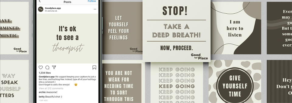
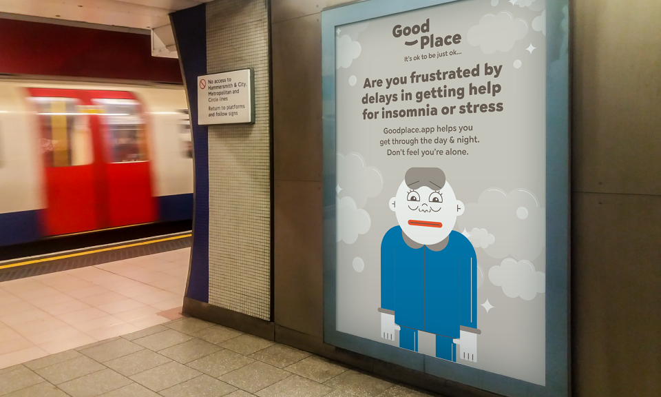
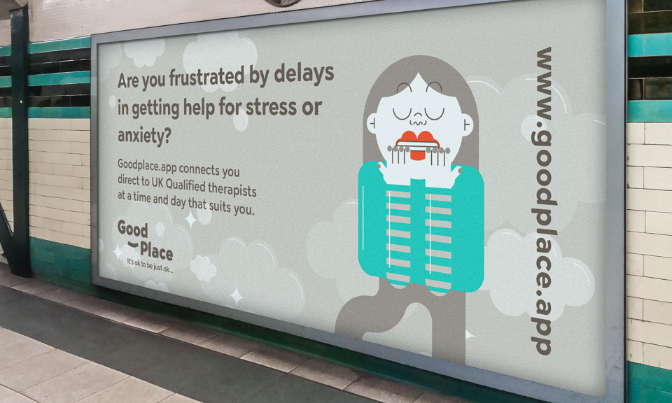
BRANDINGMARKETING DESIGNS (Social media, Emails, Print & Digital)ART DIRECTIONWIREFRAMESUSER INTERFACEBRAND GUIDELINESUSER INTERFACE GUIDELINES FOR DEVELOPERS
Hand off
Branding
LogoGoodplace logo is about making the user feel good, the eyes and smile within the brand logo is about reinforcing that the app is a 'Goodplace' and one where we want the user to feel safe and at home.
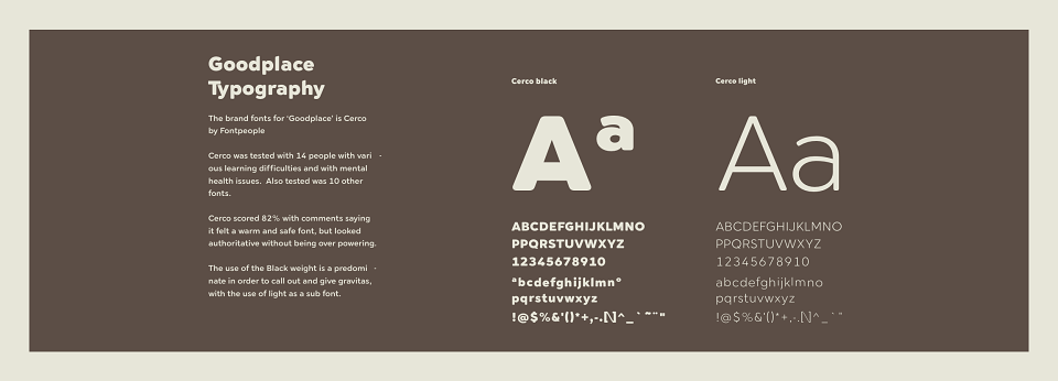
TypographyWorking with the type foundry Font Fabric, I wanted to use a sans serif, but without sharp corners, because I wanted the feel to be a safe space, doing research into multiple fonts, the majority of the fonts were round fonts, I found this to be juvenile. In my research I looked at a type foundry called Font Fabric, there was one font in particular that suited the needs of Goodplace, Cerco. Cerco is a sans serif font that has round corners and makes the user feel warm and welcomed. This font was then pulled into the design library and used within the UI and the branding to make it cohesive, friendly and welcoming.
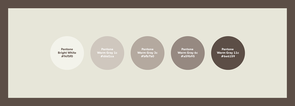
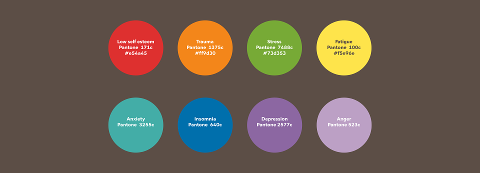
ColoursWithout trying to emulate the main player on the market which is Headspace, using a bright palette, but experimenting within the Pantone shade system to make the colours more warmer and not so over the top, the final colours represent a form of harmony because doing extensive research into colour psychology, each colour acts as a trigger with various mental health issues, in order that the palette sits with the typography and characters, the focus was to always use the brand key messaging… Safe, Fun, Engaging and Honest, this is reflected within the hues of the palette. When researching colours within psychology, including interviews done with 15 mental health professional's, the one thing that each said “don’t use blue, as it creates a negative brain space for mental health sufferers”. While researching, I was very wary about using greys as in my mind this conjures up depression, but researching the use of grey within the interface was a good thing, because grey creates a sense of harmony. Rather than using cold greys, I went into the Pantone grey palette and decided on using the warm grey palette even though they look beige and brown.
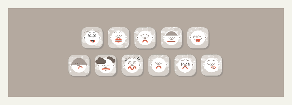
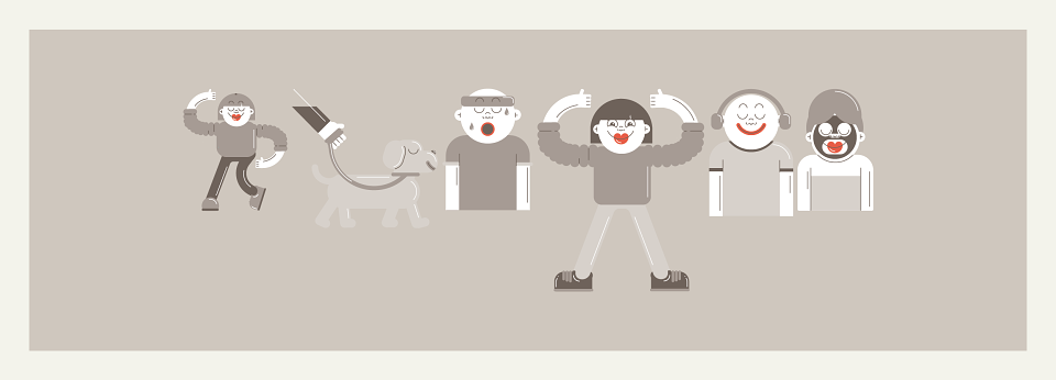
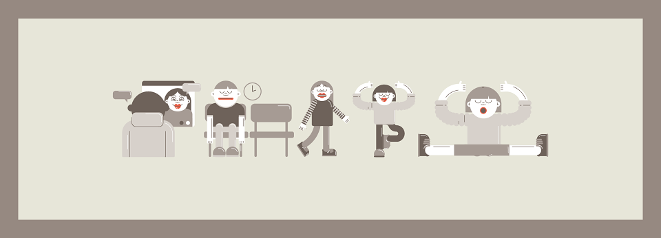
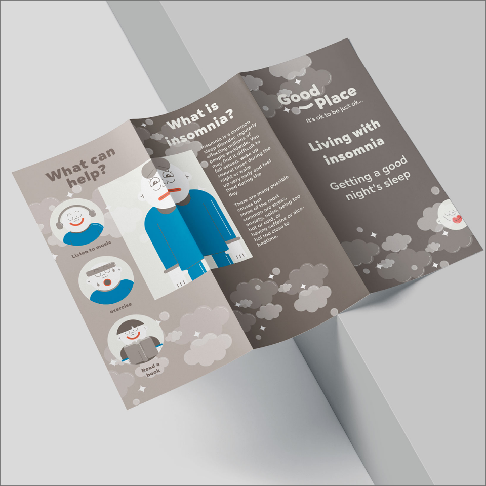
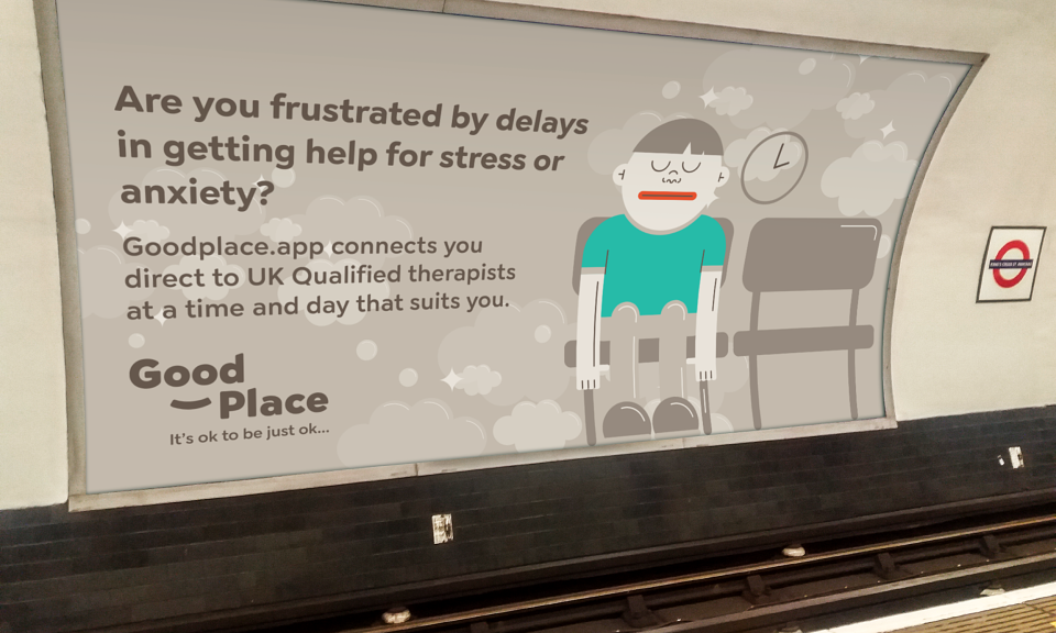
Icons & Illustrations. Reinforcing what was learned within the discovery stage about creating safe spaces especially that reflects on childhood, i knew I wanted to use illustrations, at the moment market is flooded with generic illustrations either being the doodle style (which I have used within the Rezigo brand (see link) or the elongated style (which is everywhere). I wanted Goodplace to have a unique vision, and this could only be done by working with an illustrator with a unique style. After viewing multiple portfolios, the illustrator's work that stood out the most was Rohann Thompson, who after speaking to her, sending out the brand guidelines and a cohesive brief, she came up with these incredible icons & illustrations. The original idea was to have the illustrations in multiple colours, after researching, the primary thing is to make sure that users of the Goodplace have a safe space, by using the colours that i researched that create positives relating to the mental health issue, these palettes were introduced to create a positive experience.
App design
White board / brainstormGoodplace logo is about making the user feel good, the eyes, smile and the rainbow within the brand logo is about reinforcing that the app is a Goodplace and one where we want the user to feel safe and at home.
Wireframes - 1 - Pencil / Paper - ideation2 - Blocks3 - High fidelity4 - Prototype
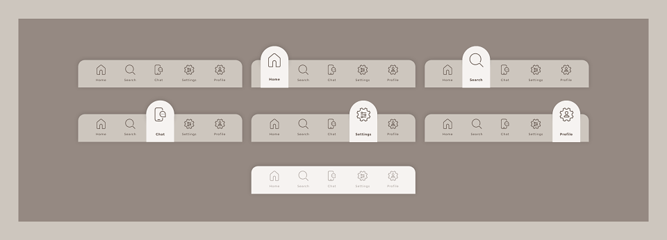
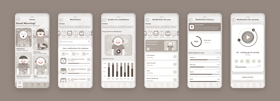
NavigationRather than going along with the typical hamburger menu within the app, all the navigation is based at the bottom of the screen and very simple and readily available using the user's natural instinct of thumbs at the bottom of the screen. On touch the icon raises up, not only does the icon raise but the correlating screen raises. When tested 72% of mental health sufferers said this was an easier approach and made them feel safe.
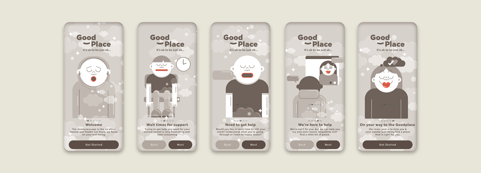
Introduction screens The splash screens are animated and give the user a warm invite and understanding of what the app entails before entering into the questionnaire section. By introducing the characters from the onset, it gives the user a taste of how friendly the app is.
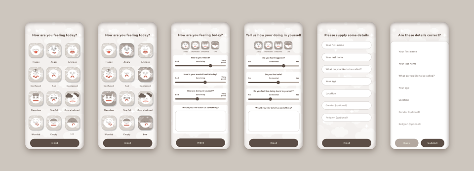
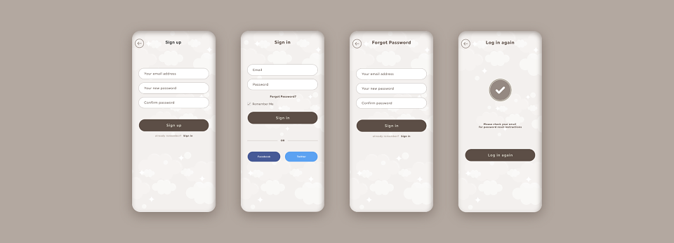
Sign up process The sign up process was about creating empathy and a safe space. Many times mental health businesses focus too much on trying to harvest as much information as possible, often forgetting that mental health sufferers can get triggered very quickly with brain overload. The use of the emotion icons and sliders and the options of adding more information is a softer approach and creates a more harmonious state of mind of the user.
MeditationThe user journey is founded around the benchmarks of simplicity and empathy. This is reflected within the meditation section which lets the user pick keywords to help with the moods they are feeling, this is triggered within the questionnaire section at the start of the journey. There are animated steps for the user to feel more peace of mind and to help them settle into their meditation sessions. The volume functionality has been purposely taken out of the app relying on the phones volume settings, this is because it’s more intrinsic for the user and to not to add extra stress within the user's jounrey.Within the meditation section there’s user readings and a history section (which as a Calm user, one of the missing attributes, as I need to scroll in to find a session that I appreciated).
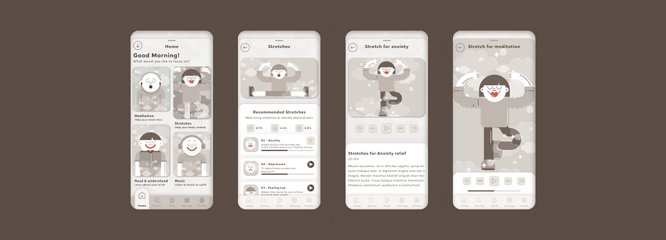
StretchesLike the meditation section, the stretches are targeted by the keywords that have been selected within the questionnaire, as each mental health ailment triggers physical manifestations. The stretch functionality is based on keywords and hashtags and once pressed the user gets to follow a video that has the option of going full screen.
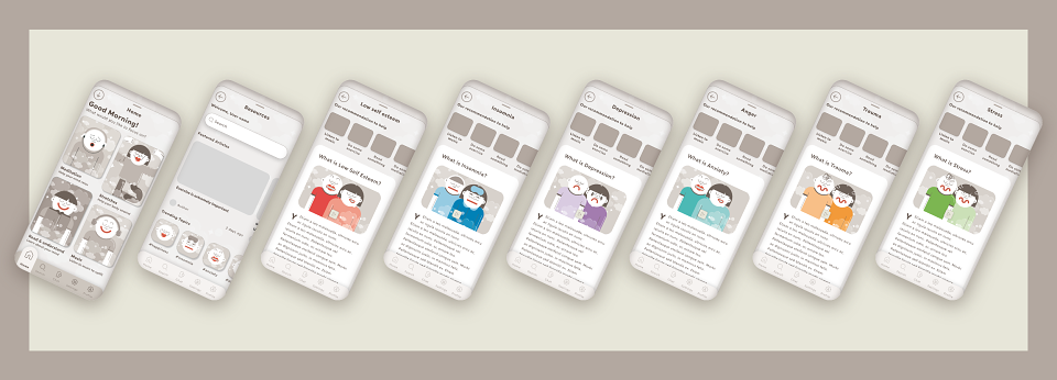
ResourcesThis section is about understanding various mental health issues and this is where the app gives the user basic information that helps them survive the issues. Understanding what you’re going through is very important to mental health users, because it’s about control (in the user research Control was mentioned 74.3% both in the positive and negative).
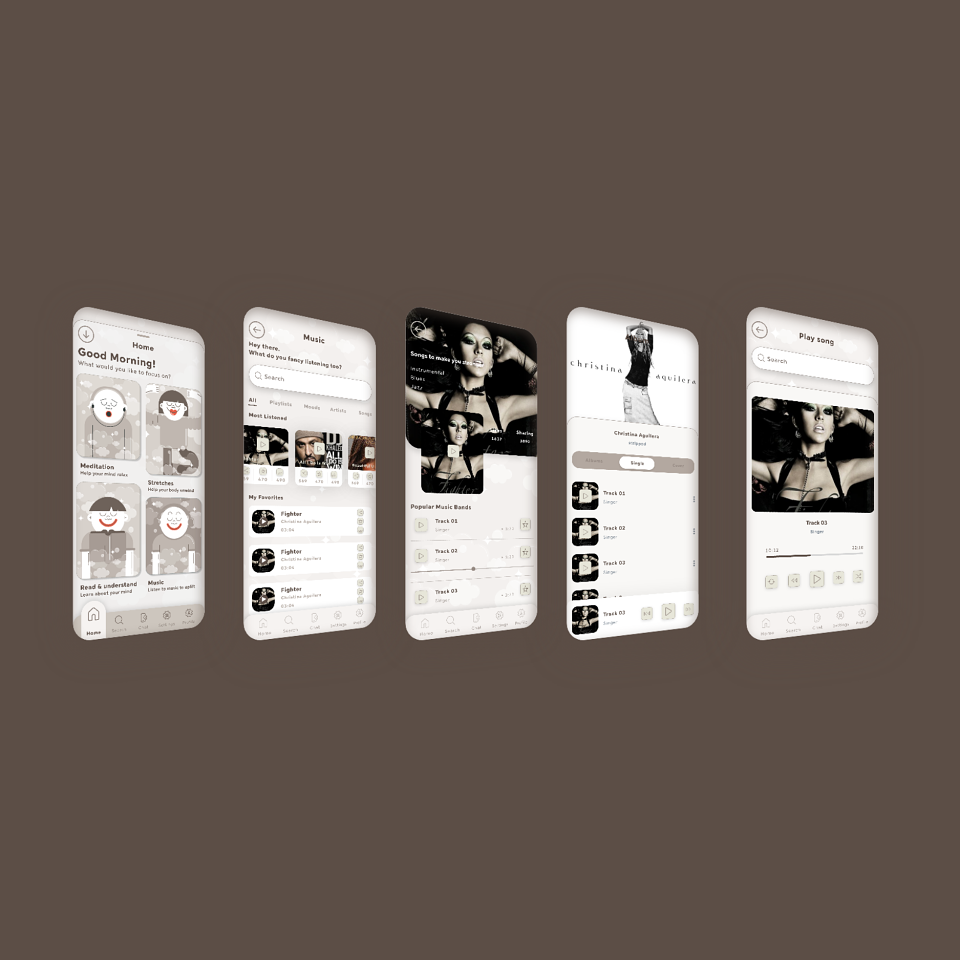
MusicThe Goodplace music player is about pulling in music that helps with your state of mind. This goes from the initial findings within the questionnaire and uses an algorithm to help pull the user's mind into a ‘Goodplace’. The functionality of the music section is to keep the clicks to a minimum in order to give a simple journey.
MADEIT CREDITS
-

ColFreelance Lead UI Designer