Clinic
London
ABOUT
Challenge
Create the branding and identity for Sano, a new food brand entering a crowded market and looking to empower people to make the best nutritional and wellbeing decisions in their everyday lives.
In creating the brand from scratch, the main challenge was to communicate its real point of difference – seriously tasty food based on sound nutritional science.
Insight
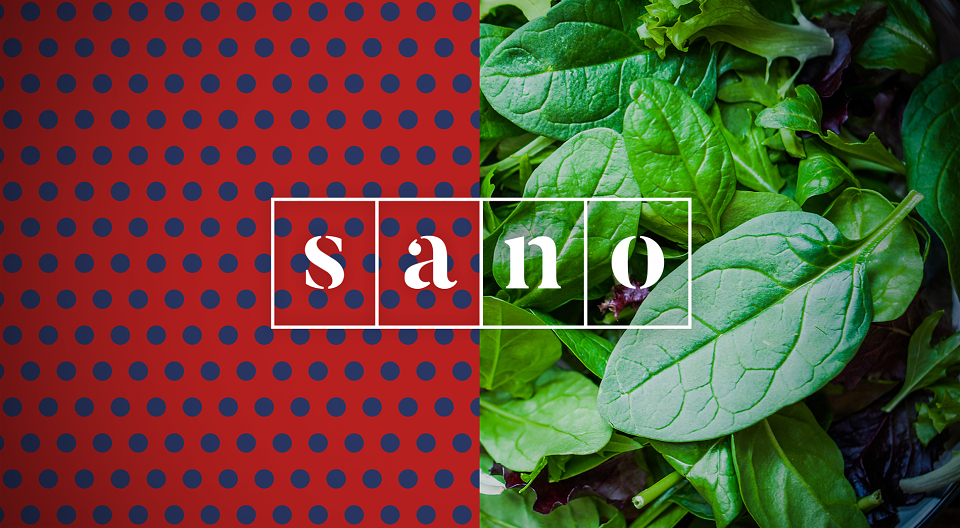
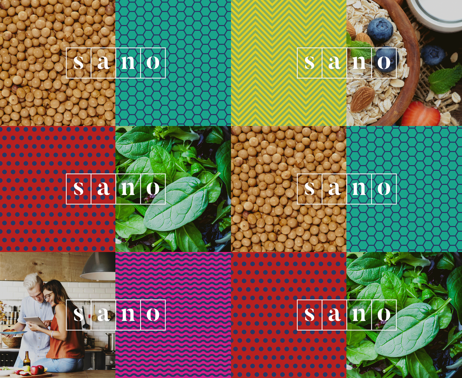
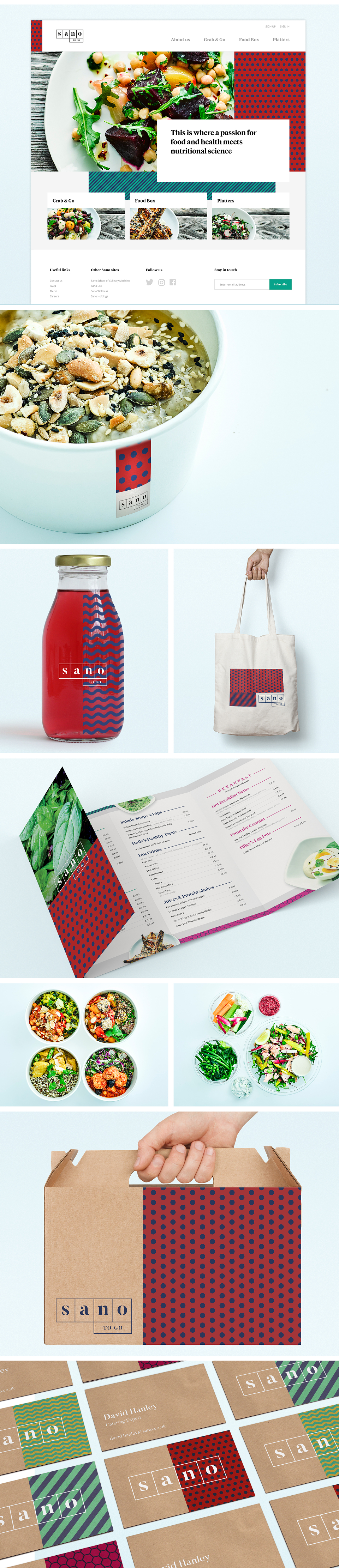
A creative audit of the ‘health and wellbeing’ space demonstrated how bland the market was, saturated with greens, browns, pastels and hand-drawn illustrations & typography. Sano would be positioned at the opposite end of the spectrum: vibrant colours, bold patterns and striking visual cues. This would reflect Sano’s fresh way of thinking and its facts not fads approach.
Outcomes
A creative audit of the ‘health and wellbeing’ space demonstrated how bland the market was, saturated with greens, browns, pastels and hand-drawn illustrations & typography. Sano would be positioned at the opposite end of the spectrum: vibrant colours, bold patterns and striking visual cues. This would reflect Sano’s fresh way of thinking and its facts not fads approach.