Claire
Graphic Designer
ABOUT
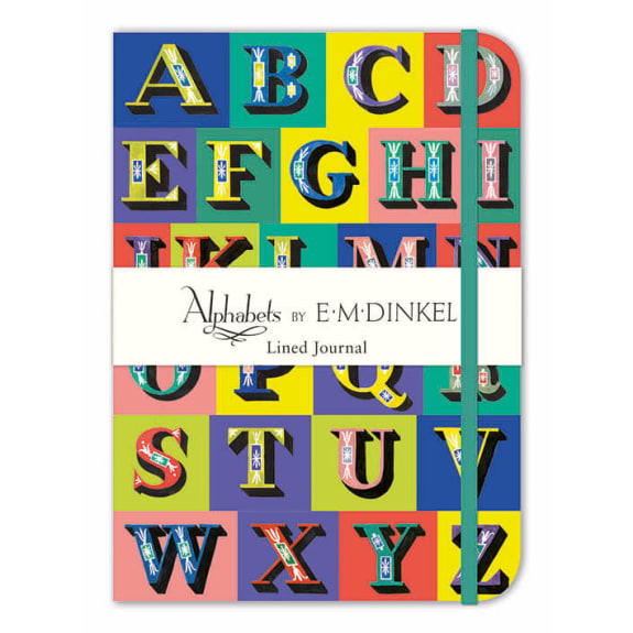
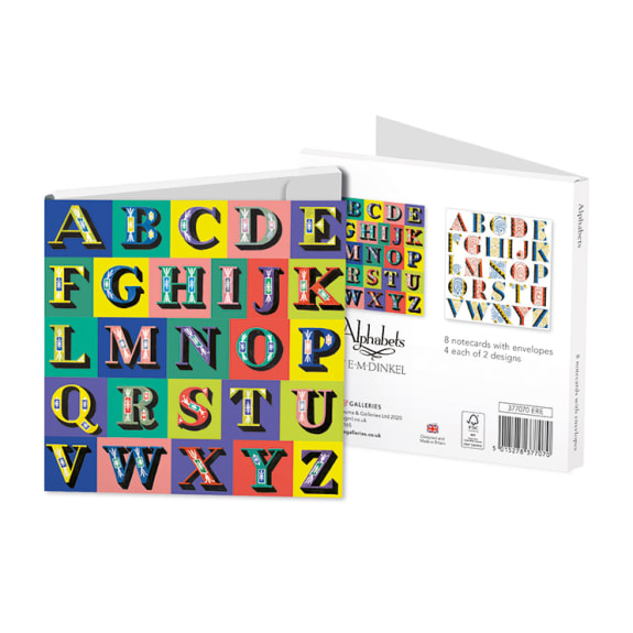
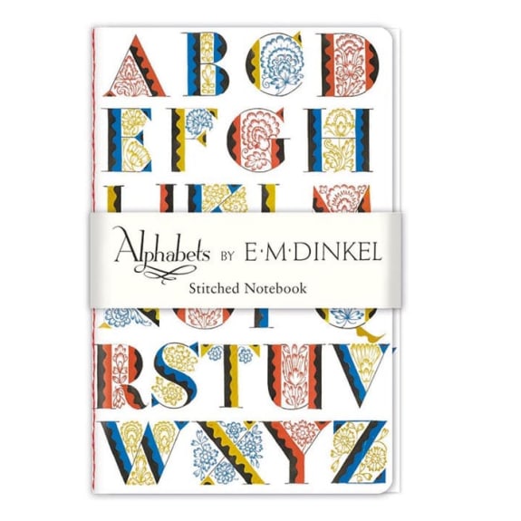
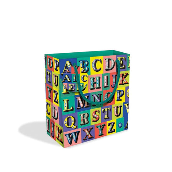
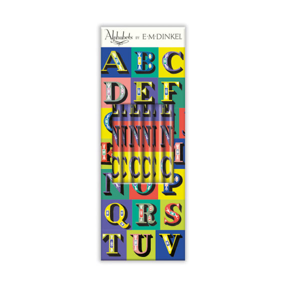
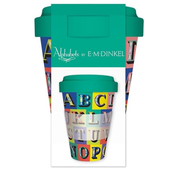
Brief: Create a range of stationery based on the decorative alphabets of E. M. Dinkel from the 1940’s and 1950’s.
Execution: Having selected the most commercial looking alphabets from the collection, I had to do some remedial work to improve the look of the alphabets, such as repairing the lettering and improving the colour. The most favoured alphabet for the project was missing quite a number of characters, so I created those myself by drawing them and painting with watercolours as the artist would have done originally. Next I had to find a way of presenting the letters in an appealing way to apply to cards and stationery. Together with the design team we decided to present each of the letters on a contrasting coloured background, which was then collated together to form a colourful patchwork alphabet. The alphabet was carefully manipulated to function across various different shapes and sizes of products. I also modified other alphabets to use on greetings cards, adding decorative foil and floral motifs.
Results: The result of the project was a collection of branded products featuring Dinkel’s alphabets. These included greeting cards and notecards, notebooks, pencil set, gift wrap, gift bags and a reusable cup.
MADEIT CREDITS
-

ClaireGraphic Designer